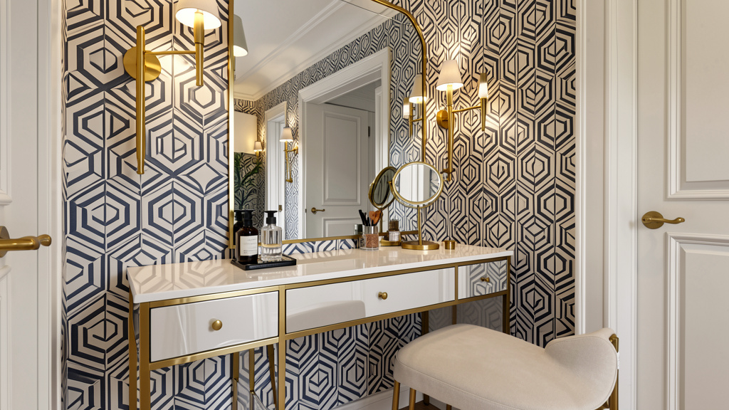
Discover how Art Deco’s celebration of human ingenuity, intentional geometry, and material harmony can thoughtfully enrich contemporary living spaces—without requiring historic architecture or unlimited resources.
Art Deco interior design offers far more than decorative motifs; it presents a cohesive visual language born from a pivotal moment in cultural history. Emerging globally during the 1920s and 1930s, this style synthesized ancient symbolism, industrial innovation, and cross-cultural artistry into spaces that feel both dynamic and deeply intentional. This guide moves beyond fragmented inspiration to provide a structured, adaptable framework for integrating Art Deco’s core principles—geometry, contrast, craftsmanship, and optimism—into homes of any era, size, or budget. Drawing upon documented collections from institutions like the Musée des Arts Décoratifs in Paris and the Metropolitan Museum of Art, alongside preservation archives from iconic Art Deco districts such as Miami Beach and New York City, this resource emphasizes contextual understanding over rigid replication. Whether enhancing a single room or reimagining an entire residence, you’ll find actionable pathways grounded in historical awareness and modern practicality.
Introduction: A Language of Optimism, Not a Costume
Picture the quiet elegance of a sunlit foyer: light catching the radiating lines of a mirror framed in brushed brass, the gentle curve of a low-profile console against a wall finished in warm plaster, a single sculptural vase resting atop a surface of matte-black lacquer. This is Art Deco not as theatrical set design, but as lived-in refinement. Born amid post-war hope and fascination with progress—from ocean liners to radio broadcasts—the style consciously shifted away from Art Nouveau’s organic fluidity toward clarity, symmetry, and symbolic geometry. It embraced both handcrafted artistry and industrial possibility, weaving influences from Egyptian archaeology, African sculpture, Mesoamerican architecture, and Asian lacquerwork into a forward-looking aesthetic.
Crucially, Art Deco was never monolithic. Regional interpretations flourished: the soft pastels of Miami Beach responded to coastal light and climate; the bold verticality of New York skyscraper lobbies embodied urban ambition; European iterations often favored richer woods and intricate marquetry. This inherent adaptability is precisely why the style remains relevant. It does not demand vast square footage, historic moldings, or museum-level budgets. Instead, it invites intentionality—choosing forms with purpose, balancing textures thoughtfully, and honoring the spirit of the era without replicating it literally. As preservation studies of interwar apartment buildings (such as New York’s Tudor City) reveal, Art Deco was originally designed for efficient, beautiful modern living. This guide reclaims that accessible spirit, framing Art Deco not as nostalgia, but as a versatile philosophy for creating spaces that feel curated, confident, and authentically yours.
The Art Deco Triad Framework: History, Aesthetics, Application
Authentic integration emerges from balancing three interconnected dimensions. Isolating motifs—like sunbursts or chevrons—without context risks superficial styling. The Triad Framework offers a sustainable foundation for every decision, whether selecting a light fixture or reimagining a room’s flow.
Pillar 1: Historical Context—Understanding the “Why”
Art Deco’s visual vocabulary directly reflects its cultural moment. Grasping this context transforms choices from arbitrary to meaningful.
The 1925 Paris Exposition and Global Dialogue
Officially titled Exposition Internationale des Arts Décoratifs et Industriels Modernes, this landmark event crystallized the style’s ethos. It showcased a deliberate fusion: French cabinetmakers presented exquisite marquetry alongside Austrian innovations in bentwood; designers celebrated both artisanal mastery (hand-inlaid surfaces) and industrial potential (tubular steel forms). For today’s homeowner, this duality is liberating. Pairing a hand-finished wood console with a factory-produced geometric lamp isn’t incongruous—it honors Art Deco’s original spirit of synthesis. Contemporary terminology also matters: the label “Art Deco” emerged decades later; period terms included Style Moderne or Jazz Age design. This awareness encourages respectful engagement rather than rigid purism.
Cross-Cultural Currents, Thoughtfully Interpreted
Global influences were integral, yet require mindful adaptation today:
– Egyptian Motifs: Following Tutankhamun’s tomb discovery (1922), stepped forms and lotus patterns appeared widely. Modern interpretation: a subtle geometric border on custom wallpaper, avoiding literal religious symbols.
– African and Oceanic Art: Abstracted rhythmic patterns and sculptural forms inspired decorative objects. Today: select textiles or ceramics from contemporary artists honoring cultural roots, displayed with contextual awareness.
– Mesoamerican Geometry: Stepped profiles (ziggurats) directly informed architectural details and furniture silhouettes. This explains why tiered forms remain a hallmark motif.
– Asian Craft Traditions: Japanese lacquer techniques and Chinese cloisonné elevated surface artistry. Modern parallel: high-gloss finishes with intentional negative space, or ceramic pieces featuring minimalist geometric inlay.
Machine Age Poetry
Technology was romanticized—not as cold machinery, but as elegant progress. Streamlined shapes echoed ocean liners (Normandie), automobiles (Bugatti), and aircraft. This manifests in:
– Speed Lines: Parallel grooves suggesting motion on screens or panels.
– Radiating Suns: Symbolizing optimism and new beginnings.
– Geometric Abstraction: Natural forms distilled to essential shapes, reflecting faith in order and clarity.
Why context matters: Choosing a sunburst mirror becomes more meaningful when understood as an emblem of hope. This depth prevents spaces from feeling like themed sets. Historical awareness guides respectful curation—honoring origins while adapting thoughtfully for contemporary values.
Pillar 2: Aesthetic Principles—Geometry, Material, Light
Art Deco’s visual identity follows consistent, learnable patterns. Mastery lies in understanding their interplay.
Geometry: Structure with Intention
Geometry operates on three complementary levels:
1. Primary Forms (Architectural): Define space and major furniture—stepped profiles, sweeping curves (inspired by ships), bold chevrons, or sunburst radii. Application: A tiered bookshelf, curved banquette, or chevron-border floor detail.
2. Secondary Patterns (Surface): Repeating motifs adding rhythm—Greek key borders, stylized florals (symmetrical clusters, not loose watercolors), abstracted tribal patterns. Application: Subtle trim on drapery, tile borders, or upholstery accents.
3. Tertiary Details (Refinement): Fine-line inlays, engraved metalwork, or delicate embossing. Application: Thin brass strips outlining a cabinet door; etched lines on glassware.
Critical nuance: Restraint creates impact. Select one dominant geometric theme per room. A chevron rug pairs elegantly with a sunburst mirror but may compete with a stepped console and Greek key trim. Balance sharp angles with a single organic curve (e.g., a circular mirror amid angular furniture) to avoid visual rigidity.
Material Harmony: Contrast with Purpose
Art Deco thrives on intentional juxtaposition—never using materials in isolation.
| Material Category | Authentic Spirit | Modern, Accessible Adaptations | Thoughtful Considerations |
|---|---|---|---|
| Luxurious Textures | Rare woods, lacquer, velvet, silk | Faux shagreen vinyl, high-gloss automotive paint on furniture, performance velvet (Crypton®), sustainably sourced walnut with ebony stain | Avoid ivory replicas; choose ethical alternatives like resin with mother-of-pearl effect. Prioritize materials that age gracefully. |
| Industrial Elements | Chrome, nickel, Bakelite | Brushed brass (warmer tone), matte black metal, recycled aluminum, modern composites mimicking vintage plastics | Mix metals intentionally: brushed brass hardware on a matte-black console. Avoid overwhelming cool tones; balance with warmth. |
| Earthy Foundations | Terrazzo, travertine, stucco | Large-format porcelain tiles mimicking terrazzo, honed quartz with subtle veining, textured plaster (Venetian or lime wash) | Include at least one deeply textured element (nubby bouclé, woven seagrass) to counter smooth surfaces and add tactile warmth. |
Guiding Principle: For every cool, hard surface (glass, polished metal), incorporate one warm, soft texture (wool rug, velvet pillow). For every dark element (stained wood), include a light counterpoint (cream plaster, pale stone). This “push-pull” energy defines Art Deco’s livable sophistication.
Color Strategy: Clarity Over Chaos
Palettes varied by region and function—avoid assuming Art Deco equals only black-and-gold.
- Urban Contrast Palette: Jet black, stark white, chrome, with jewel-tone accents (emerald, sapphire, ruby). Best for: Formal living areas, powder rooms. Modern tip: Use black on architectural details (door frames, shelf edges) rather than entire walls to maintain airiness.
- Coastal Pastel Palette: Soft coral, seafoam, butter yellow, sky blue. Origin: Miami Beach adaptations for light reflection and climate. Best for: Sunrooms, bedrooms, coastal homes. Key: Maintain sharp contrasts—crisp white trim against pastel walls preserves Deco clarity.
- Earthy Global Palette: Terracotta, ochre, olive, deep bronze. Origin: Archaeological influences and African art. Best for: Libraries, studies, spaces seeking grounded warmth. Modern tip: Pair with raw textures like rattan or unpolished stone.
Practical Guidance: Limit core colors to three plus metallics per room. Example: Cream walls (base) + charcoal furniture (secondary) + emerald accents (tertiary) + brushed brass (metallic). Always view samples in your space under morning, noon, and evening light—materials interact dynamically with illumination.
Motifs: Meaningful Vocabulary
Use symbolic elements with purpose:
– Sunburst/Radiating Lines: Represents energy and optimism. Use: One focal piece per room (mirror, light fixture, rug motif). Avoid repetition across multiple items.
– Chevron (Precise Zigzag): Symbolizes speed and modernity. Use: Flooring borders, textile patterns. Note: True Deco chevrons are sharp, geometric, and high-contrast—not soft or wavy.
– Stepped Forms (Ziggurat): Evokes ancient architecture and skyscraper setbacks. Use: Bookshelves, console profiles, room dividers. Creates shadow play and visual depth.
– Streamlined Curves (1930s Evolution): Horizontal lines, rounded corners, “waterfall” edges. Use: Curved sofas, arched openings, porthole-inspired details. Distinction: Curves feel engineered, not organic—smooth and continuous, never floral.
Lighting: Sculptural and Layered
Lighting is central art, not mere utility. Prioritize three layers:
– Ambient: Cove lighting (modern LED tape makes this achievable), geometric flush mounts, or scaled chandeliers. Tip: Dimmers are essential for mood flexibility.
– Task: Adjustable-arm lamps (architect or “Cobra” style), under-cabinet strips in kitchens. Position to eliminate glare on screens or work surfaces.
– Accent: Sconces with geometric backplates (mounted at eye level: 60–66″ from floor), picture lights, LED strips highlighting shelves. Critical: Sconces flanking mirrors provide superior facial illumination versus overhead lights alone.
Textiles: Pattern with Restraint
Fabrics soften geometry while reinforcing theme:
– Patterns: Geometric repeats (circles, diamonds), stylized florals (symmetrical clusters), subtle stripes. Avoid loose watercolor florals or busy botanicals.
– Textures: Velvet (light-absorbing depth), bouclé (nubby warmth), heavy linen, shantung. Modern performance fabrics offer durability without sacrificing aesthetics.
– Application: Start small—patterned pillows on a solid sofa. For windows, floor-length drapes with crisp pleats (not gathered swags); add a contrasting band at the leading edge for detail. Layer sheer underpanels for light control in bedrooms.
The Guiding Insight: Art Deco’s enduring power lies not in period-perfect replication, but in its philosophy: geometry as intentional order, contrast as dynamic energy, and craftsmanship as respectful engagement. Authenticity emerges when choices reflect why elements existed—not just what they looked like.
Room-by-Room Integration: Practical Pathways for Real Homes
Apply principles flexibly. Each space includes scalable approaches: Full Integration (dedicated spaces), Strategic Accents (balanced adaptation), and Subtle Touches (minimal commitment).
Living Room: Social Space with Intentional Flow
Focus: Balance drama with comfort; avoid museum-like formality.
Architectural Enhancements
– Existing moldings: Paint in a contrasting tone (e.g., charcoal against cream walls) to emphasize lines. Add a subtle Greek key stencil along the crown molding base using metallic paint.
– No moldings? Create definition with paint: tape a horizontal band 8–10″ below the ceiling; paint the upper section a slightly deeper shade of your wall color.
– Fireplace: Tile the surround with geometric patterns (black-and-white hexagons, chevron border). Flank with sconces featuring sunburst or stepped backplates.
– Windows: Floor-to-ceiling drapes in solid jewel tones or heavy linen. Mount rods 6″ above the frame and extend 6″ beyond for perceived height. Add a contrasting band (e.g., black velvet strip) along the leading edge.
Furniture Strategy
– Sofa: Low-profile silhouette with clean lines, tapered legs, tight back cushions. Upholster in solid velvet or performance fabric. Budget path: Recover an existing low-slung sofa; add tailored slipcovers with contrast piping.
– Seating Mix: Pair one sculptural curved chair (cream bouclé) with one angular accent chair (chrome frame, black leather-look fabric) to embody Deco’s love of contrast.
– Coffee Table: Geometric base preferred (stepped wood, chrome frame). Adaptation: Paint a thrifted table base in high-gloss black; replace top with tempered glass.
– Storage: Stepped étagère for books and curated objects. Group items in odd numbers; leave negative space. Avoid overcrowding shelves.
Lighting & Textiles
– Layer ambient (dimmed ceiling fixture), task (adjustable floor lamp), and accent (shelf lighting).
– Anchor with a large geometric rug; ensure front furniture legs rest upon it.
– Pillows: Mix scales—two large solids, two medium geometric prints, one textured accent (faux-fur).
– Common Pitfall Alert: A room of only smooth surfaces (glass, chrome, lacquer) feels cold. Always include tactile elements: wool rug, bouclé chair, woven basket.
Bedroom: A Sanctuary of Calm Opulence
Focus: Serenity over drama; prioritize restful ambiance.
Bed as Anchor
– Headboard: Upholstered in velvet or textured fabric with vertical channel tufting or subtle geometric quilting. Renter-friendly: Mount a large geometric art print or tapestry; frame with simple molding in a contrasting color.
– Bedding: Crisp white or ivory sheets. Duvet in solid deep tone (navy, charcoal) or subtle geometric print. Layer with a cashmere-look throw. Use Euro shams (26″x26″) for structured height against the headboard.
– Nightstands: Match bed’s aesthetic—stepped profile or clean rectangles with geometric hardware. Ensure surface accommodates lamp, book, water glass.
Lighting for Rest
– Sconces with adjustable arms are ideal (free nightstand space; mount shade bottom at 48″ for lying-down reading).
– Table lamps: Weighted bases (glass, ceramic), drum shades in complementary tones.
– Ambient: Small geometric flush mount on dimmer.
– Hidden comfort: Warm-white LED strip under bed frame for soft nighttime navigation.
Sensory Details
– Window Layers: Blackout roller shade (hidden) + floor-length drapes in heavy fabric (velvet-look, damask). Use geometric-shaped tie-backs (brass rings, leather straps).
– Rug: Plush underfoot; extend 18–24″ beyond bed sides. Color harmonizes with bedding (e.g., charcoal rug with cream bedding).
– Color Psychology: Bedrooms benefit from sophisticated neutrals with one accent hue. Calming palette: cream walls, charcoal bedding, warm wood tones, brass accents. Avoid high-contrast black walls in small rooms—they can feel oppressive.
– Scent: Subtle sandalwood or amber diffuser aligns with Deco’s global influences; avoid overpowering florals.
Kitchen: Streamlined Function with Character
Focus: Enhance existing layout; prioritize durability and workflow.
Cabinetry & Surfaces
– Paint Transformation: High-gloss lacquer finish creates signature Deco reflectivity. Options: jet black lowers + white uppers (classic contrast); deep forest green + warm gray. Renter note: Verify lease permissions; high-quality removable vinyl wraps offer temporary alternative.
– Hardware: Replace pulls with geometric shapes—sunburst brass, stepped rectangles, long horizontal bars.
– Countertops: Terrazzo-look porcelain tiles (durable, lower maintenance than real terrazzo). Temporary: Premium vinyl contact paper for renters.
– Backsplash: Feature wall opportunity. Black-and-white hexagons; herringbone subway tile; or solid high-gloss panel if countertops are patterned. Extend to bottom of uppers for seamless look. Add under-cabinet LED strips (warm white) to highlight at night.
Functional Accents
– Pendant Lights: Geometric shapes over island/sink—drum shades in metallic fabric, tiered glass. Cluster three at varying heights for visual interest.
– Bar Cart: Essential Deco element. Style with cut-crystal glassware, geometric decanters, chrome tools on a lacquered tray. Use as coffee station or cocktail setup.
– Textiles: Tea towels with subtle geometric prints; oven mitts in solid jewel tones stored visibly in a woven basket.
– Workflow Reminder: Preserve the “work triangle” (sink-stove-fridge). Aesthetics should enhance, not hinder, daily function. Choose satin-finish cabinets if high-gloss shows fingerprints in busy households.
Bathroom: Geometry Meets Serenity
Focus: Maximize impact in compact spaces; prioritize moisture-resistant materials.
Tile Strategy
– Feature Wall: Behind vanity or in shower niche. Sunburst mosaic (glass/ceramic), chevron pattern, or Greek key border along top edge.
– Floor: Large-format tiles (12″x24″+) in neutral tone with subtle texture. Add a contrasting border tile (e.g., black strip) where floor meets wall for geometric definition.
– Grout Choice: Contrasting grout (dark gray with white tile) emphasizes patterns; matching grout creates seamless look for solid tiles.
– Shower: Frameless glass enclosure maintains clean lines. Tile walls monochromatically with texture variation (matte field tiles + glossy accent strip). Install niche with stepped shelves.
Vanity & Fixtures
– Mirror: Statement piece essential. Sunburst shape iconic; alternatives include stepped frame or oval with etched radiating lines.
– Sconces: Mount flanking mirror at eye level (60–66″). Choose adjustable arms for optimal task lighting. Match finish to faucet (brushed brass for warmth, polished nickel for cool elegance).
– Hardware: Streamlined cross handles or angular single-lever faucets. Ensure all finishes coordinate (towel bars, toilet paper holder).
Atmosphere & Accessories
– Lighting Layers: Sconces (primary), recessed downlights on dimmer (ambient), LED strip inside floating shelf (accent). Smart dimmer allows “spa mode” (soft warm) vs. “ready mode” (bright cool).
– Textiles: Shower curtain in solid heavy fabric (vinyl-backed linen-look) with geometric trim if no glass enclosure. Plush bath mat in accent color with subtle border. Towels in solid hues; fold neatly on open shelves or ladder rack.
– Accessories: Glass soap dispenser, woven seagrass wastebasket, one sculptural plant (snake plant, ZZ) in geometric pot.
– Powder Room Power: Small spaces allow bold choices—deep jewel-tone walls (burgundy, forest green) in matte finish, dramatic black-and-white geometric wallpaper on one wall, vintage-style pedestal sink. Edit relentlessly; every item must earn its place.
Home Office: Clarity for Focus and Creativity
Focus: Blend inspiration with ergonomics; integrate technology thoughtfully.
Desk & Seating
– Desk: Rectangular or L-shaped with clean lines. High-gloss black lacquer ideal; paint thrifted wood desk as budget path. Add removable stepped shelf unit for vertical organization. Position perpendicular to window to reduce screen glare.
– Chair: Prioritize ergonomics. Reupholster a quality ergonomic chair in Deco-appropriate fabric (navy velvet, charcoal wool). Guest chair: single sculptural accent piece (curved barrel chair in bouclé).
– Storage: Stepped étagère for books (spine-out in color order) and meaningful objects (vintage globe, geometric brass bookend). Hide utilitarian items in lacquered cabinet with geometric hardware.
Lighting & Integration
– Task Lighting: Adjustable-arm architect lamp (brass or matte black) positioned to eliminate hand shadows. Use 4000K LED bulb for alertness.
– Ambient: Small geometric table lamp for softer evening work. Maximize natural light with sheer roller shades.
– Tech Integration: Braided cable sleeves in matching colors; hide power strips in decorative box. Choose monitor arms with clean lines. Wireless charger in geometric shape. Philosophy: Technology should serve invisibly—honoring Deco’s celebration of tools that enhance human potential.
Personal Touches
– Art above desk: Abstract geometric print in your palette, vintage map of a Deco-rich city (Miami, Mumbai, Shanghai), or typography quote in bold geometric font.
– Color Psychology: Soft gray or warm beige walls; accent wall behind desk in deep navy. Avoid reds (agitating) or sterile white.
– One meaningful object: Family photo in geometric frame, travel souvenir on small pedestal. Restraint amplifies significance.
Adapting Art Deco for Contemporary Living
True authenticity lies in thoughtful adaptation—not rigid replication. These pathways address real-world constraints with creativity and respect.
Budget-Conscious Integration: Impact Over Expense
Strategic choices deliver disproportionate visual returns. Focus resources on high-visibility elements.
| Element | High-Impact Strategy | Budget Pathway | Temporary/Renter Solution |
|---|---|---|---|
| Lighting | One statement fixture (sconce, floor lamp) | Estate sales for vintage bases (professionally rewired); reproduction sales (Rejuvenation, Schoolhouse) | Spray-paint thrifted lamp base high-gloss black; recover shade in metallic fabric. Plug-in wall sconces require no hardwiring. |
| Walls | One accent wall or architectural detail | Stencil Greek key border along crown molding; removable geometric wallpaper on single wall | Painter’s tape stripes (vertical for height); gallery wall of black-and-white geometric art prints in matching thrifted frames. |
| Furniture | One key silhouette (console, chair) | Refinish solid wood thrift finds; IKEA hacks (add tapered legs to LACK table; paint high-gloss) | High-quality slipcovers in velvet-look or geometric-print fabric; add contrast piping for polish. |
| Textiles | Curtains, area rug, pillows | Sew pillow covers from remnant fabric; hunt overstock rugs online | Dye existing pillows/rugs in solid jewel tones; use fabric paint for subtle geometric accents. |
| Accessories | Mirror, art, curated objects | Thrift stores: sunburst mirrors (restore frame), brass trays, geometric glassware | Create art: Print geometric patterns on cardstock; frame in painted thrifted frames. DIY sunburst mirror using craft wood strips and gold-leaf paint. |
Thrifting with Discernment
– Seek: Brass trays, geometric glassware, mirrors with angular frames, furniture with clean lines (refinishable).
– Avoid: Heavy carvings (Victorian), flowing florals (Art Nouveau), organic shapes (Mid-Century). Look for symmetry, straight lines, geometric details.
– Restoration Basics: Clean brass with vinegar/salt paste; polish chrome with vinegar solution. Sand wood lightly; apply gel stain for even coverage; seal with polyurethane. Safety: Never rewire electrical items yourself unless qualified. Hire a professional for lamp rewiring ($20–$50). Non-electrical items (mirrors, trays) are safe for DIY restoration.
– Paint Power: High-gloss finish creates lacquered effect on trim, doors, or furniture. Patch imperfections thoroughly first. Two-tone walls (dark lower third, light upper) mimic Deco paneling. Ceiling painted soft gray or pale blue feels intentional versus stark white.
Small Spaces: Precision Over Grandeur
Art Deco’s emphasis on vertical lines, reflective surfaces, and intentional editing excels in compact homes.
Spatial Illusions
– Mirrors: Place opposite windows to amplify light and space. Choose thin-framed or frameless styles to avoid visual weight. Full-length mirror on closet door; tall narrow mirror in hallway.
– Vertical Emphasis: Install tall narrow bookshelves; use vertical striped wallpaper on one wall. Mount curtain rods high and wide; hang floor-length drapes.
– Color Strategy: Light, reflective wall colors (cream, soft gray). Reserve dark tones for accents (pillow, art frame).
– Furniture Profile: Select pieces with visible legs (tapered wood or metal) to create visual airflow. Avoid skirted furniture or bulky forms.
Multi-Functional Solutions
– Storage ottoman (upholstered in textured fabric) serves as footrest, seating, or coffee table.
– Nesting tables with geometric profiles tuck away when not in use.
– Fold-down desk mounted on wall; back panel lined with removable geometric wallpaper visible when open.
– Room divider: Stepped étagère defines zones while providing storage; style with books and intentional objects.
Zoning Without Walls (Studio Apartments)
– Living/Sleeping: Position low bookshelf perpendicular to bed. Use ceiling-mounted curtain track with solid-color drape for privacy.
– Dining Nook: Round table (softens geometry, saves space) with two chairs. Anchor with small geometric pendant light.
– Entry Zone: Narrow console table (stepped profile) with mirror above and tray for keys.
– Rugs: Different rugs define zones (geometric under living area; solid under dining). Ensure colors coordinate within your palette.
– Editing Principle: Apply “one in, one out.” Display only meaningful objects. Closed storage (baskets with lids, cabinets) hides daily clutter. Open shelves showcase beauty intentionally.
Blending Styles: Harmonious Integration
Art Deco pairs beautifully with other aesthetics when a “bridge element” connects them.
Art Deco + Modern Minimalism
– Bridge: Shared love of clean lines and intentional form.
– Strategy: Neutral base (white walls, light floors). Minimalist furniture silhouettes in Deco materials (velvet sofa, high-gloss console). One or two Deco accents: sunburst mirror, geometric rug, brass sconces.
– Color: 90% neutral (white, gray, beige) + 10% Deco accent color (emerald, navy) used sparingly.
– Pitfall to Avoid: Over-accessorizing. Minimalism requires restraint. Edit until the space feels calm, then add back one meaningful Deco element.
Art Deco + Mid-Century Modern
– Bridge: Tapered legs, appreciation for wood tones.
– Strategy: Walnut platform bed (MCM) + cream bouclé barrel chair (Deco curve). Geometric black-and-white rug (Deco) under MCM dining set. Mix lighting: sunburst chandelier with spherical pendants.
– Color Palette: Warm wood tones + Deco jewel tones (mustard, olive) + brass accents.
– Critical Distinction: Deco geometry is sharp, symmetrical, ornate; MCM geometry is organic, asymmetrical, playful. Keep patterns distinct but harmonious.
– Pitfall to Avoid: Mixing too many wood tones. Choose one dominant wood (e.g., walnut); refinish mismatched pieces to unify.
Art Deco + Thoughtful Eclecticism
– Bridge: Shared global influences (used respectfully).
– Strategy: Establish strong Deco foundation—geometric rug, sunburst mirror, high-contrast palette. Layer select global textiles: vintage kilim pillow on velvet sofa, Moroccan brass tray on stepped console.
– Curation Rule: Bohemian elements must feel intentionally placed, not randomly accumulated. Group objects thoughtfully; maintain negative space.
– Pitfall to Avoid: Clutter. Deco demands order. If an item doesn’t enhance the narrative or function, remove it. Prioritize quality and meaning over quantity.
Universal Blending Principle
Let Art Deco provide the structural framework (60%), secondary style offer complementary elements (30%), and accent details add personality (10%). Regularly revisit the Triad: Does this blend honor historical context (respectful fusion), aesthetic coherence (unified visual language), and practical application (supports your daily life)? If yes, it succeeds.
Navigating Common Challenges with Awareness
Even well-intentioned efforts encounter hurdles. Proactive awareness prevents frustration and preserves authenticity.
Challenge: Confusing Art Deco with Art Nouveau
– Distinction: Art Nouveau (1890s–1910s) features flowing “whiplash” curves, asymmetrical florals, and nature motifs (dragonflies, vines). Art Deco (1920s–1940s) embraces sharp angles, symmetry, geometric abstraction, and machine-inspired forms.
– Practical Check: Does the item feel hand-drawn and organic (Nouveau) or engineered and precise (Deco)? When uncertain, choose cleaner lines and symmetry.
– Memory Aid: Deco = Dynamic, Diagonal, Decisive. Nouveau = Natural, Nuanced curves.
Challenge: Pattern Overload
– Cause: Overusing recognizable motifs (chevrons everywhere).
– Solution: Treat patterns like spices. Select one dominant geometric pattern per room (e.g., chevron rug), then support with solids and subtle textures. Use bold patterns on architectural elements (floor border) rather than multiple textiles.
– Visual Test: Step back. Does one element command attention, or do patterns compete? Simplify until harmony emerges.
Challenge: Scale and Proportion Missteps
– Cause: Purchasing without measuring; focusing on items versus spatial relationships.
– Solution: Measure room dimensions, doorways, window placements. Create a scale sketch (graph paper or free app like Roomstyler). For art: should occupy ⅔ to ¾ of wall space above furniture. Mirror over console should be narrower than the console.
– Pro Tip: Cut newspaper to item dimensions; tape to floor/wall to visualize scale before buying.
Challenge: Creating a “Theme Park” Vibe
– Cause: Over-reliance on reproduction catalogs; fear of “getting it wrong.”
– Solution: Blend vintage-inspired pieces with contemporary items sharing Deco principles. A modern ergonomic chair reupholstered in velvet beside a Deco-style console feels collected, not staged. Incorporate personal items: family photos in geometric frames, books you read on stepped shelves.
– Mindset Shift: Aim for “Art Deco-influenced” rather than “period replica.” Your life belongs in the space.
Challenge: Cold or Sterile Atmosphere
– Cause: Focusing only on industrial materials (chrome, glass, lacquer); neglecting texture.
– Solution: For every cool, hard surface, add one warm, soft texture: chrome lamp + bouclé pillow; glass table + wool rug; lacquered cabinet + woven seagrass basket.
– Texture Audit: Run your hand over surfaces. If everything feels smooth and cool, introduce nubby, soft, or rough elements.
Challenge: Lighting That Falls Short
– Cause: Relying solely on overhead fixtures; poor placement.
– Solution: Commit to layered lighting. Start with one high-impact pair (sconces flanking a mirror). Add plug-in wall sconces (no wiring) or adjustable floor lamps. Install dimmers universally. Prioritize light quality (CRI >90 for accurate color).
– Renter Fix: Smart bulbs with app-controlled dimming/color temperature; LED strips under shelves.
Challenge: Color Chaos
– Cause: Misinterpreting “bold colors” as “all colors at once.”
– Solution: Adopt a clear formula:
– 60% Dominant Neutral (walls, large furniture: cream, gray, taupe)
– 30% Secondary Color (upholstery, rugs: charcoal, navy, forest green)
– 10% Accent Color (pillows, art: emerald, ruby, brass)
– Validation Step: Create a physical mood board with paint chips, fabric swatches, material samples. Live with it for several days under different lighting.
Challenge: Prioritizing Form Over Function
– Cause: Selecting beautiful but impractical pieces.
– Solution: Test furniture for comfort. Ensure lighting supports activities (reading, cooking). Ask: “Does this make my daily life easier or harder?” Art Deco celebrated functional beauty—the ocean liner was elegant and efficient. Honor that spirit.
– Guiding Mantra: “Form follows function, adorned with intention.”
Clarifying Stylistic Relationships
Precise understanding prevents misapplication and builds confident decision-making.
Art Deco vs. Art Nouveau
| Aspect | Art Deco (1920s–1940s) | Art Nouveau (1890s–1910s) |
|——–|————————-|—————————|
| Philosophy | Machine age optimism, global synthesis | Nature reverence, organic unity |
| Lines | Sharp angles, symmetry, geometry | Flowing “whiplash” curves, asymmetry |
| Motifs | Sunbursts, chevrons, stepped forms | Lilies, dragonflies, vine tendrils |
| Materials | Chrome, lacquer, exotic woods (historical) | Wrought iron, stained glass, flowing wood |
| Color | Bold contrasts, jewel tones | Muted earth tones, peacock blues |
| Key Example | Chrysler Building lobby | Hector Guimard’s Paris Metro entrances |
Art Deco vs. Mid-Century Modern (MCM)
| Aspect | Art Deco | Mid-Century Modern (1940s–1960s) |
|——–|———-|———————————-|
| Era Spirit | Pre-WWII optimism, luxury | Post-WWII pragmatism, accessibility |
| Lines | Ornate geometry, vertical emphasis | Clean lines, organic curves, horizontality |
| Motifs | Sunbursts, Egyptian/Mesoamerican | Atomic stars, boomerangs, kidney shapes |
| Materials | Luxury woods + industrial metals | Molded plastic, fiberglass + natural woods |
| Furniture | Low, substantial, detailed | Lightweight, modular, “floating” |
| Color | High-contrast, jewel tones | Earthy tones + accent brights (mustard, teal) |
| Note | Streamline Moderne (late Deco) shares MCM curves but retains Deco ornamentation and luxury materials | MCM generally rejects ornament for pure function |
Art Deco vs. Hollywood Regency
| Aspect | Art Deco | Hollywood Regency (1930s–1950s) |
|——–|———-|——————————–|
| Origin | 1925 Paris Exposition, global design movement | Golden Age Hollywood, decorator Dorothy Draper |
| Spirit | Confident modernity, structured elegance | Theatrical glamour, playful maximalism |
| Lines | Geometric rigor, symmetry | Bold curves, dramatic contrasts, “more is more” |
| Color | Structured palettes (black/white + accent) | High-drama contrasts (black lacquer + hot pink) |
| Materials | Chrome, lacquer, exotic woods | Lucite, mirrored surfaces, abundant animal prints |
| Key Insight | Understated confidence | Unapologetic theatricality |
| Relationship | Hollywood Regency evolved from Art Deco, amplifying its glamour while adding whimsy |
Streamline Moderne: The Bridge
Emerging in the 1930s, Streamline Moderne represents Art Deco’s evolution toward aerodynamic simplicity. Key traits: horizontal lines (inspired by ships/trains), rounded corners, nautical elements (porthole windows), minimal ornamentation. Identification Tip: If it features curves and chrome and feels sleekly functional (e.g., Miami Beach’s Ocean Drive buildings), it’s Streamline Moderne—a late-phase Art Deco expression. Design Application: Ideal for blending Deco geometry with fluidity. Use curved furniture (sofa, desk) paired with geometric accents (sunburst mirror, chevron rug).
Your Questions, Answered
Q: Is Art Deco only suitable for large homes with high ceilings?
A: Not at all. Art Deco principles scale beautifully. In compact spaces, emphasize vertical lines (floor-to-ceiling curtains), use reflective surfaces (strategically placed mirrors), and select furniture with visible legs to create openness. Focus on high-impact accents: a sunburst mirror in a narrow hallway, geometric tile in a powder room, a stepped bookshelf in a studio. Preservation studies of Art Deco apartment buildings (like New York’s Tudor City, built 1927) confirm the style was originally designed for efficient, elegant urban living—making it inherently adaptable to modern smaller footprints.
Q: How can I incorporate Art Deco elements in a rental without permanent changes?
A: Focus on removable, high-impact layers:
– Walls: Removable geometric wallpaper on one accent wall; large art prints in matching frames; peel-and-stick tile decals for fireplace surrounds or backsplashes.
– Floors: Area rugs with bold geometric patterns to define zones without altering existing flooring.
– Furniture: Slipcovers in Deco-appropriate fabrics (velvet-look, geometric prints); add contrast piping for polish. Choose pieces with visible legs.
– Lighting: Plug-in wall sconces (no hardwiring); stylish floor and table lamps.
– Hardware: Temporary adhesive hooks; swap cabinet knobs (store originals for reinstalling later—always confirm lease terms first).
– Textiles: Curtains, pillows, and throws in jewel tones or geometric patterns instantly shift ambiance. These solutions are typically landlord-friendly and fully reversible.
Q: Are there ethical considerations with traditional Art Deco materials like ivory or shagreen?
A: Yes, and contemporary practice strongly emphasizes ethical alternatives. Authentic historical pieces containing endangered materials belong in museums or private collections as artifacts, not as templates for new production. For modern design:
– Ivory: Choose high-quality resin, bone (ethically sourced as agricultural byproduct), or ceramic with subtle veining. Reputable reproduction brands use “faux ivory” composites.
– Shagreen (stingray skin): Opt for vegan alternatives—textured vinyl, embossed leather, or specialty papers mimicking the pebbled texture.
– Exotic Skins: Avoid entirely. Modern faux alternatives offer remarkable realism and durability.
This approach aligns with Art Deco’s original spirit of embracing new materials (Bakelite, chrome). Today’s innovation lies in sustainable, cruelty-free solutions. Organizations like the International Art Deco Society advocate for conservation and ethical adaptation in contemporary practice.
Q: Can Art Deco work in a family home with children and pets?
A: Absolutely—with smart material choices and layout planning. Art Deco’s inherent durability is an asset:
– Fabrics: Performance velvet (solution-dyed acrylic), Crypton® fabrics, or tightly woven bouclé resist stains and wear. Deeper jewel tones camouflage everyday marks better than light colors.
– Surfaces: High-gloss lacquer is surprisingly wipeable; for high-traffic zones, consider satin or matte finishes to minimize visible scratches.
– Furniture: Choose tempered glass over delicate glass tops; select solid wood with rounded edges. Securely mount stepped shelves to walls.
– Layout: Maintain clear pathways; use closed storage (baskets with lids, cabinets) for toys. Place fragile accessories out of reach.
– Lighting: Use LED bulbs (cool to touch); secure heavy fixtures properly.
Remember: Art Deco celebrated livable luxury. A gently worn velvet sofa tells a story of use and love—perfection isn’t the goal. Prioritize pieces that age gracefully and support your family’s rhythm.
Q: How do I avoid making my space feel like a staged movie set?
A: Authenticity grows from integration, not replication. Key strategies:
1. Blend Eras: Pair one or two vintage-inspired Deco pieces (a lamp, mirror) with contemporary furniture sharing Deco principles (geometric forms, quality materials).
2. Include Personal Narratives: Display family photographs in geometric frames, books you genuinely read on stepped shelves, meaningful travel souvenirs.
3. Embrace Imperfection: Allow spaces to feel lived-in. A slightly rumpled velvet pillow adds humanity.
4. Focus on Philosophy: Honor the why behind elements—geometry as intentional order, contrast as dynamic energy.
As noted in archival studies of original Art Deco residences, these were homes designed for modern life of their time. Adapting the style thoughtfully for your life today honors that progressive legacy far more than perfect replication ever could.
Q: What distinguishes early Art Deco from Streamline Moderne?
A: Early Art Deco (1920s) emphasizes verticality, ornate geometric motifs (sunbursts, chevrons), rich materials (ebony, chrome, ivory*), and global symbolism. Streamline Moderne (1930s) evolved as a subset responding to the Great Depression and transportation design—prioritizing horizontal lines, aerodynamic curves, nautical elements (portholes, ship rails), and simplified forms. While early Deco feels opulent and structured (Chrysler Building lobby), Streamline Moderne feels sleek and functional (Miami Beach’s Ocean Drive hotels). In practice: early Deco suits formal spaces craving drama; Streamline Moderne complements casual, open-plan areas seeking fluidity. Both fall under the Art Deco umbrella but serve different aesthetic intentions.
Q: How can I incorporate Art Deco elements into a minimalist home without overwhelming the space?
A: Restraint is the bridge between these styles. Select one or two high-impact Deco elements that align with minimalist values of intentionality:
– Install a sunburst mirror with a slim brass frame above a simple console.
– Choose a geometric rug in a neutral palette (charcoal and cream) to anchor the room.
– Opt for furniture with clean lines but Deco-inspired details—a low-profile sofa with tapered legs, a side table featuring a subtle stepped base.
– Limit color to a neutral foundation (white, gray, beige) with a single accent hue (deep teal, warm brass) used sparingly in accessories.
This approach honors minimalism’s calm while inviting Deco’s curated elegance. The key is ensuring every added element serves clear purpose—visual or functional.
Q: How do I maintain and clean Art Deco-inspired surfaces and furniture?
A: Care depends on materials—always check manufacturer guidelines first:
– High-Gloss/Lacquered Surfaces: Dust regularly with microfiber cloth. Clean smudges with barely damp cloth and mild soap; dry immediately. Avoid abrasive cleaners or ammonia-based products.
– Metal Finishes (Brass, Chrome): Polish sparingly (monthly) with dedicated metal polish to preserve finish without removing patina. For brushed finishes, wipe with grain using mild soap solution.
– Velvet/Upholstery: Vacuum gently with upholstery attachment. Spot-clean stains promptly with mild detergent solution; blot (don’t rub). Consider professional cleaning for deep stains.
– Terrazzo-Look Tiles: Sweep daily; mop with pH-neutral cleaner. Avoid acidic cleaners that can etch surfaces.
– General Tip: Test any cleaning product on a hidden area first. For valuable vintage pieces, consult a professional conservator. Preventative care—using coasters, rotating textiles from direct sun—extends longevity significantly.
Conclusion: Your Art Deco Journey Begins with Intention
Art Deco endures not as a relic, but as a living design philosophy—one that celebrates human creativity, embraces progress with grace, and finds beauty in intentional contrast. By understanding its historical roots, respecting its aesthetic principles, and adapting its spirit to your unique life, you create spaces that feel both timeless and deeply personal.
Recap: Three Foundational Insights
1. Context Over Copying: Authenticity emerges from understanding why elements existed—geometry as order, sunbursts as optimism—not merely replicating shapes.
2. Balance is Non-Negotiable: For every cool surface, add warmth; for every dark tone, include light; for every sharp angle, introduce one soft curve. This tension creates vitality.
3. Adaptation Honors Legacy: Art Deco was born from synthesis and innovation. Thoughtfully integrating modern needs, ethical materials, and personal narrative doesn’t dilute the style—it continues its evolution.
The 24-Hour Rule
Before purchasing any significant item, create a small physical mood board: tape a fabric swatch, paint chip, and inspiration image to cardboard. Live with it for 24 hours. Observe it in morning light, evening lamplight, and during your daily routine. Notice how it makes you feel. This pause cultivates confidence, prevents impulsive choices, and ensures alignment with your authentic vision.
The Bigger Picture
Your home is more than aesthetics—it’s a reflection of values. Choosing craftsmanship over disposability, intentional contrast over visual noise, and respectful cultural engagement over appropriation contributes to a more thoughtful design culture. In embracing Art Deco’s spirit of optimism and human achievement, you join a century-long conversation about how spaces can uplift, inspire, and support how we live. Start small. Choose one element that resonates—a sunburst mirror, a geometric pillow, a moment of intentional contrast. Let that be your foundation. Your journey toward a home of clarity, confidence, and curated beauty begins now.
Explore Our Complete Design Framework:
[Understanding Design Movements: Art Nouveau to Contemporary] | [The Conscious Color Guide: Psychology and Palette Building] | [Material Matters: Sustainable Choices for Modern Interiors] | [Lighting Layers Decoded: Ambient, Task, Accent Mastery] | [Small Space Alchemy: Design Strategies for Urban Homes] | [Ethical Sourcing in Home Design: A Practical Handbook] | [Preservation Meets Progress: Adapting Historic Styles Today]