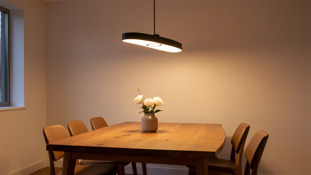
Your Step-by-Step Blueprint to Choosing Fixtures That Elevate Ambiance, Support Daily Life, and Stand the Test of Time
Selecting the right lighting fixture transforms how a space feels and functions—but too often, homeowners face tension between visual appeal and practical performance. This guide dismantles that false dilemma. Through a structured, room-by-room methodology grounded in lighting science, design principles, and safety standards, you’ll learn to evaluate fixtures through dual lenses: measurable functional requirements and resonant aesthetic qualities. Whether refreshing a single room or planning a full renovation, these actionable strategies reduce uncertainty, support informed decisions, and help create environments that feel intentionally illuminated across all moments of daily life.
Introduction
Lighting shapes perception. It influences how color appears on surfaces, supports visual tasks, enhances spatial safety, and contributes to emotional atmosphere—from focused work sessions to relaxed evenings. Yet fixture selection remains a frequent pain point in home design. Showroom displays present idealized scenarios under controlled lighting, which rarely translate directly to real-world conditions. A fixture admired in-store may cast uneven shadows over a dining table or lack necessary environmental ratings for a covered porch. Conversely, purely utilitarian solutions can leave spaces feeling sterile. This tension is avoidable. Drawing from established guidelines published by the Illuminating Engineering Society (IES), electrical safety standards (UL, ETL), and cross-cultural residential design patterns, this resource offers a systematic approach to harmonizing technical performance with visual harmony. You’ll move beyond subjective preferences toward objective criteria that ensure each fixture serves a clear purpose. The journey begins with a foundational shift: lighting fixtures are functional tools expressed through design—deserving thoughtful evaluation comparable to other critical home systems.
The Dual-Lens Framework: Integrating Purpose and Presence
Imagine evaluating a fixture through two complementary perspectives simultaneously: one focused on measurable performance (lumens, color accuracy, environmental suitability), the other on visual resonance (proportion, material, stylistic alignment). Most shoppers toggle between these views reactively. The Dual-Lens Framework guides you through four sequential steps that integrate both dimensions into a cohesive decision process. This isn’t about compromise—it’s about convergence. When technical requirements and aesthetic considerations align intentionally, the result feels natural, supportive, and enduring. This methodology reflects principles documented in residential lighting best practices and design theory. Let’s explore each step.
Step 1: Define the Functional Non-Negotiables
Begin with the immutable realities of the space. Function forms the foundation; aesthetics build upon it. Skipping this phase risks selecting fixtures that look beautiful but underperform where it matters most. Approach this systematically.
Purpose Mapping: Clarify Activities
List every primary activity occurring in the space. A kitchen supports chopping vegetables (requiring shadow-minimized task light), reading recipes at the island, entertaining guests (needing adaptable ambient levels), and late-night navigation (demanding subtle path lighting). A bedroom accommodates reading in bed, selecting outfits, applying skincare, and transitioning toward rest. Each activity has distinct lighting needs. Task zones (countertops, vanities, desks) benefit from focused, glare-controlled illumination. Ambient areas require even, diffuse coverage. Accent zones (artwork, architectural features) call for controlled beam angles. This mapping prevents overreliance on a single central fixture—a common source of frustration. Layering begins with intention.
Quantifying Light: Lumens as Your Metric
Watts measure energy use; lumens measure visible light output. This distinction is essential when selecting modern LED solutions. A vintage-style filament bulb may emit 400 lumens—suitable for bedside ambiance but insufficient over a kitchen workspace where 800+ lumens support safe food preparation. Use these room-based ranges as starting points (adjust for room size, ceiling height, surface colors, and personal sensitivity):
| Room/Area | Total Ambient Lumens (Baseline) | Task Area Lumens (Per Zone) | Key Considerations |
|---|---|---|---|
| Living Room | 1,500–3,000 | 400–800 (reading nook) | Layer sources; avoid single bright ceiling fixture |
| Kitchen (General) | 3,000–6,000 | 700–1,200 (per countertop ft) | Prioritize under-cabinet task lighting |
| Dining Area | 3,000–6,000 (focused downward) | N/A | Fixture bottom 30–36″ above table surface |
| Bedroom (General) | 2,000–4,000 | 400–800 (per bedside) | Warm dimming supports circadian rhythm |
| Bathroom (Vanity) | 4,000–8,000 (total) | 1,000+ per side of mirror | Sconces beside mirror prevent facial shadows |
| Home Office | 3,000–5,000 | 1,000–1,500 (desk surface) | Minimize screen glare; 3500K–4000K for focus |
| Hallway/Stairs | 1,000–2,000 | N/A | Ensure even illumination; eliminate dark steps |
| Outdoor Entry | 800–1,500 | N/A | Shield bulbs to reduce glare; motion sensors helpful |
Note: These ranges assume average room dimensions (approx. 12’x15′). Dark surfaces or ceilings above 10′ may require increased output. Always verify specific product specifications.
Color Temperature: Setting the Emotional Tone
Measured in Kelvin (K), color temperature influences perceived atmosphere. Lower values (2700K–3000K) emit warm, relaxing light ideal for bedrooms, living areas, and dining spaces. Mid-range values (3500K–4000K) provide neutral, alerting illumination suited for kitchens, bathrooms, home offices, and task zones. Higher values (5000K+) feel clinical and are generally reserved for utility areas or security lighting. Consistency within connected sightlines prevents visual dissonance (e.g., a warm living room flowing into a cool-toned kitchen). For flexibility, consider tunable-white LED systems that adjust temperature throughout the day. Always confirm Kelvin values in product specifications—marketing terms like “soft white” lack precision.
Color Rendering Index (CRI): Accuracy in Visual Perception
CRI measures how faithfully a light source reveals colors compared to natural daylight (CRI 100). Lower CRI values (<80) can mute reds, distort skin tones, and flatten material textures. For living spaces—especially vanities, kitchens, art displays, and clothing areas—prioritize CRI 90+. High-CRI lighting enhances visual clarity and supports tasks requiring color discernment. When possible, review product imagery under similar conditions or request samples to assess real-world performance. For critical applications, note the R9 value (specific red rendering); values above 50 contribute to vibrant, natural-looking results.
Environmental Suitability: Safety Through Certification
Fixtures carry location ratings defined by safety organizations (UL in North America, CE in Europe). These are non-negotiable for hazard prevention:
– Dry Location: Interior spaces with no moisture exposure (bedrooms, living rooms).
– Damp Location: Areas with humidity but no direct water contact (covered porches, bathrooms outside shower zones, garages).
– Wet Location: Spaces exposed to rain, snow, splashes, or steam (uncovered patios, shower stalls, pool areas).
Verify the specific certification marking on product packaging or specifications. A fixture labeled “bathroom suitable” may not be rated for direct shower installation. When uncertain, select wet-location rated fixtures—they are safe for damp or dry applications too. This precaution protects against electrical hazards, premature failure, and voided warranties.
Dimmability & Control Integration
Not all dimmable LEDs perform equally. Compatibility depends on three elements:
1. Fixture/bulb labeled “dimmable”
2. Dimmer switch designed for LED loads (older incandescent dimmers often cause flicker or buzz)
3. Smart system compatibility (if applicable)
Review manufacturer compatibility lists before purchasing. Test dimming range if possible—quality solutions dim smoothly to very low levels without cutting out. Layered controls (separate switches for ambient, task, accent) empower adaptable lighting scenes without hardware changes. Dimming capability is widely considered essential for ambiance control in living, dining, and bedroom settings.
Why This Step Matters: Functional criteria act as objective filters. They efficiently narrow options before aesthetic evaluation begins. A visually striking fixture becomes irrelevant if it lacks required lumens, appropriate CRI, or correct environmental rating. This phase transforms selection from impulse-driven to purposeful curation.
Step 2: Map the Aesthetic DNA of Your Space
With functional parameters established, turn to visual harmony. Aesthetics communicate identity, evoke comfort, and influence psychological response. Move beyond vague directives like “match your decor” using these tangible filters.
Architectural Dialogue: Complement the Space
Observe the room’s inherent character. Are ceilings coffered? Are windows arched? Is there exposed woodwork or stone? Fixtures should converse with these elements. In a space with traditional millwork, a minimalist linear pendant may feel disconnected. In a sleek contemporary loft, an ornate crystal chandelier could create visual tension. Ask: “Does this fixture enhance the room’s existing narrative?”
Illustrative example: In a residence featuring Craftsman-style details—exposed beams, tapered built-ins—a fixture with straight lines, dark bronze finish, and artisan glass elements may resonate more cohesively than a geometric mid-century design. The goal is resonance, not replication.
Counterpoint: A rustic iron fixture in a high-gloss modern kitchen introduces conflicting visual languages, potentially causing subconscious unease. Harmony supports comfort.
Scale and Proportion: Visual Balance Principles
Fixtures that feel “off” often violate spatial ratios. Human perception is sensitive to imbalance. Use these industry-referenced guidelines:
– Chandeliers over dining tables: Diameter ≈ (Room width in feet + Room length in feet) ÷ 2.
Example: 12′ x 14′ room → ~13″ diameter fixture. Hang bottom 30–36″ above tabletop. For ceilings >8′, add 3″ per extra foot.
– Pendant clusters over islands: Space 24–30″ apart, centered. Bottoms 28–34″ above counter. For a 6′ island, three modest pendants often work better than two oversized units.
– Flush mounts in hallways: Fixture width ≤ 1/3 hallway width.
– Wall sconces: Mount at 60–66″ from floor. In bathrooms, position beside mirrors at cheek height for shadow-free grooming.
Conduct a cardboard mock-up: cut to fixture dimensions, suspend at intended height. Live with it for several hours. Does it feel immersive without obstruction? Proportion creates subconscious ease.
Material and Finish Resonance
Finishes should feel intentional within your material palette. Modern practice favors thoughtful contrast over exact matching:
– Anchor finish (≈60%): Dominant metal (e.g., unlacquered brass on faucet/hardware).
– Secondary finish (≈30%): Complementary metal (e.g., matte black on switches or appliance handles).
– Accent finish (≈10%): Subtle variation (e.g., antique silver frames).
Repeat finishes intentionally across a floor plan for cohesion. Texture matters: woven rattan softens hard surfaces; smooth ceramic promotes calm. Limit visible metal types within a single sightline to avoid visual clutter. When possible, examine physical samples in your space at different times of day—finishes interact uniquely with natural and artificial light.
Style Translation: Essence Over Labels
You don’t need a “farmhouse” fixture for a farmhouse-style home. Identify the core qualities of your preferred aesthetic:
– Modern: Clean lines, geometric forms, monochromatic finishes, minimal ornamentation.
– Transitional: Blended traditional silhouettes with simplified details.
– Coastal: Natural materials (rope, driftwood), light finishes, organic shapes.
– Industrial: Exposed elements, utilitarian forms, raw textures.
– Bohemian: Mixed textures, asymmetry, global influences.
Collect reference images of spaces you admire. What visual threads connect them? Warm brass accents? Cylindrical silhouettes? Use this “style essence” as your filter—not rigid category names. A modern fixture with warm brass details can beautifully complement a transitional space if proportions and materials align.
Why This Step Matters: Aesthetics foster emotional connection. A technically sound fixture that clashes visually will feel unresolved. This phase ensures your selection feels intentional and harmonious within its specific context.
Step 3: Bridge Gaps with Layered Solutions
Rarely does one fixture fulfill every functional and aesthetic requirement perfectly. This isn’t failure—it’s reality. Mastery lies in strategic layering and intelligent adaptation.
The Layering Imperative
Effective lighting integrates three complementary layers:
1. Ambient (General): Overall illumination (recessed downlights, cove lighting, flush mounts). Establishes baseline light level.
2. Task: Focused light for specific activities (under-cabinet strips, desk lamps, vanity sconces). Eliminates shadows where work occurs.
3. Accent: Highlights features (track lights on art, wall grazers on texture). Adds depth and visual interest.
Practical scenario: A homeowner selects a delicate rattan pendant for dining ambiance. While visually appealing, it provides insufficient lumens for meal visibility and lacks dimming capability. Solution: Install recessed downlights (3000K, high-CRI) on a separate dimmer circuit around the table perimeter for functional task lighting. Retain the pendant on an independent control for ambient warmth. For dinner parties, activate both layers; for casual meals, use only the pendant. Layering preserves both form and function.
Strategic Trade-Offs: A Priority Guide
When constraints require compromise:
1. Safety first: Never compromise on location ratings (damp/wet) or certified safety markings.
2. Function second: Prioritize adequate lumens and CRI 90+ in task zones. Poor light quality in grooming or food prep areas impacts daily usability.
3. Aesthetics third: Once safety and core function are met, refine for visual harmony. A “good enough” aesthetic with strong function typically outperforms a “perfect” aesthetic that fails functionally.
4. Future flexibility: Prefer fixtures with replaceable LED modules (standard E26/E27 bases) over fully integrated systems where technology obsolescence is a concern.
Budget-conscious adaptation: If high-CRI vanity sconces exceed budget, install damp-rated sconces paired with high-CRI LED bulbs (sold separately) and supplement with under-cabinet LED tape (CRI 95+) focused on the sink zone. Layering compensates for individual component limitations.
Pre-Purchase Verification Protocol
Before finalizing:
– Scale mock-up: Cardboard template suspended at intended height/location. Observe over 24 hours.
– Light quality check: Review product videos showing dimming performance. Verify CRI and Kelvin values in specifications.
– Finish validation: Request physical samples. View in your space under morning, midday, and evening light. Note how finishes interact with existing materials.
Why This Step Matters: Bridging transforms constraints into creative opportunities. It shifts perspective from limitation to solution-oriented thinking—where layered approaches yield richer, more adaptable results than any single fixture could provide.
Step 4: Future-Proof Through Foresight
Today’s ideal fixture should support tomorrow’s evolving needs. Future-proofing integrates adaptability into the selection process.
Technology Considerations
– Standard bases over proprietary systems: Fixtures using E26/E27 sockets accommodate evolving bulb technology. Avoid brand-locked ecosystems where obsolescence risks are higher.
– Smart-ready > smart-built: Choose fixtures compatible with universal smart bulbs or dimmers rather than those with non-upgradable built-in smart components. When modules fail, replaceable bulbs simplify updates.
– Wiring foresight (new construction/remodels): Running low-voltage conduit to fixture locations during rough-in enables future sensor or control upgrades at minimal added cost.
Life Stage and Usage Evolution
– Aging in place: Prioritize even, shadow-free illumination in hallways and stairs. Consider motion-activated path lighting. Avoid fixtures requiring complex cleaning at height.
– Family dynamics: Nurseries benefit from dimmable, warm light for nighttime care. Select fixtures with neutral aesthetics that transition smoothly as children grow.
– Room repurposing: Will a guest room become a home office? Ensure overhead lighting supports focused tasks. Choose versatile finishes that adapt across functions.
Durability and Maintenance Realities
– Finish longevity: Unlacquered brass develops a patina over time; powder-coated finishes resist chipping better than painted metal. Consider long-term appearance preferences.
– Cleanability: Open-weave textures trap dust; smooth surfaces wipe clean easily. Match fixture complexity to your maintenance capacity and environment (e.g., avoid intricate fixtures near cooking zones).
– Warranty insight: Reputable manufacturers offer multi-year warranties covering drivers and components. A robust warranty often signals confidence in product longevity.
Sustainability Perspective
– Energy efficiency: Look for ENERGY STAR certification, which verifies efficiency, longevity, and light quality metrics.
– Repairability: Brands offering replacement parts (glass shades, drivers) extend fixture life. Avoid fully sealed “disposable” designs where feasible.
– End-of-life planning: Metal fixtures are generally more recyclable than complex composites. Some manufacturers offer take-back programs—worth investigating for larger installations.
The Fundamental Principle: Lighting serves the space and its occupants—it should enhance architecture and support human experience without drawing undue attention to itself. True success is felt in the comfort, clarity, and calm it enables.
Room-by-Room Application: Framework in Practice
Theory gains clarity through contextual application. Below, we apply the Dual-Lens Framework to critical living areas, highlighting functional priorities, aesthetic considerations, and adaptable solutions. These examples illustrate pattern-based decision-making rather than prescriptive rules.
The Kitchen: Precision Meets Warmth
Kitchens demand layered lighting that supports safety-critical tasks while fostering connection. Under-lighting creates hazards; over-lighting feels institutional.
Functional Priorities
– Task lighting is essential: Countertops require shadow-minimized illumination. Continuous under-cabinet LED tape (CRI 90+, 3000K) outperforms puck lights, which create dotted shadows. Position lights 12–18″ from the wall edge.
– Island strategy: For an 8′ island, three pendants spaced 30″ apart, hanging 30–36″ above surface. Each should deliver adequate downward lumens. Supplement with recessed downlights between pendants if cooking occurs frequently at the island.
– Sink zone: Avoid a single downlight directly overhead—it casts shadows on hands. Instead, use two sconces flanking a window or an angled downlight targeting the basin.
– Ambient base: Recessed downlights (4″–5″ aperture) on dimmers, spaced to graze walls rather than shine into seating areas. Fixtures within 3′ of sink or stove must be damp-rated; under-cabinet units should have IP65 rating or equivalent moisture resistance.
Common friction point: Installing decorative pendants over an island without dedicated under-cabinet lighting often leads to unsafe chopping conditions. Layering isn’t optional—it’s foundational for kitchen functionality.
Aesthetic Integration
– Style alignment: Farmhouse kitchens with open shelving may resonate with black iron pendants and seeded glass. Sleek European-style kitchens often suit linear suspensions in matte white.
– Material echoing: Repeat cabinet hardware finishes in fixture details (e.g., unlacquered brass pulls echoed in pendant accents). For countertops with veining, consider fixtures with organic textures (hand-blown glass, woven elements).
– Scale awareness: Oversized pendants overwhelm compact kitchens. For islands under 6′, two smaller pendants or a single linear fixture often feels more balanced. Cardboard mock-ups prevent costly scale errors.
Adaptable Tip: Place under-cabinet lights on a separate switch from overheads. Late-night snack retrieval activates only the counters—minimizing disruption while maintaining safety.
The Bathroom: Clarity with Compassion
Bathroom lighting directly impacts daily confidence and safety. Poor choices cause grooming errors and discomfort; thoughtful design supports well-being.
Functional Priorities
– Vanity lighting transformation: Ceiling-only lighting casts shadows under eyes and chin. Vertical sconces mounted beside the mirror (at cheek height, 65–70″ from floor) provide even facial illumination. Target 1,000+ lumens per side, 3000K color temperature, CRI 95+, fully dimmable.
– Shower safety: Fixtures inside shower enclosures must be wet-location rated with tempered glass lenses. Recessed units should feature airtight trims to prevent moisture migration into ceiling cavities.
– Ambient balance: A central damp-rated ceiling fixture provides general light but should complement—not replace—task lighting. Dim to low levels for relaxation.
– Mirror integration: Backlit mirrors offer even glow but lack dimensionality. Pairing with side sconces yields optimal results. Avoid mirrors with lights only at the top—they recreate problematic shadow patterns.
Supporting insight: Lighting resources emphasize that color temperatures near 3000K combined with high CRI significantly improve color accuracy for skincare and grooming tasks—a functional necessity beyond aesthetics.
Aesthetic Integration
– Finish harmony: Coordinate sconce finishes with faucet and hardware. Brushed nickel offers versatility in transitional spaces; unlacquered brass adds warmth against white tile.
– Shape consideration: Round sconces soften angular rooms (square tiles, sharp countertops). Rectangular fixtures add structure to curved or organic layouts.
– Scale sensitivity: Powder rooms can accommodate statement fixtures. Master baths benefit from balanced pairs flanking mirrors. Avoid undersized “bathroom-specific” fixtures—they often appear flimsy and underpowered.
Adaptable Tip: Specify dimmers with low-end trim adjustment. Standard dimmers cut out around 10% brightness—too bright for pre-dawn routines. Quality dimmers reach 1%, enabling true moonlight levels for nighttime visits without disrupting sleep cycles.
The Living Room: Layered Ambiance for Dynamic Use
Living rooms host diverse activities—from focused reading to social gatherings—requiring adaptable lighting that shifts seamlessly between moods.
Functional Priorities
– Ambient foundation: Recessed downlights on dimmers provide base illumination. Angle trims to graze walls, reducing glare in seating areas. Where recessed options aren’t feasible, a semi-flush mount with a fabric shade diffuses light softly.
– Task zones: Position adjustable floor lamps or swing-arm wall sconces beside primary seating. Target 400–800 lumens per zone at 2700–3000K.
– Accent strategy: Use adjustable track heads or picture lights to highlight artwork. Angle at 30 degrees to minimize glare on glass. Graze architectural features with narrow-beam downlights.
– Control strategy: Multi-scene controllers enable preset configurations: “Movie” (ambient dimmed, task lights off), “Entertain” (perimeter lights brightened), “Read” (task lamps activated). Even simple layered switches offer significant flexibility.
Key insight: Single bright ceiling fixtures often create “cave lighting”—bright overhead, dark floor—making rooms feel smaller and less inviting. Layering builds dimensional depth and visual comfort.
Aesthetic Integration
– Style as narrative: Mid-century modern spaces shine with arc floor lamps and geometric pendants. Traditional rooms feel complete with silk-shaded table lamps and classic chandeliers. Transitional designs blend elements thoughtfully—a contemporary linear suspension above a vintage console.
– Texture dialogue: In rooms with plush textiles (velvet, wool), introduce contrasting fixture textures: ribbed glass, woven rattan, or smooth ceramic.
– Height awareness: In rooms with vaulted ceilings, avoid flush mounts—they emphasize height awkwardly. Multi-tiered chandeliers or pendant clusters draw the eye down to human scale.
Adaptable Tip: Position floor lamps behind seating areas, aimed at walls. This “uplighting” technique bounces light softly into the room, eliminating harsh facial shadows during conversation—a technique valued in hospitality and residential design alike.
The Bedroom: Sanctuary Through Light
Bedrooms require lighting that supports circadian biology while accommodating diverse activities—from reading to relaxation.
Functional Priorities
– Circadian alignment: Warm dimming technology (shifting from 2700K down to 2200K as brightness decreases) mimics natural sunset progression, supporting melatonin production. Critical for pre-sleep routines.
– Bedside task lighting: Swing-arm wall sconces conserve nightstand space. Ensure arms extend sufficiently to position light over reading material without glare. Target 300–500 lumens per side, fully dimmable.
– Closet illumination: Motion-activated LED strips (CRI 90+) inside closets ensure accurate color matching. Damp-rated if adjacent to bathroom humidity.
– Ambient softness: Avoid bright overheads. Cove lighting, LED tape behind headboards, or a low-lumen semi-flush mount with an opaque shade creates gentle base light. Total ambient output typically stays under 2,000 lumens for standard bedrooms.
Physiological note: Exposure to light above 3000K in the hours before bedtime may interfere with natural sleep onset. Warm dimming aligns lighting with biological needs—a consideration supported by sleep environment research.
Aesthetic Integration
– Calming palettes: Soft finishes (brushed brass, matte white, fabric shades) promote tranquility. Minimize cold metals or sharp geometries in primary fixtures.
– Personal resonance: Bedrooms invite personal expression. A hand-thrown ceramic pendant or macramé hanging light can enhance emotional connection. Prioritize what brings you peace.
– Scale intimacy: Fixtures should feel human-scaled. Oversized chandeliers overwhelm; tiny pendants feel insignificant. For a king bed, a pendant width of 24–30″ often feels balanced.
Adaptable Tip: Pair bedside lights with smart controls featuring sunset/sunrise scheduling. Lights gradually dim 30 minutes before target bedtime, then fade to off. Morning simulation provides gentle wake-up cues. This automated ritual supports consistent sleep hygiene with minimal daily effort.
Dining Room, Home Office, Hallways & Outdoor: Targeted Applications
Dining Room
– Function: Focus light downward onto the table surface. Dimmers enable adjustment from brighter levels (3500K) for family meals to warmer tones (2200K) for entertaining. Ensure no glare enters seated eye lines.
– Form: Chandelier height is critical—too high feels disconnected; too low impedes conversation. Cardboard mock-ups are invaluable. For rectangular tables, linear suspensions often provide better coverage than round chandeliers.
– Key consideration: Dimmability is essential. Fixed-brightness fixtures limit adaptability across occasions and times of day.
Home Office
– Function: Position task lighting opposite your dominant hand (right-handed users: lamp on left) to minimize shadows on work surfaces. Use 3500–4000K for alertness with CRI 90+. Ambient light should be noticeably dimmer than the task zone to reduce eye strain. Consider bias lighting (low-lumen LED strip behind monitor) to soften screen-to-room contrast.
– Form: Choose fixtures with integrated cable management and neutral finishes to minimize visual distraction. Clean lines support focus.
– Adaptable insight: Adjustable-arm lamps allow precise beam placement. For video calls, ensure ambient light is sufficient to avoid harsh backlighting from windows.
Hallways & Staircases
– Function: Even illumination is a safety priority. Recessed lights spaced every 4–6 feet. Motion sensors activate light upon entry—eliminating fumbling for switches. Subtle step lighting (LED strips under nosing) enhances nighttime safety on stairs.
– Form: Flush mounts should complement adjacent room aesthetics. In historic homes, reproduction sconces honor period details without compromising safety.
– Non-negotiable: Walk the path at night with lights off. Identify and address any shadow zones where additional fixtures or reflectivity adjustments are needed.
Outdoor Entry & Porch
– Function: Wet-location rating is mandatory for exposed areas. Path lights should use full-cutoff designs to direct light downward—reducing glare and light pollution. Motion sensors enhance security; dusk-to-dawn sensors ensure consistent safety.
– Form: Fixtures should echo architectural style—lanterns for traditional homes, minimalist cylinders for contemporary. Scale relative to entry size: too small feels insignificant; too large appears aggressive.
– Critical detail: Shield bulbs from direct line of sight. Unshielded sources create disabling glare for visitors approaching your door. “Dark sky” compliant fixtures maximize usable light while minimizing spill.
Technical Specifications Decoded: Your Practical Reference
Marketing language can obscure essential details. This plain-language guide clarifies key specifications to support confident evaluation. Knowledge empowers discernment.
Lumens vs. Watts: Understanding Brightness
– Watt (W): Measures electrical power consumed. Not a brightness indicator across technologies.
– Lumen (lm): Measures total visible light output. This is your brightness metric.
Practical reference:
– 450 lm ≈ soft accent lighting
– 800 lm ≈ standard bedside or small task area
– 1100 lm ≈ medium task zones (vanity, desk)
– 1600 lm ≈ primary ambient sources
Always verify lumens on packaging or spec sheets—not “replaces XX watt” claims, which lack standardization.
Color Temperature (Kelvin): The Atmosphere Dial
| Kelvin Range | Common Description | Recommended Applications | Perceived Effect |
|————–|——————–|——————————–|—————————|
| 1800K–2200K | Candlelight | Bedrooms (pre-sleep), intimate settings | Deep relaxation |
| 2700K–3000K | Warm White | Living rooms, dining, bedrooms | Cozy, inviting |
| 3500K–4000K | Neutral White | Kitchens, bathrooms, offices | Alert, focused, clean |
| 5000K–6500K | Cool White/Daylight| Garages, workshops, security | Energizing (use sparingly)|
Important nuance: “Warm dimming” LEDs shift color temperature warmer as dimmed (e.g., 2700K → 2200K), mimicking incandescent behavior. Standard dimmable LEDs maintain fixed color temperature while dimming. Warm dimming is particularly valued in bedrooms and dining areas.
CRI (Color Rendering Index): Fidelity of Color
– CRI < 80: Colors appear muted or inaccurate. Generally unsuitable for living spaces.
– CRI 80–89: Acceptable for utility areas (garages, laundry rooms).
– CRI 90–100: Excellent. Recommended for kitchens, bathrooms, art displays, retail. Skin tones appear natural; food looks fresh; materials show true texture.
Additional insight: For critical color tasks, note the R9 value (red rendering). High overall CRI with low R9 may still distort warm tones. Values above 50 for R9 contribute to vibrant results.
Beam Angle: Controlling Light Spread
– Narrow Spot (10°–25°): Highlights artwork, architectural details. Creates dramatic focus.
– Spot (25°–40°): Ideal for task lighting (desk lamps, under-cabinet).
– Flood (40°–70°): General ambient coverage (recessed downlights).
– Wide Flood (>70°): Wall washing, large area illumination.
Application note: For kitchen recessed lights over counters, a 40° beam angle typically provides focused task light without spilling into eyes when standing at the sink.
Dimming Performance: Beyond the “Dimmable” Label
“Dimmable” certification doesn’t guarantee smooth operation. Evaluate:
– Dimming range: Quality solutions dim to 1% brightness; budget options may cut out at 10–20%.
– Flicker risk: Review manufacturer videos showing dimming performance. Flicker contributes to eye strain.
– Compatibility: Reputable brands publish dimmer compatibility lists. Verify match with your existing or planned dimmer.
– Driver quality: The internal driver significantly impacts performance. Established lighting manufacturers typically invest in higher-quality drivers.
Safety Certifications: Essential Verification
– UL (USA/Canada): Underwriters Laboratories listing indicates rigorous safety testing. Look for “UL Listed” permanently marked on fixture.
– ETL: Intertek certification, equivalent to UL in North America.
– CE (Europe): Mandatory for EU market; verify alongside brand reputation.
– DLC (DesignLights Consortium): Indicates high efficiency and quality, primarily for commercial but a positive signal residentially.
Caution: Fixtures sold online with only “CE” marking and no UL/ETL may lack independent safety verification. Purchase from authorized dealers when possible.
IP Ratings: Moisture and Dust Protection
Format: IPXX (e.g., IP65)
– First digit (0–6): Solid particle protection (6 = dust-tight)
– Second digit (0–9): Liquid ingress protection (5 = low-pressure water jets; 6 = powerful jets; 7 = temporary immersion)
Practical guidance:
– Bathroom vanity (outside shower): IP44 minimum
– Shower stall: IP65 minimum
– Outdoor uncovered areas: IP65 minimum
– Pool lights: IP68 (continuous immersion)
Keep this reference accessible while shopping. Precise specification knowledge transforms selection from guesswork to informed curation.
Style Integration: Creating Cohesive Visual Narratives
Style transcends matching finishes—it’s about crafting visual harmony that feels authentic to your space and story. Move beyond trend-driven choices toward intentional curation.
Finish Strategy: Intentional Repetition
Modern design embraces thoughtful contrast rather than rigid uniformity:
– Anchor finish (≈60%): Your dominant metal (e.g., unlacquered brass on faucet and cabinet hardware).
– Secondary finish (≈30%): Complementary metal (e.g., matte black on light switches, appliance handles).
– Accent finish (≈10%): Subtle variation (e.g., antique silver in frames or accessories).
Execution: In a kitchen with unlacquered brass faucet (anchor), matte black pendants (secondary) create modern tension while unlacquered brass cabinet pulls reinforce warmth. Avoid introducing a third distinct metal (e.g., chrome) unless repeated intentionally elsewhere. Photograph your space—do finishes feel harmonious or chaotic within a single sightline?
Material Storytelling
Fixtures contribute tactile dimension. Select materials that resonate with your home’s character:
– Wood: Adds warmth and organic connection. Best for dry locations; avoid humid bathrooms.
– Wrought Iron: Conveys timelessness and strength. Suitable for traditional, farmhouse, or Mediterranean styles. Develops character with age.
– Glass (Clear/Seeded): Amplifies light, adds vintage charm. Seeded glass diffuses light softly—ideal over dining tables.
– Rattan/Wicker: Introduces texture and coastal ease. Softens hard surfaces (tile, concrete). Requires regular dusting; avoid high-moisture zones.
– Ceramic/Porcelain: Offers artisanal serenity. Glazed finishes resist moisture—excellent for bathrooms.
– Concrete: Provides modern, grounded presence. Significant visual weight—best suited for high ceilings. Pair with warm wood tones to avoid coldness.
Practical tip: When possible, examine material samples in person. Light interaction with texture (e.g., hand-blown glass vs. mass-produced acrylic) is difficult to assess digitally.
Scale Psychology: Human-Centered Proportions
Fixtures should relate to human scale, not just room dimensions:
– Entryways: Fixtures should feel welcoming at eye level. Too high feels distant; too low creates unease.
– Bedrooms: Bedside fixtures should feel accessible—arms shouldn’t strain to reach controls.
– Dining: Light should frame faces comfortably, not blind diners. The bottom edge is the critical measurement.
Empathy exercise: Sit in primary seating positions. Look up. Does the fixture feel oppressive, inviting, or ignored? Your physical response provides valuable data.
Honoring Architectural Context
– Historic Homes (Pre-1940): Reproduction fixtures should honor period details without feeling like museum pieces. For a 1920s Craftsman home, choose fixtures with clean lines and artisan details rather than ornate Victorian elements. Modernize finishes (matte black instead of polished brass) for contemporary livability.
– Mid-Century Modern: Seek authentic design inspiration. Fixtures reflecting George Nelson or Greta Magnusson Grossman aesthetics often feature organic shapes and minimalist forms. Prioritize quality materials over “faux” reproductions.
– New Construction: Move beyond builder-grade basics. A single thoughtfully selected fixture in the entryway establishes tone for the entire home. Lighting is an opportunity to inject personality from day one.
The Timelessness Principle
Trend-driven fixtures may feel dated quickly. Invest in pieces with enduring qualities:
– Quality materials: Solid brass versus plated zinc; thick glass versus thin acrylic.
– Thoughtful details: Hand-finished elements, balanced proportions, intentional hardware.
– Neutral palettes: Matte black, warm brass, white, or natural materials adapt across style evolutions.
Reserve trend expressions for easily changed elements (lampshades, bulbs, portable lamps). Timeless fixtures become long-term assets.
Confident Style Mixing
A Georgian-style home doesn’t require strictly period fixtures. Consider:
– Traditional architecture + minimalist linear suspension (creates intriguing dialogue)
– Industrial loft + delicate glass chandelier (softens harshness)
– Farmhouse kitchen + sculptural contemporary pendants (adds sophistication)
Guideline: When blending styles, anchor with one strong traditional element (e.g., wood beams) and one strong modern element (lighting). Limit dominant style influences to two themes to avoid visual clutter.
Navigating Common Challenges: Proactive Solutions
Even well-planned projects encounter hurdles. Awareness of frequent friction points enables proactive solutions. These patterns, documented across residential lighting resources, help avoid common pitfalls.
Challenge 1: Over-Reliance on Single Light Source
Symptom: One bright ceiling fixture attempting to serve all lighting needs.
Impact: Harsh shadows, unflattering facial lighting, inability to set mood, “cave effect” (bright ceiling, dark floor).
Solution: Commit to layering from the outset. Budget for ambient (recessed/flush), task (lamps/sconces), and accent (track/picture lights) sources. Even in rentals, plug-in arc lamps, smart bulbs, and adhesive LED strips create effective layers.
Challenge 2: Scale Miscalculation
Symptom: Fixture feels visually “off” but the cause is unclear.
Impact: Room feels unbalanced; fixture dominates or disappears.
Solution: Cardboard mock-ups are highly recommended. For chandeliers: (Room width in feet + Room length in feet) ÷ 2 = approximate maximum diameter in inches. For pendants over islands: fixture width should be 1/3 to 1/2 of island width. When uncertain, slightly undersized often feels more intentional than oversized.
Challenge 3: Prioritizing Fixture Over Light Quality
Symptom: Beautiful fixture installed, but space still feels dim, harsh, or visually inaccurate.
Impact: Fixture may be returned; frustration increases.
Solution: Evaluate the light output specifications before aesthetics. Verify lumens, beam angle, CRI, and color temperature. For critical spaces (kitchens, vanities), request photometric data from manufacturers when available.
Challenge 4: Finish Overload
Symptom: Room feels visually chaotic despite “matching” metals.
Impact: Subconscious unease; space lacks cohesion.
Solution: Apply the 60/30/10 finish framework. Photograph the space. Circle every visible metal finish. If more than three distinct metals appear within one continuous sightline, simplify. Carry one secondary finish (e.g., matte black) through connected rooms to create flow.
Challenge 5: Maintenance Mismatch
Symptom: Stunning crystal chandelier installed in a high-dust kitchen; cleaning becomes burdensome.
Impact: Fixture remains dirty; resentment builds toward the design choice.
Solution: Match fixture complexity to lifestyle and location. High ceilings? Choose sealed fixtures requiring minimal cleaning. Dust-sensitive? Avoid open-weave textures in cooking zones. Love maintaining brass? Unlacquered finishes develop character. Prefer low upkeep? Opt for smooth, wipeable surfaces.
Challenge 6: Overlooking Human Experience
Symptom: Technically correct lighting that feels cold or unwelcoming.
Impact: Space is used less; emotional connection is weak.
Solution: Sit in the space at different times of day. Ask: “Does this light make me feel calm? Capable? Welcome?” If specifications and emotional response don’t align, adjust color temperature, add warmer accent sources, or refine layering. Lighting serves people—not just specifications.
Challenge 7: Installation Oversight
Symptom: Perfect fixture arrives, but existing electrical box cannot support weight or wiring.
Impact: Project delays; unexpected electrician costs.
Solution: Before ordering:
– Verify electrical box weight rating (standard boxes support ≤ 50 lbs; heavy fixtures require fan-rated or reinforced boxes)
– Confirm ceiling height allows proper hanging clearance
– Check if existing wiring supports dimming or smart controls
A brief pre-purchase verification prevents significant complications later.
Your Questions, Answered
Q: How do I determine the right size chandelier for my dining room table?
A: Focus on two measurements: width and hanging height. For width: The chandelier diameter should be approximately half the table’s width (e.g., 48″ wide table → 24″ diameter fixture). For hanging height: The bottom of the fixture should hang 30–36 inches above the tabletop surface. For ceilings higher than 8 feet, add approximately 3 inches of hanging height per additional foot of ceiling height. Always conduct a cardboard mock-up—suspend a circle cut to the fixture’s diameter at the target height and sit at the table. Does it feel immersive without obstructing sightlines or conversation? Adjust based on this physical test, which prevents the most common sizing regrets.
Q: What’s the difference between lumens and watts, and why should I care?
A: Watts measure energy consumption; lumens measure visible light output. With incandescent bulbs, higher watts meant brighter light—but LED technology decoupled this relationship. A 10W LED can output the same lumens as a 60W incandescent. Focusing on watts leads to under- or over-lighting. Prioritize lumens for brightness needs. Use this reference: 450 lumens for soft accent light, 800 lumens for bedside/task areas, 1100 lumens for medium task zones, 1600 lumens for primary ambient sources. The FTC-mandated Lighting Facts label on packaging provides verified lumen output—rely on this rather than “watt-equivalent” marketing claims.
Q: Are higher-priced lighting fixtures worth the investment?
A: Value extends beyond initial cost. Higher-quality fixtures often feature superior components: drivers enabling smooth dimming without flicker, higher CRI for accurate color rendering, better thermal management extending LED life, and serviceable parts (replaceable modules, glass shades). For prominent or hard-to-access locations (foyers, vaulted ceilings, stairwells), investing in fixtures with strong warranties (5+ years) and reputable manufacturer support reduces long-term maintenance burden. For easily accessible, lower-impact areas (closets, laundry rooms), budget-friendly options meeting safety and functional needs may suffice. Allocate resources where light quality, reliability, and longevity matter most to your daily experience.
Q: How can I assess fixture quality when shopping online?
A: Quality indicators include: specifications noting solid materials (brass, steel) versus plated zinc; powder-coated or high-quality finishes described in detail; clear safety certifications (UL, ETL) listed in product documentation; comprehensive warranty information; and accessible customer support. Reputable manufacturers provide detailed spec sheets, installation guides, and dimming compatibility lists. When possible, purchase from authorized dealers to avoid counterfeits. Read verified buyer reviews focusing on long-term performance (dimming quality, finish durability, customer service experiences).
Q: What color temperature is best for a bedroom?
A: Prioritize support for circadian rhythm. For general ambient lighting, 2700K provides warm, relaxing illumination. Crucially, select “warm dimming” technology for bedside fixtures: as brightness decreases, color temperature shifts warmer (down to 2200K), mimicking natural sunset to support melatonin production. Avoid temperatures above 3000K in bedrooms, as cooler light may interfere with sleep preparation. For reading lights, 2700K remains ideal; higher temperatures can cause eye strain during prolonged close work. If using smart systems, program a “bedtime” scene that gradually dims and warms light 30 minutes before target sleep time.
Q: Can I mix different metal finishes in one room?
A: Yes—and done intentionally, it adds depth and sophistication. Avoid random mixing. Implement the 60/30/10 framework: 60% anchor finish (e.g., unlacquered brass faucet), 30% secondary finish (e.g., matte black switches), 10% accent finish (e.g., antique silver frames). Repeat each finish at least twice within the space for cohesion. In open floor plans, carry one secondary finish (like matte black) through connected rooms to create visual flow. When uncertain, photograph the space—do the metals feel harmonious or chaotic? Trust your visual assessment.
Q: What does “damp-rated” versus “wet-rated” truly mean for outdoor fixtures?
A: This distinction is critical for safety and longevity.
– Damp-rated: Suitable for covered areas protected from direct precipitation (covered porches, breezeways, indoor bathrooms). Resists humidity but not direct water contact.
– Wet-rated: Required for locations exposed to weather (uncovered patios, gazebos, shower stalls, pool areas). Fully sealed against rain, snow, and splashes.
Installing a damp-rated fixture in a wet location risks electrical failure, safety hazards, and voided warranties. Always verify the specific certification marking on the product—not just marketing terms like “outdoor suitable.” When in doubt, select wet-rated fixtures; they are safe for damp or dry locations too. In coastal areas with salt air, seek fixtures with corrosion-resistant finishes (powder-coated aluminum, stainless steel).
Q: How many recessed lights do I need in a room?
A: Avoid rigid “one every 4 feet” rules—they often create sterile, office-like lighting. Instead:
1. Define activity zones (seating area, reading nook, kitchen counter).
2. Position lights to graze walls for ambient glow, not shine directly into seating areas.
3. Space lights approximately 1.5 times ceiling height apart (e.g., 8′ ceiling → lights spaced ~12′ apart).
4. For task areas (counters, desks), place lights 12–18″ from the wall edge.
5. Prioritize fewer, higher-quality lights with adjustable trims over numerous fixed lights.
A typical 12’x15′ living room often requires 4–6 recessed lights—not 9–12. Over-lighting causes glare and eliminates comforting shadows. Always pair recessed lights with other layers (floor lamps, sconces) for dimensional, adaptable illumination.
Q: Are integrated LED fixtures advisable?
A: Integrated LEDs (bulbs built into the fixture) offer seamless aesthetics but carry long-term considerations. Pros: optimized thermal design, often higher efficacy, clean appearance. Cons: when the LED driver fails (typically after several years), the entire fixture usually requires replacement—costly and wasteful. Non-integrated fixtures using standard bases (E26/E27) allow easy, affordable bulb upgrades as technology evolves. Recommendation: For statement fixtures in hard-to-reach locations (vaulted ceilings), integrated LEDs from reputable brands with strong warranties (7+ years) may be acceptable. For most applications—especially task lighting—choose fixtures accepting standard, high-CRI LED bulbs. This balances design intent with future flexibility and repairability.
Q: How do I light a room with no overhead electrical box?
A: Many older homes lack ceiling fixtures—a constraint that encourages creative layering. Build illumination entirely with plug-in and wall-mounted sources:
– Ambient: Tall arc floor lamps positioned to bounce light off ceilings; LED tape hidden behind floating shelves or crown molding (plug-in transformers available).
– Task: Adjustable wall sconces beside seating; architect lamps on desks.
– Accent: Plug-in picture lights for art; small LED spotlights on shelves.
Use smart plugs to group controls (“Living Room Lights” scene). Battery-operated puck lights inside cabinets add functional surprise. This approach often creates more flattering, human-scaled light than a single overhead source. Embrace the constraint—it fosters intentional, adaptable design.
Q: What’s the most overlooked lighting consideration in home offices?
A: Managing screen glare and visual contrast. Placing a bright light directly behind or in front of your monitor creates disabling reflections. Instead:
– Position task lamp opposite your dominant hand (right-handed users: lamp on left)
– Consider bias lighting: a low-lumen LED strip behind the monitor reduces eye strain by minimizing contrast between bright screen and dark room
– Select 3500–4000K color temperature for alertness; avoid >5000K which may cause fatigue
– Use dimmers to reduce ambient light during video calls
Additionally, ensure windows aren’t directly behind you on camera—use sheer curtains to diffuse daylight. These adjustments support visual comfort during extended screen use and improve on-camera appearance.
Q: How long do LED bulbs and fixtures typically last?
A: Quality LEDs are rated for 15,000–50,000 hours of use (versus 1,000 for incandescents). However, “rated life” doesn’t guarantee consistent performance. Watch for:
– Lumen depreciation: Light output gradually dims. If a space feels noticeably darker after 3–5 years of regular use, replacement may be warranted.
– Color shift: Lower-quality LEDs may shift from warm white toward cooler tones over time.
– Driver failure: Flickering, buzzing, or failure to activate often indicates driver issues.
For integrated fixtures, review the manufacturer’s warranty (typically 3–10 years). For standard bulbs, proactive replacement every 5 years in high-use areas (kitchens, bathrooms) maintains optimal light quality. Retain model numbers from original packaging for exact replacements—LED specifications can vary even within the same color temperature label.
Conclusion and Your Next Step
Lighting fixture selection is less about finding a single perfect object and more about cultivating a thoughtful process. It’s the alignment of human needs with spatial realities, technical requirements with emotional resonance. You now hold a framework grounded in established principles: define non-negotiable functions first, map your space’s aesthetic language second, bridge gaps through intelligent layering, and future-proof with foresight. This methodology transforms lighting from a source of uncertainty into a powerful tool for shaping how you live, feel, and connect within your home.
Recap: Three Foundational Principles
1. Function Anchors Form: Safety certifications, adequate light levels, and color accuracy form the essential foundation. Use lumens, CRI, and location ratings as objective filters before aesthetic evaluation.
2. Layering Creates Adaptability: No single fixture fulfills all needs. Ambient + task + accent layers provide flexibility, depth, and responsiveness across moments and moods.
3. Human Experience is the True Measure: Sit in the space. Does the light support your activities? Does it evoke the feeling you intend? When technical specifications and emotional response align, you’ve achieved success.
The 24-Hour Reflection Practice
Before finalizing any fixture purchase:
1. Document the exact location (room, position, adjacent finishes, activities)
2. Note functional requirements (required lumens, location rating, dimming needs)
3. Capture photos of the space at different times of day
4. Pause. Return with fresh perspective tomorrow.
This brief reflection encourages mindful decision-making, reducing the likelihood of choices that don’t serve long-term needs. Confidence emerges from clarity, not speed.
The Broader Perspective
Lighting is infrastructure with soul. It’s the quiet backdrop to morning routines, the focused beam enabling concentration, the warm glow welcoming you home. When chosen with intention, fixtures become silent partners in daily life—honoring architecture without demanding attention, supporting well-being while inspiring comfort. This isn’t merely about illuminating rooms; it’s about illuminating experiences. Begin with one space. Apply the Dual-Lens Framework to a current challenge. Notice how intentional light transforms perception and function. Carry that awareness forward. Your home deserves lighting that works thoughtfully—and feels deeply right.
Explore Our Complete Lighting System:
The Layered Lighting Blueprint: Ambient, Task & Accent Mastery | Decoding Light Bulbs: A No-Jargon Guide to LEDs, CFLs & Smart Tech | Room-by-Room Lighting Plans: Printable Worksheets for Every Space | Circadian Lighting at Home: Sync Your Lights to Your Body Clock | Outdoor Lighting Safety & Style: Pathways, Security & Ambiance Done Right | Fixture Installation Demystified: When to DIY vs. Call an Electrician | Sustainable Lighting Choices: Energy Savings Without Sacrificing Quality