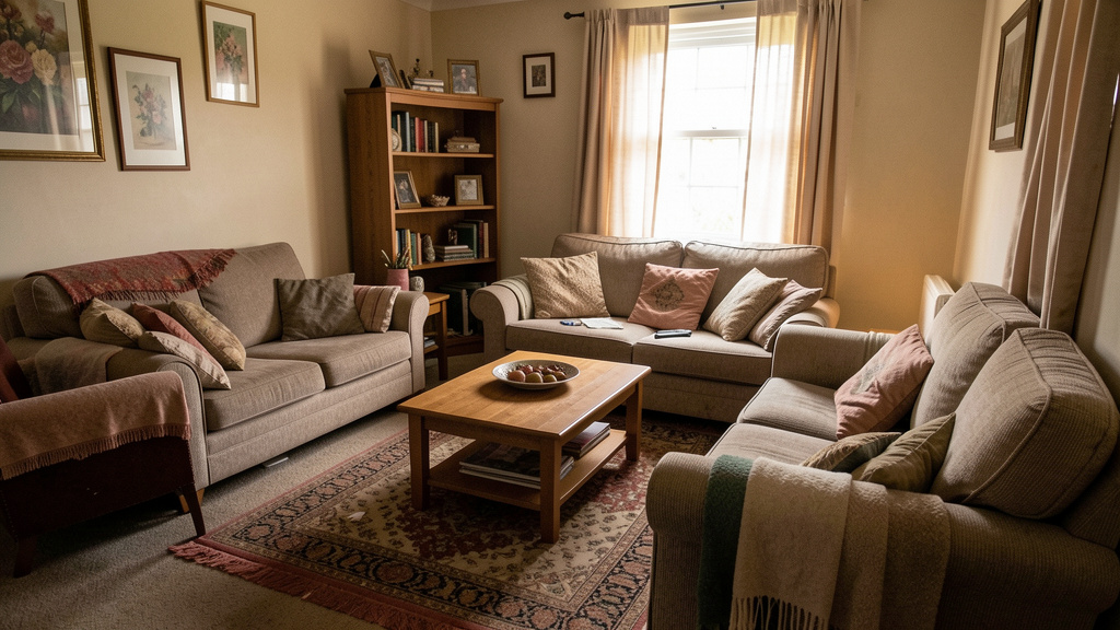
Stop sacrificing well-being for style. This definitive guide exposes the hidden design errors that disrupt relaxation, sleep, and daily ease—and delivers an actionable blueprint to transform your space into a true sanctuary.
Your home should be a refuge where tension melts away the moment you step inside. Yet so many carefully curated spaces leave occupants feeling subtly unsettled, fatigued, or restless without understanding why. Comfort isn’t merely the absence of discomfort—it’s a delicate ecosystem woven from physical, sensory, psychological, and functional threads. When one thread frays, the entire tapestry unravels. Research across environmental psychology, ergonomics, and human-centered design consistently shows that true comfort emerges not from trending aesthetics alone, but from intentional alignment with how humans actually live, move, and process their surroundings. This guide moves beyond superficial checklists to reveal the invisible mistakes silently undermining your peace—and provides precise, adaptable corrections to restore harmony to every corner of your home.
Introduction: The Comfort Illusion
Walk into any beautifully photographed living room online, and you’ll likely see flawless symmetry, a curated color palette, and furniture arranged with magazine-worthy precision. Yet sit in that same space for thirty minutes, and you might notice your lower back aching from a sofa that’s too deep, your eyes straining under harsh overhead glare, or a persistent sense of unease from walls painted in a color that subtly elevates your heart rate. This disconnect between visual appeal and lived experience defines the “comfort illusion”—the assumption that if a space looks serene, it is serene.
Environmental psychology research indicates that spatial design directly influences stress responses, cognitive load, and emotional regulation. Studies suggest individuals in environments with poor ergonomic alignment and sensory overload often report significantly higher daily stress levels compared to those in thoughtfully calibrated spaces—even when both environments are rated equally “attractive” by external observers. Comfort is increasingly recognized not as a subjective luxury, but as a physiological and psychological necessity shaped by measurable design choices.
This guide dismantles the comfort illusion pillar by pillar. We’ll move beyond vague advice like “add more pillows” to expose precise, often-overlooked errors that sabotage well-being: lighting temperatures that disrupt natural rhythms, furniture scales that block intuitive movement, acoustic neglect that keeps your nervous system subtly alert. Each section includes actionable diagnostics (“How to spot this mistake in your home”), layered solutions (ideal, budget-conscious, and rental-friendly), and illustrative examples showing the transformation from friction to flow. Whether refreshing a single room or reimagining your entire home, this framework empowers you to design with human biology—not against it. Your sanctuary awaits. Let’s rebuild it, intentionally.
The Comfort Integrity Framework: Four Pillars of Truly Livable Spaces
Before diagnosing specific mistakes, we must establish a foundational lens. Comfort isn’t a single feature you “add” like a throw blanket. It’s an integrated system resting on four interdependent pillars. Neglect one, and the others weaken. Strengthen all four, and comfort becomes self-sustaining. This framework—synthesized from established ergonomics standards (ANSI/BIFMA), sensory design principles (WELL Building Standard), and behavioral environmental research—provides the diagnostic backbone for every correction that follows.
- Physical Comfort: How your body interacts with surfaces, heights, clearances, and movement paths. Does furniture support natural posture? Can you navigate rooms without subconscious tension?
- Sensory Comfort: How light, sound, texture, temperature, and scent register in your nervous system. Is stimulation calming or chaotic?
- Psychological Comfort: How spatial cues influence safety, belonging, focus, and emotional restoration. Do colors, layouts, and personal artifacts foster peace or anxiety?
- Functional Comfort: How seamlessly the space accommodates daily rituals, storage needs, and evolving life stages. Does the design serve your reality—not an idealized version?
These pillars operate invisibly until disrupted. A stunning velvet sofa (Psychological Comfort) becomes a source of strain if its seat depth forces awkward perching (Physical Comfort). Floor-to-ceiling windows offering breathtaking views (Psychological Comfort) create glare that strains eyes during morning coffee (Sensory Comfort). True design mastery lies in harmonizing all four. As we dissect each mistake, return to this framework. Ask: Which pillar is compromised? How does this ripple into the others? This systems-thinking approach transforms isolated fixes into lasting transformation.
The Fundamental Principle: Comfort is not the absence of design—it is design working so seamlessly with human biology that you cease to notice the space itself, and only feel its support.
Pillar 1: Physical Comfort – Honoring the Body’s Unspoken Language
Physical comfort is the bedrock of well-being. When your body feels secure, supported, and free to move naturally, mental relaxation follows. When it doesn’t, micro-stresses accumulate: a stiff neck from a poorly angled reading lamp, knee strain from a coffee table too low, chronic fatigue from navigating cramped pathways. These aren’t “minor annoyances.” They are physiological taxations that drain energy reserves before you’ve even begun your day. Let’s expose the most pervasive physical comfort saboteurs—and how to correct them with precision.
Mistake 1: The Seating Depth and Height Mismatch
You fall in love with a deep, plush sofa in the showroom. At home, you sink so far back that your feet dangle, your lower back loses support, and standing up requires effort. This is the seating depth/height mismatch—a critical ergonomic failure disguised as luxury.
Why it ruins comfort: Human seating ergonomics rely on two key measurements:
– Seat depth: Should allow 2–4 inches between the back of your knee and the front edge of the seat when seated upright. Too deep forces slouching (straining lumbar discs); too shallow concentrates pressure on thighs.
– Seat height: Should align with your knee height (typically 16–19 inches from floor to top of cushion). Too low makes standing difficult; too high leaves feet unsupported, affecting circulation.
Research in ergonomics indicates that improper seat depth correlates with increased reports of lower back discomfort after sustained sitting. The body compensates for poor support by engaging stabilizing muscles unnecessarily—a silent energy drain.
How to diagnose: Sit fully back in your chair/sofa. Place feet flat on floor.
– ✅ Correct: Thighs are parallel to floor; knees form ~90-degree angle; 2–4 fingers fit between knee crease and seat edge.
– ❌ Too Deep: Knees are significantly lower than hips; you slide forward to reach floor; lumbar support feels distant.
– ❌ Too Shallow: Thighs slope downward; pressure concentrates behind knees; you feel “perched.”
Layered Solutions:
– Ideal Fix: Choose furniture with adjustable features. Sectionals with modular depths let you customize seating zones. Look for sofas with “tight backs” (firm, upright support) paired with seat depths under 22 inches for average adults. Brands like Article and Joybird publish detailed dimensional specs online—measure your body before purchasing.
– Budget Fix: Add a firm lumbar roll (a rolled towel works temporarily) to bridge the gap between your lower back and the sofa back. Place a sturdy ottoman (height matching seat) to support dangling feet. For dining chairs, use a cushion cut to reduce effective seat depth.
– Rental-Friendly: Use a folded blanket behind your lower back for immediate lumbar support. Place a small stool under the coffee table to elevate feet subtly.
Illustrative Example: A homeowner purchased a 26-inch deep sectional for an open-concept living room. Within weeks, persistent lower back stiffness developed. Solution: Two 18-inch deep armchairs (with proper seat height) were added flanking the sectional for daily use, reserving the deep seats for occasional lounging with feet elevated. The sectional remained visually appealing but no longer served as primary seating—a pragmatic compromise honoring both aesthetics and anatomy.
Critical Nuance: Body proportions vary significantly. A seat depth perfect for someone 5’4″ may be uncomfortable for someone 6’2″. Always test furniture in person while wearing typical home shoes. Sit for 3–5 minutes. Stand up. How does your body feel? Trust sensation over style.
Mistake 2: Ignoring the “Personal Bubble” in Traffic Flow
Hallways feel cramped. You constantly bump elbows with family members passing through the kitchen. Guests hesitate at doorways, unsure how to navigate. This isn’t “just how the house is”—it’s a failure to design for human movement psychology.
Why it ruins comfort: Environmental psychology identifies the “personal bubble” (proxemics theory) as the invisible zone around our bodies required to feel safe and unthreatened. In many cultures, the personal zone spans 1.5–4 feet. When furniture placement forces people into closer proximity during routine movement, the subconscious may register subtle stress. Accessibility guidelines (like ADA standards) offer universally applicable wisdom: main pathways should be at least 36 inches wide; 42+ inches is ideal for two-way traffic.
How to diagnose: Use painter’s tape to mark pathways on your floor:
– From entry door to main living area
– Around dining table chairs when pulled out
– Between kitchen counters (work triangle zones)
– Through bedroom doorways to closet/bathroom
Measure the narrowest point. If under 32 inches, movement feels restrictive. Under 28 inches, it may trigger subconscious unease.
Layered Solutions:
– Ideal Fix: Rearrange furniture to create clear, looping pathways. Float sofas away from walls (if space allows) to define zones without blocking flow. In kitchens, ensure 42+ inches between counters where two people might work simultaneously.
– Budget Fix: Remove one “decorative” piece crowding a path (e.g., a narrow console table in a hallway). Swap bulky side tables for wall-mounted shelves. Use area rugs to visually define zones without physical barriers.
– Rental-Friendly: Apply removable floor markers (like washi tape under rugs) to gently guide household traffic patterns. Store rarely used items (vacuum, holiday decor) in under-bed storage to clear floor space.
Illustrative Example: A family experienced frequent friction in their galley kitchen. Tape measurement revealed the work triangle pathway narrowed to 26 inches between the fridge and island. Solution: Moving the microwave from the counter to an upper cabinet freed 8 inches of clearance. This simple shift eliminated shoulder-bumping during meal prep—a small change with meaningful impact on daily harmony.
Critical Nuance: Flow isn’t just about width. Avoid “dead ends” where someone must back-track through a social zone. Create visual sightlines so people can anticipate movement. In open plans, use lighting changes (pendant over island vs. recessed in living area) to signal zone transitions without walls.
Mistake 3: The Coffee Table Collision Course
That beautiful coffee table sits precisely where shins meet wood every time someone sits on the sofa. Or it’s so large it dominates the room, forcing awkward detours. Coffee tables are functional anchors—but misplaced, they become hazard zones.
Why it ruins comfort: The ideal coffee table sits 14–18 inches from the sofa seat edge. Closer risks knee bumps; farther strains reach for remotes or drinks. Height should match or sit 1–2 inches below the sofa seat height. A table taller than the seat forces awkward reaching upward; significantly lower strains the back. Rectangular tables in narrow rooms create “pinch points”; round tables improve flow but reduce surface area.
How to diagnose: Sit on your sofa. Have someone place a book where your knees naturally rest. Measure from book edge to intended table front. Check table height against sofa cushion. Walk the perimeter—can you circle the table comfortably without brushing furniture?
Layered Solutions:
– Ideal Fix: Choose an oval or round table for tight spaces (no sharp corners). For deep sofas, select a table with a lower shelf for books/remotes, keeping the main surface accessible. Nesting tables offer flexibility—pull one close when needed, tuck away when not.
– Budget Fix: Replace a large rectangular table with two smaller side tables (one per sofa end). Use a large ottoman with a tray top—it’s movable, soft-edged, and doubles as extra seating.
– Rental-Friendly: Add felt pads to table legs to reduce noise when bumped. Place a textured rug under the table to visually “anchor” it and prevent sliding.
Illustrative Example: A vintage wooden coffee table caused frequent minor injuries. Instead of replacing it, soft, removable corner guards (designed for child safety) were added to the front edges. The subtle padding eliminated injuries while preserving the table’s aesthetic—a clever friction-reducer requiring zero renovation.
Critical Nuance: Consider your specific use cases. Do you host board game nights? Prioritize surface area. Have toddlers? Avoid glass tops. Work from home on the sofa? Ensure space for a laptop tray. The “perfect” table serves your rituals—not external ideals.
Pillar 2: Sensory Comfort – Calming the Nervous System Through Design
Your nervous system is constantly processing sensory input from your environment. Harsh overhead lights trigger pupil constriction and mental fatigue. Echoing footsteps on hardwood elevate alertness. A single synthetic fragrance can trigger headaches. Sensory comfort isn’t about eliminating stimulation—it’s about curating inputs that signal safety and restoration to your brain. When sensory design aligns with biological needs, stress responses ease, focus improves, and emotional resilience strengthens. Let’s correct the invisible sensory saboteurs.
Mistake 4: The Overhead Lighting Trap
A single bright ceiling fixture floods the room in flat, shadowless light. It’s the default in countless homes—and a common route to eye strain, disrupted natural rhythms, and a sterile feel.
Why it ruins comfort: Human vision evolved under dynamic, directional light (sun through leaves, firelight). Flat overhead light creates visual “noise”:
– Glare: Direct bulbs reflect off screens, glossy tables, or light-colored walls, forcing pupils to constantly adjust.
– Lack of dimension: Without layered light (ambient, task, accent), rooms feel two-dimensional and uninviting.
– Circadian considerations: Cool-white LEDs (4000K+) after sunset may interfere with melatonin production. Research suggests exposure to blue-rich light in evenings can delay sleep onset.
How to diagnose: At dusk, turn on only your main overhead light.
– Do you squint at screens or books?
– Are shadows harsh under furniture?
– Does the room feel “cold” or unwelcoming?
– Check bulb packaging: Is color temperature above 3000K? (Ideal evening range: 2200K–2700K)
Layered Solutions:
– Ideal Fix: Implement a three-layer lighting system:
1. Ambient: Dimmable recessed lights or cove lighting (2700K max) for overall glow.
2. Task: Adjustable floor lamps beside seating (for reading), under-cabinet strips in kitchens.
3. Accent: Wall sconces, picture lights, or LED tape inside shelves to create depth.
Install smart bulbs to gradually adjust color temperature from cooler (day) to warmer (evening).
– Budget Fix: Replace overhead bulbs with warm-dim LEDs (2700K). Add two inexpensive arc floor lamps flanking the sofa. Use plug-in wall sconces (no wiring needed) to bounce light softly off walls.
– Rental-Friendly: Clip-on reading lights for beds/chairs. Battery-operated LED puck lights inside cabinets or under shelves. String fairy lights behind the headboard or TV for indirect glow.
Illustrative Example: A home office user experienced daily headaches. Solution: Removing the harsh overhead fluorescent tube, adding a dimmable 2700K desk lamp with an adjustable arm, and placing a small lamp on a shelf behind the monitor eliminated screen glare. Headaches diminished noticeably—a testament to light’s physiological influence.
Critical Nuance: Light direction matters as much as temperature. Uplighting (bouncing off ceiling) feels expansive; downlighting feels focused. Avoid placing lights directly in line of sight. In bathrooms, flank mirrors with vertical sconces (not overhead) to eliminate facial shadows—a meaningful improvement for grooming confidence.
Mistake 5: Acoustic Neglect – The Echo Chamber Effect
Footsteps echo down the hall. Voices carry sharply from kitchen to bedroom. Rain on the roof sounds like drumming. Hard surfaces (tile, hardwood, glass, drywall) reflect sound waves, creating reverberation that keeps your auditory system subtly alert.
Why it ruins comfort: Chronic low-level noise exposure may elevate stress markers. Studies suggest noisy environments can reduce cognitive performance and hinder mental decompression. At home, acoustic chaos disrupts concentration, masks comforting sounds (like a partner’s calm breathing), and prevents true rest. While environmental noise is recognized as a public health consideration, homes are rarely designed with acoustics in mind.
How to diagnose: Clap your hands once sharply in the center of a room.
– ✅ Good: Sound dissipates quickly (<1 second).
– ❌ Poor: Echo lingers noticeably (>1.5 seconds).
Walk barefoot across floors. Do footsteps sound loud and hollow? Close a door—does it muffle sound significantly?
Layered Solutions:
– Ideal Fix: Integrate sound-absorbing materials:
– Floors: Area rugs with thick pads (wool absorbs well).
– Walls: Fabric wall panels, heavy curtains, or textured plaster.
– Ceilings: Acoustic tiles or cloud panels in open spaces.
– Furniture: Upholstered pieces absorb more than wood/metal.
– Budget Fix: Layer textiles strategically:
– Hang floor-length curtains (use tension rods if needed).
– Place a large rug under seating areas (extend 12+ inches beyond furniture).
– Add throw blankets and cushions to hard chairs.
– Install a bookshelf filled with books (irregular surfaces diffuse sound).
– Rental-Friendly:
– Removable acoustic panels adhere with command strips.
– Thick door sweeps block sound transfer between rooms.
– Place a folded quilt over a hard dining chair when seated.
Illustrative Example: In an open-plan apartment with young children, adding a large wool rug under the living area, hanging velvet curtains over the main window, and placing a bookshelf filled with books and plants between kitchen and living zones noticeably reduced perceived noise. The ability to hear children’s quiet play without strain returned—a meaningful shift in daily experience.
Critical Nuance: Not all sound is disruptive. Gentle, predictable sounds (a tabletop fountain, white noise machine) can mask intermittent noises. Position sound sources away from resting zones. In bedrooms, prioritize blocking external noise (traffic) over internal—use heavy curtains and seal window gaps.
Mistake 6: Texture Imbalance – The Smooth Surface Syndrome
Everything feels hard, cold, or slick: polished concrete floors, lacquered tables, leather sofas, glass accents. While visually sleek, a texture-deficient space lacks tactile warmth and sensory variety—critical components of psychological safety.
Why it ruins comfort: Touch is a primal sense. Neurological research suggests varied textures stimulate the somatosensory cortex, promoting calm and presence. Smooth, uniform surfaces feel sterile because they offer minimal tactile feedback. Cold materials (metal, stone) may trigger subtle physiological withdrawal; warm materials (wood, wool, linen) often signal safety. A room dominated by cool, hard textures can feel emotionally distant—even with warm colors.
How to diagnose: Close your eyes. Run your hands over surfaces within arm’s reach of your favorite chair:
– Do most feel cool, hard, or slippery?
– Is there variety in temperature (warm wood vs. cool ceramic) and texture (nubby wool vs. smooth cotton)?
– Would bare feet feel welcome on the floor?
Layered Solutions:
– Ideal Fix: Plan textures intentionally:
– Floors: Wide-plank wood with matte finish; natural fiber rugs (jute, sisal).
– Walls: Limewash paint, grasscloth wallpaper, or wood slat accents.
– Textiles: Layer chunky knit throws, bouclé pillows, linen curtains, velvet accents.
– Budget Fix: Introduce texture through accessories:
– Swap polyester pillows for wool or cotton blends.
– Drape a chunky cable-knit throw over the sofa arm.
– Place a seagrass basket beside the chair for remotes/books.
– Add a small wooden tray on the coffee table for tactile contrast.
– Rental-Friendly:
– Removable textured wallpaper panels.
– Faux sheepskin rug over existing flooring in seating areas.
– Woven placemats under lamps or decor items.
Illustrative Example: A minimalist apartment felt “like a showroom I couldn’t relax in.” Adding a thick shag rug under the sofa, swapping leather cushions for linen ones, placing a raw-edge wood stool beside the armchair, and hanging a macramé wall hanging transformed the space. The change wasn’t primarily visual—it was felt. “Suddenly, the space invited me to sink in,” the resident noted. “My shoulders actually dropped when I walked in.”
Critical Nuance: Texture affects perceived temperature. In warm climates, balance warm textures (wood) with cool ones (smooth stone, cotton) to avoid sensory overheating. In cold climates, prioritize insulating textures (wool, shearling). Always consider practical maintenance—textured fabrics often show less wear than smooth ones.
Pillar 3: Psychological Comfort – The Invisible Architecture of Peace
Psychological comfort operates below conscious awareness. It’s the feeling of safety when entering a room, the ease of finding your keys without frustration, the emotional resonance of colors that feel “like you.” When psychological cues align with your needs, the space becomes a true sanctuary. When they clash—through chaotic layouts, impersonal palettes, or spatial disorientation—your mind remains subtly on guard. Let’s correct the invisible psychological friction points.
Mistake 7: Color Choices That Trigger Subconscious Stress
You chose “Serene Blue” from the paint chip, but the room feels cold and isolating. Or “Energetic Yellow” leaves you feeling agitated by evening. Color psychology is deeply personal yet universally influential—ignoring its biological impact sabotages comfort.
Why it ruins comfort: Color wavelengths interact with brain activity and physiological responses:
– Cool blues/greens: Often associated with lowered heart rate (ideal for bedrooms). But overly saturated or gray-toned versions may feel sad or detached in low-light rooms.
– Warm reds/oranges: Stimulate appetite and conversation (great for dining rooms). But in large doses or high saturation, they may feel overwhelming in rest spaces.
– Neutrals: Beige, gray, white seem “safe,” but cool grays can feel sterile; stark whites increase visual fatigue; muddy beiges feel dated.
Crucially, context matters: A color that feels calming in a sun-drenched room may feel oppressive in a north-facing space with limited light.
How to diagnose: Sit in the room at different times of day. Journal your immediate emotional response:
– Morning (natural light): Does the color feel energizing or harsh?
– Evening (artificial light): Does it feel cozy or cold?
– Does the color resonate with the room’s purpose? (e.g., vibrant red in a meditation nook = mismatch)
Layered Solutions:
– Ideal Fix: Test paint rigorously before committing:
1. Paint 2×2 foot samples on multiple walls.
2. Observe at dawn, noon, dusk, and under evening lights for 3+ days.
3. Hold fabric swatches (curtains, pillows) against the sample to see interactions.
Choose colors with warm undertones for north-facing rooms; cooler undertones for south-facing. For bedrooms, opt for muted, earthy tones (sage, clay, warm taupe) over pure pastels.
– Budget Fix: Shift the room’s color story through textiles:
– Layer warm-toned throws and pillows to counteract cool gray walls.
– Add wood elements (tray, frame) to introduce organic warmth.
– Use art with dominant warm colors to visually “pull” the space.
– Rental-Friendly:
– Removable wallpaper on a single accent wall (floral, grasscloth pattern).
– Large area rug with warm, complex colors (terracotta, ochre, olive).
– String art or woven wall hanging to add visual warmth without paint.
Illustrative Example: A bedroom painted a popular “greige” (gray-beige) left the occupant waking unrested. Diagnosis: The cool gray undertone clashed with the room’s limited morning light, creating a cave-like feel. Solution: Adding a burnt orange velvet throw, mustard yellow pillows, and a rattan mirror transformed the room’s emotional temperature—proving color impact lives in the combination, not just the wall.
Critical Nuance: Personal history shapes color response. A “calming” blue might trigger sadness if associated with a past loss. Honor your unique associations. When in doubt, lean toward earth-derived colors (ochre, moss, clay)—they often signal safety and grounding across diverse contexts.
Mistake 8: The Clutter-Comfort Paradox
You’ve read “declutter for peace,” so you stripped surfaces bare. Now the room feels sterile, unwelcoming, and devoid of personality. This is the clutter-comfort paradox: both excessive clutter and extreme minimalism can undermine psychological safety.
Why it ruins comfort: Clutter overloads the visual field, increasing cognitive load as the brain processes irrelevant stimuli. But zero visual anchors create a different stress: the space feels transient, unowned, and emotionally vacant. Humans often seek “prospect and refuge”—the ability to see the room clearly (prospect) while feeling nestled in a defined, personal zone (refuge). Bare surfaces offer prospect without refuge; chaotic surfaces offer neither.
How to diagnose: Stand in the room’s entrance.
– Does your eye know where to rest? (Clutter = too many focal points; minimalism = no focal point)
– Do surfaces feel intentionally curated or randomly abandoned?
– Would a guest feel this space reflects you?
Layered Solutions:
– Ideal Fix: Apply the “Rule of Three” for surfaces:
– Coffee Table: One functional item (tray), one textural item (book stack), one personal item (small sculpture).
– Console Table: Anchor with a lamp (light source), a vessel (organic shape), a framed photo (personal connection).
– Shelves: Mix books (spines facing out for color), objects of varying heights, and negative space (empty areas).
Prioritize “meaningful minimalism”—keep only items that serve function or spark genuine resonance.
– Budget Fix:
– Use attractive boxes/baskets to corral small items (remotes, chargers).
– Edit surfaces to 30% capacity—remove everything, then return only essentials.
– Group similar items (all remotes in one tray) to reduce visual chaos.
– Rental-Friendly:
– Command-strip floating shelves to create intentional display zones.
– Use a decorative screen to hide utility areas (laundry basket, pet supplies).
– Rotate seasonal decor—store off-season items to keep surfaces fresh but not empty.
Illustrative Example: After a major decluttering effort, a living room felt like a hotel lobby. The resident felt disconnected. Solution: Reintroducing three deeply personal items—a framed map of a meaningful location, a ceramic bowl made by a child, and a vintage compass from a grandparent—restored emotional resonance without clutter. Comfort lived in meaningful objects, not their absence.
Critical Nuance: Clutter tolerance varies by personality and culture. Some thrive with abundant visual stimuli; others need near-empty surfaces. The goal isn’t universal minimalism—it’s intentionality. Ask: “Does this item support my well-being today?” If yes, keep it visibly. If no, store or release it thoughtfully.
Mistake 9: Forgetting the View – Windows as Emotional Portals
Windows are treated as mere light sources or architectural features—not as dynamic emotional portals. A window framing a brick wall, a busy street, or bare branches in winter becomes a source of subconscious stress rather than restoration.
Why it ruins comfort: Biophilic design research suggests that views of nature may reduce stress and improve mood. But even non-natural views matter: A window showing a quiet courtyard feels safer than one overlooking a parking lot. When windows frame chaotic, unchanging, or unpleasant scenes, they become visual anchors of unease. Conversely, thoughtfully curated views—even artificial ones—provide micro-moments of restoration throughout the day.
How to diagnose: Sit beside each window at different times. Note your emotional response:
– Does the view feel calming, stimulating, or draining?
– Is there movement (trees swaying, clouds) or static harshness (blank wall)?
– At night, does the window become a black mirror reflecting indoor chaos?
Layered Solutions:
– Ideal Fix: Frame and enhance the view:
– Outward: Plant window boxes with trailing ivy or flowers to soften harsh edges. Position seating to face the most pleasant view.
– Inward: Use sheer curtains to diffuse harsh light while maintaining visibility. Install exterior shutters to control view composition.
– Artificial: If view is poor, create a “living screen”—a tall potted plant placed just outside the window to frame a green vignette.
– Budget Fix:
– Hang a delicate beaded curtain or stained-glass suncatcher to transform light and add visual interest.
– Place a small indoor plant on the windowsill to draw the eye to life, not the outside scene.
– Use removable window film with subtle patterns (frosted leaf designs) to obscure unpleasant views while admitting light.
– Rental-Friendly:
– Command-hook tension rod for lightweight sheers.
– Removable static-cling window decals (botanical patterns) to personalize the glass.
– Position a floor mirror opposite the window to reflect light and double the perceived view.
Illustrative Example: An apartment window faced a dim alley, creating a sense of confinement. Solution: Placing a tall bird-of-paradise plant in a woven basket directly in front of the window created a “living painting” from the armchair. Adding a small bird feeder on the fire escape transformed the window into a source of joy—watching birds visit became a cherished part of the morning coffee ritual.
Critical Nuance: Nighttime views matter. Black windows reflecting room clutter can feel unsettling. Close curtains/blinds in the evening to contain the cozy interior space. In bedrooms, prioritize blackout capabilities for sleep hygiene—but ensure morning light can gently enter to support natural rhythms.
Pillar 4: Functional Comfort – Designing for Real Life, Not Showrooms
A space can be physically supportive, sensorially soothing, and psychologically resonant—yet still fail if it doesn’t accommodate how you actually live. Functional comfort is the art of aligning design with daily rituals, storage realities, and evolving needs. When function is ignored, beauty becomes a burden: beautiful cabinets too high to reach, a “statement” chair you never sit in, a kitchen layout that turns meal prep into an obstacle course. Let’s correct the functional friction points that turn homes into sources of daily frustration.
Mistake 10: Storage Solutions That Create More Work
You installed floor-to-ceiling cabinets to “maximize storage,” but now retrieving a serving platter requires a step stool and rearranging three shelves. Or you chose beautiful woven baskets with no labels, so finding the tape measure means emptying three containers. Storage should reduce cognitive load—not increase it.
Why it ruins comfort: Every time you struggle to access or locate an item, your brain registers a micro-stressor. The “activation energy” required to use a space (e.g., “Is it worth climbing to get the blender?”) determines whether systems are maintained or abandoned. Poorly designed storage leads to surface clutter (items left out because putting them away is too hard), wasted time, and decision fatigue.
How to diagnose: Track one week of interactions with storage:
– How many times did you avoid using an item because storage was inconvenient?
– How long did it take to find common items (scissors, batteries, spices)?
– Do you have “dump zones” where items accumulate because no logical home exists?
Layered Solutions:
– Ideal Fix: Design storage around frequency of use (the “Golden Triangle” principle):
– Daily-use zone (waist to shoulder height): Coffee mugs, cooking oils, frequently worn shoes.
– Occasional-use zone (above shoulder/below knee): Serving dishes, seasonal decor, luggage.
– Rare-use zone (high shelves, under beds): Archival items, heirlooms.
Label everything—use a label maker for uniformity. Install pull-down shelves in high cabinets. Choose drawers over deep shelves for base cabinets (full visibility).
– Budget Fix:
– Edit ruthlessly: Donate items used less than once a year.
– Add shelf risers in cabinets to create vertical visibility.
– Use clear bins for categories (craft supplies, kids’ art) with photos taped to fronts.
– Rental-Friendly:
– Over-door organizers for pantry, closet, or bathroom (no drilling).
– Stackable acrylic drawers for under-sink or closet organization.
– Removable adhesive hooks inside cabinet doors for measuring cups, oven mitts.
Illustrative Example: A chaotic spice rack behind the stove led to nightly frustration searching for ingredients. Solution: Installing a simple magnetic strip on the side of the fridge (using strong adhesive tape suitable for rentals) allowed spices in uniform tins to live at eye level, clearly labeled. Cooking became joyful again—a small spatial adjustment with profound daily impact.
Critical Nuance: Storage must evolve with life stages. A nursery needs accessible diaper stations; an aging parent needs lower shelves. Build flexibility: modular shelving systems, multi-functional furniture (storage ottomans), and “transition zones” (a bench by the door for bags/shoes) prevent future friction.
Mistake 11: Ignoring the “Daily Ritual” Flow
You love your kitchen’s aesthetic, but making coffee requires walking to three different zones: beans in pantry, grinder on counter, mug in distant cabinet. Or your morning routine involves backtracking through the house to gather keys, bag, and lunch. Spaces should support rituals—not disrupt them.
Why it ruins comfort: Rituals are cognitive anchors that reduce decision fatigue and create rhythm. When spatial layout forces inefficient movement, rituals become chores. Environmental psychology suggests that “frictionless flow” in daily tasks conserves mental energy for meaningful activities. A home that honors ritual flow feels intuitive; one that fights it feels exhausting.
How to diagnose: Map your top 5 daily rituals (morning coffee, school prep, evening wind-down):
1. List every step and item needed.
2. Trace your physical path through the house on paper.
3. Identify backtracking, unnecessary steps, or “hunting” for items.
Layered Solutions:
– Ideal Fix: Create dedicated ritual stations:
– Coffee Station: Cabinet near coffee maker holds beans, filters, mugs, spoons.
– Launch Pad: Bench by entry door with hooks (keys, bag), shelf (shoes), basket (mail).
– Wind-Down Nook: Chair with side table holding book, water glass, blanket.
Group related items where the action happens. In kitchens, follow the work triangle (sink-fridge-stove) but personalize zones: baking station, coffee corner, prep area.
– Budget Fix:
– Repurpose existing furniture: A small bookshelf becomes a launch pad.
– Use a rolling cart as a mobile coffee or craft station.
– Assign one drawer per ritual (e.g., “morning drawer” with vitamins, lip balm, hair ties).
– Rental-Friendly:
– Command-strip hooks by the door for keys/bag.
– Place a decorative tray on the entry console to corral daily essentials.
– Use a folding screen to define a ritual zone (e.g., meditation corner) in open spaces.
Illustrative Example: A family wasted precious morning minutes searching for shoes, lunches, and permission slips. Solution: Creating a “family command center” on a blank wall near the garage door using a corkboard (for notes), three labeled bins (one per child), and a shoe rack transformed mornings from chaotic to calm—a small spatial investment yielding significant daily peace.
Critical Nuance: Rituals are deeply personal. An introvert may need a quiet “re-entry” zone after work (a chair by the door to decompress); an extrovert may want immediate connection (kitchen island facing living area). Design for your emotional needs within rituals.
Mistake 12: One-Size-Fits-All Room Design
Every chair is identical. Every surface is hard. Every light switch controls the entire room’s lighting. This “uniformity trap” ignores the reality that humans have diverse needs—even within one household. A space designed for a single ideal user excludes everyone else.
Why it ruins comfort: Comfort is contextual. A deep armchair perfect for reading may be difficult for someone with mobility considerations to rise from. Bright task lighting ideal for crafting creates glare for someone watching TV nearby. When spaces lack variety, occupants constantly compromise—leading to avoidance of shared areas or subtle resentment. Inclusive design isn’t solely about accessibility; it’s about honoring neurodiversity, age ranges, and differing sensory preferences under one roof.
How to diagnose: Observe how different household members use (or avoid) shared spaces:
– Does anyone consistently sit on the floor instead of chairs?
– Are lights always on “full blast” or completely off?
– Do certain family members retreat to bedrooms during group time?
Layered Solutions:
– Ideal Fix: Introduce “choice architecture” into shared spaces:
– Seating: Mix depths (deep sofa + upright chairs + floor cushions). Include armrests on some chairs for easier standing.
– Lighting: Multiple independent zones (dimmable lamps, separate switches for overheads).
– Surfaces: Combine hard tables (for puzzles) with soft ottomans (for feet).
– Zones: Define quiet corners (for introverts) and open areas (for socializing) within one room.
– Budget Fix:
– Add floor pillows or a beanbag chair for flexible seating options.
– Use smart plugs to create independent lamp zones controlled by phone.
– Place a small side table with a lamp in a quiet corner for solo activities.
– Rental-Friendly:
– Portable seating: Folding chairs stored in closet for flexibility.
– Clip-on book lights for individual reading without disturbing others.
– Room divider (folding screen, tall plant) to create visual privacy within open space.
Illustrative Example: A family experienced recurring tension about living room lighting. Teens needed bright light for homework; parents preferred dim lighting for evening relaxation. Solution: Adding two adjustable floor lamps (one near the sofa, one by the window) and keeping overheads off allowed each person to control their own light zone. Conflict diminished—a powerful lesson in designing for coexistence.
Critical Nuance: Inclusive design benefits everyone. Curb cuts help parents with strollers, travelers with suitcases, and wheelchair users. Similarly, varied seating supports guests with back sensitivity, children who fidget, and adults who prefer upright posture. Design for diverse needs, and shared spaces become more welcoming for all.
Navigating Real-World Constraints: Budget, Rentals, and Existing Layouts
You might be thinking: “This all sounds ideal, but my budget is tight,” or “I rent and can’t paint,” or “My floor plan is fixed.” These constraints are not barriers—they are creative catalysts. Research in consumer psychology suggests that perceived constraints can sometimes lead to more innovative and satisfying solutions than unlimited resources. Let’s transform friction into fuel.
The Budget-Conscious Comfort Pathway
Comfort isn’t purchased—it’s curated. A thrifted wool blanket often adds more tactile warmth than a mass-produced throw. Focus spending where impact is highest:
– Priority 1: Lighting. Replace one harsh overhead bulb with a warm-dim LED ($8). Add a $15 clip-on reading light to your bedside. This single shift reduces eye strain and supports evening relaxation.
– Priority 2: Textiles. A $30 rug pad under an existing rug transforms acoustics and foot comfort. Swap polyester pillow covers for $12 linen ones. Texture shifts perception more than color.
– Priority 3: Ergonomics. A $20 lumbar roll corrects sofa posture. A $10 footrest elevates dangling feet. These micro-investments yield meaningful comfort gains.
Pro Tip: Track “comfort ROI.” Spend $25 on a dimmer switch? Notice how many headache-free evenings follow. This reframes spending as intentional self-care.
The Renter’s Toolkit for Non-Permanent Transformation
Your lease is not a design limitation. Modern adhesive technology unlocks profound change:
– Walls: Removable wallpaper creates accent walls. Fabric panels hung with command strips add texture and absorb sound.
– Floors: Large area rugs (with non-slip pads) define zones and soften acoustics. Peel-and-stick vinyl tiles can refresh dated flooring (check lease first).
– Lighting: Plug-in wall sconces eliminate cord clutter. Battery-operated puck lights illuminate dark cabinets. Smart bulbs adjust color temperature without rewiring.
– Hardware: Swap dated cabinet knobs for modern pulls (store originals!). Use removable hooks for keys, bags, art.
Critical Reminder: Always get landlord permission in writing for modifications. Document pre-existing conditions with photos. Most landlords appreciate tenants who thoughtfully care for the space.
Working With (Not Against) Your Existing Layout
You can’t move walls, but you can redefine space:
– Awkward Corners: Place a tall plant or floor lamp to draw the eye upward, minimizing perceived dead space. Add a narrow console table for function.
– Long Hallways: Break visual monotony with alternating art heights. Place a small bench at the midpoint for pause. Use runner rugs with directional patterns to guide movement.
– Open Plans: Define zones with area rugs (different patterns/sizes per zone). Use furniture orientation (sofa back to dining area) to create psychological boundaries. Vary lighting temperatures (warmer in living zone, brighter in kitchen).
Key Insight: Perception is malleable. A room feels larger with consistent flooring; cozier with layered textiles. Work with light, color, and sightlines—not just square footage.
When Professional Help Is Worthwhile
Some constraints require expertise:
– Structural Changes: Removing walls, adding windows. Always consult a structural engineer first.
– Major Electrical: Adding circuits for lighting zones. Hire a licensed electrician—safety is non-negotiable.
– Persistent Discomfort: If physical discomfort persists despite ergonomic adjustments, consult a physical therapist. They can identify body-specific needs you might miss.
Remember: A single hour of professional consultation can prevent costly mistakes. Many designers offer virtual “comfort audits” at accessible rates.
Your Questions, Answered
Q: How do I know if my discomfort is from design or just “me”?
A: Track patterns. Does stiffness occur only in your home office chair? Does unease spike in the brightly lit kitchen but ease in the dim bedroom? Correlate physical/emotional sensations with specific spaces and times. If symptoms shift with environment changes (e.g., discomfort lessens after adding lumbar support), design is likely a factor. Persistent issues warrant medical consultation—but environmental factors should never be dismissed.
Q: Are there universal comfort principles that apply to everyone?
A: Core physiological needs show strong consistency: proper spinal alignment when seated, glare-free task lighting, safe movement paths. However, expression of comfort is deeply personal. One person finds white walls calming; another finds them sterile. Use universal ergonomics as your foundation (seat heights, pathway widths), then layer personal preferences (colors, textures) on top. When designing shared spaces, prioritize universal physical/sensory needs first, then collaboratively address psychological preferences.
Q: Can plants genuinely improve comfort, or is that just hype?
A: Research offers nuanced insights. Some studies, including work associated with NASA, suggest certain plants like snake plants may contribute to air quality. More consistently, research published in the Journal of Physiological Anthropology indicates that interacting with indoor plants may reduce psychological stress. Choose wisely: high-maintenance plants causing guilt undermine comfort. Start with one resilient plant (ZZ plant, pothos) in a frequently used space. The visual softness and mindful care can create micro-moments of calm.
Q: My partner and I have opposite comfort needs (they like it cool/dark; I like it warm/bright). How do we compromise?
A: Zone, don’t compromise. Create micro-environments within shared spaces:
– Temperature: Use personal solutions (throw blanket for you, small fan for them) rather than battling the thermostat.
– Lighting: Task lamps allow individual control. Install dimmers with presets (“movie mode” vs. “reading mode”).
– Discussion Tip: Frame needs neutrally: “I feel more focused with brighter light here” vs. “Your lighting is too dim.” Focus on shared goals (“We both want to relax together comfortably”) to find creative solutions.
Q: How often should I reassess my home’s comfort?
A: Treat comfort as cyclical, not static. Conduct a gentle “comfort check-in” seasonally:
– Spring: Assess lighting as days lengthen; refresh textiles for warmer weather.
– Fall: Evaluate heating zones; add layers for cooler months.
– After Life Changes: New job (more home office time?), new pet, family member moving in. Comfort must evolve with you. Set a calendar reminder—this proactive habit prevents slow erosion of well-being.
Q: Are there quick “comfort boosts” I can do today?
A: Absolutely. Try these accessible micro-fixes:
1. The 5-Minute Lighting Shift: Replace one cool-white bulb (4000K+) with a warm-white (2700K) in your most-used evening space.
2. The Texture Touchpoint: Place a soft wool or cotton throw on your primary seating spot. Run your hands over it when stressed—it can trigger tactile calm.
3. The Pathway Pause: Clear one narrow pathway (hallway, between sofa and table). Walk it slowly. Notice the mental ease of unobstructed movement.
These tiny actions can gently rewire your perception of space.
Q: Does comfort design apply to small spaces like apartments?
A: It’s more critical in small spaces. Every square inch impacts well-being intensely. Prioritize:
– Vertical Storage: Free floor space to reduce visual clutter and improve flow.
– Multi-Functional Furniture: Storage ottomans, wall beds, nesting tables.
– Mirror Magic: Place a mirror opposite a window to double light and perceived space.
– Zoning with Light: Use different lamp temperatures to define sleep/work/relax zones without walls.
Small spaces demand intentionality—but yield profound comfort rewards when designed thoughtfully.
Q: How do I avoid “comfort fatigue”—constantly tweaking my space?
A: Comfort is a practice, not perfection. Establish gentle boundaries:
– The 24-Hour Rule: Wait one day before making any non-urgent change. Does the discomfort persist?
– The One-Change-at-a-Time Rule: Implement one comfort fix per week. Observe its impact before adding another.
– The Joy Check: After a change, ask: “Does this feel effortlessly better?” If it requires constant adjustment, it’s not true comfort.
True comfort feels intuitive, not fussy. Trust your body’s quiet signals over fleeting trends.
Q: Can color genuinely affect sleep quality?
A: Evidence suggests it can play a role. Studies, including some published in sleep research journals, indicate that participants in rooms with cool, muted tones like soft blues or sage greens may fall asleep more easily compared to rooms with highly saturated colors or stark whites. Why? These tones can mimic twilight skies, supporting the body’s natural wind-down. For bedrooms:
– Consider: Soft blues, sage greens, warm grays with beige undertones.
– Observe: How colors feel under your actual evening lighting—test samples at bedtime.
Personal response varies; honor what feels restful to you.
Q: What’s the most overlooked comfort mistake in home offices?
A: Screen height and viewing distance. A monitor too low forces neck flexion; too high causes extension strain. Ideal: Top of screen at or slightly below eye level, arm’s length away. Pair with an external keyboard/mouse to keep elbows near 90 degrees. Add a document holder beside the screen to avoid constant refocusing. These micro-adjustments often prevent discomfort more effectively than an expensive chair alone. Your eyes and spine will appreciate the attention daily.
Conclusion: Your Path to a Truly Comfortable Home
We began by dismantling the comfort illusion—the gap between how a space looks and how it feels to inhabit. Along this journey, we’ve exposed the invisible threads that weave true comfort: the ergonomic precision of seating depths, the nervous-system-calming power of layered lighting, the emotional resonance of curated views, and the profound peace of spaces designed for your rituals. Comfort is not a destination reached by purchasing the “right” sofa or paint color. It is a continuous, compassionate dialogue between you and your environment—a practice of listening to your body’s whispers before they become shouts.
Recap: The Three Guiding Principles of Comfort
1. Honor the Four Pillars: No single element—no matter how beautiful—can compensate for neglecting physical, sensory, psychological, or functional comfort. Audit your space through all four lenses.
2. Design for the Human, Not the Image: Prioritize how a space feels at 7 a.m. on a Tuesday over how it photographs. Your well-being is the only metric that matters.
3. Embrace Progressive Refinement: Comfort evolves. Start with one micro-fix today. Observe. Adjust. Build momentum. Perfection is the enemy of progress; intentionality is your compass.
The 24-Hour Comfort Invitation
Tonight, before bed, spend exactly 20 minutes in your most-used room. Do not judge, fix, or plan. Simply observe with gentle curiosity:
1. Physical Scan: Sit in your favorite chair. Notice points of contact—do any feel strained, unsupported, or tense?
2. Sensory Scan: Close your eyes. What do you hear? Smell? Feel on your skin? Is stimulation calming or chaotic?
3. Psychological Scan: Open your eyes. What is the first emotion you feel? Does the space feel like yours?
Tomorrow morning, implement one tiny correction based on your observation. Lower a harsh lamp. Add a soft throw. Clear one pathway. This single act of mindful attention is more powerful than any grand redesign. It is the seed of a home that truly serves you.
The Bigger Picture: Comfort as a Compassionate Practice
In a world that often glorifies busyness and aesthetic perfection, choosing comfort is a quiet act of self-regard. It is a declaration that your well-being matters. That rest is not laziness. That your home should be a sanctuary—not another source of pressure. When you design spaces that honor your humanity, you cultivate resilience that radiates outward: into your work, your relationships, your community. You model self-care without apology. You create a legacy of peace within your walls.
This journey is uniquely yours. There are no universal blueprints—only principles to adapt, test, and refine through the lens of your life. Trust your body’s wisdom. Celebrate small victories. Release comparison. Your most comfortable home is not the one that matches a magazine spread. It is the one where you sigh with relief the moment you walk through the door. Where your shoulders drop. Where you feel, deeply and completely, at home.
You have everything you need to begin. Start small. Start today. Your sanctuary is waiting.
Explore Our Complete System:
The Science of Cozy: Biophilic Design Principles for Everyday Spaces | Ergonomic Home Office Setup: A Step-by-Step Guide for All Budgets | Sensory Sanctuary: Creating a Bedroom That Supports Restful Sleep | The Ritual-First Kitchen: Designing for Joyful Daily Cooking | Adaptive Living: Future-Proofing Your Home for Changing Needs | The Clutter Compass: A Compassionate Guide to Meaningful Minimalism | Lighting Layers Decoded: From Harsh to Harmonious in 5 Steps