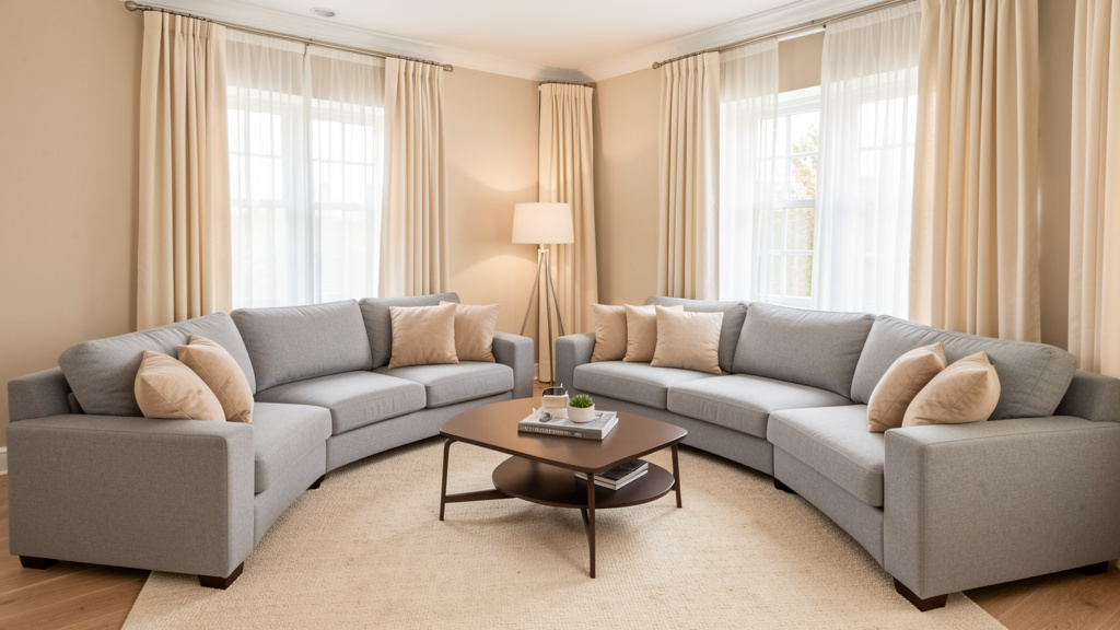
Go beyond beige: A systematic framework for selecting, layering, and living with neutral palettes that evolve with your style and support your well-being across seasons and years.
Neutral colors form the quiet architecture of enduring interiors—yet many homeowners face frustration when rooms feel sterile, dated, or emotionally disconnected despite choosing “safe” shades. This guide dismantles the myth that neutrals are limiting. Instead, it presents a researched, three-layer framework for curating backdrops that feel intentionally warm, visually dynamic, and resilient against passing trends. Drawing on principles from environmental psychology, architectural history, and material science, this approach transforms neutral selection from a source of uncertainty into a confident foundation for spaces that support your life. Whether refreshing a single wall or designing a new build, this methodology prioritizes your space’s unique conditions over generic recommendations. The goal is not trend adherence, but cultivating a backdrop that recedes gracefully, allowing your life, art, and evolving story to take center stage.
Introduction
Step inside spaces celebrated for timeless appeal—from sun-bleached Cycladic villas with limestone walls to Pacific Northwest cabins wrapped in cedar—and a pattern emerges: neutral backdrops are not an absence of color, but a deliberate language of light, material, and human experience. Historically, these choices arose from necessity: local stone, limewash, weathered wood, and clay plaster created palettes inherently harmonized with climate and landscape. Today, that wisdom remains relevant, though our context has shifted. Many homeowners report repainting within two years due to color regret—often stemming from mismatched undertones, untested light conditions, or texture-deficient applications. This guide bridges that gap. Referencing cross-disciplinary insights—from circadian lighting considerations in wellness-focused design to archival studies of enduring architectural palettes—it offers a structured methodology centered on your space’s reality. This isn’t about predicting decades ahead; it’s about making intentional choices today that provide flexibility, comfort, and visual harmony for years to come. True timelessness lies not in rigidity, but in thoughtful adaptability.
The Adaptive Neutral Framework: Foundation, Atmosphere, Evolution
Mastery of neutrals begins with a mental model addressing three interconnected needs: structural harmony with your space, emotional resonance for daily living, and graceful adaptability through life’s changes. This framework, informed by documented design patterns and environmental research, transforms selection from subjective guessing into an intentional process. Each layer builds deliberately upon the last, creating resilience against common pitfalls like coldness, visual flatness, or premature datedness. Approach this not as rigid rules, but as a compassionate lens for observing your space with fresh eyes.
Layer 1: Foundation – Anchoring to Light and Architecture
The Foundation layer addresses the most critical question: How does this neutral interact with the immutable physical realities of my space? Neglecting this step is a frequent source of neutral regret. This layer operates through three practical filters:
Decoding Your Room’s Light Personality
Natural light carries temperature (measured in Kelvin) that actively transforms color perception. North-facing rooms receive consistent, cool, blue-toned light. Without intentional balancing, this can amplify cool undertones in paint, potentially creating a detached feel. Here, neutrals with subtle warm undertones (hinting at yellow, red, or pink) often provide perceived warmth. South-facing rooms flood with warm, golden light that intensifies yellow and orange undertones. In these spaces, neutrals with cooler bases (gray, green, or blue hints) may prevent walls from appearing overly warm by afternoon. East-facing rooms offer warm morning light that softens to neutral by midday—often suitable for balanced neutrals like soft greiges or taupes that transition gracefully. West-facing rooms intensify in warmth at sunset; cooler-leaning neutrals here can offer refreshing contrast in the evening but require careful testing to avoid starkness in morning light. Actionable Protocol: For two consecutive days, observe your room at 9 AM, 1 PM, and 4 PM. Place a pure white sheet of paper against the wall. Note the light’s cast: Does it read blue? Golden? Grayish? Photograph the paper at each interval. This documented evidence reduces guesswork. Remember: artificial lighting compounds these effects—always test under your actual bulbs later in the process.
Harmonizing with Fixed Elements: The Contextual Conversation
Walls engage in continuous visual dialogue with permanent features: flooring, countertops, tile, brick fireplaces, or wood beams. Ignoring this relationship often creates friction. Pull physical samples whenever possible—a tile chip, wood floor off-cut, granite remnant. Visit a paint store with these samples. Hold potential swatches directly against them under natural daylight (near a window, not under store fluorescents). Seek harmony, not exact matching. For instance, honey-toned oak floors contain subtle red undertones. A wall color with a faint green undertone creates sophisticated complementary contrast (green sits opposite red on the color wheel), resulting in dynamic balance. Conversely, a wall with strong orange undertones may clash, amplifying warmth into visual noise. Similarly, cool gray quartz countertops often pair elegantly with warm greige walls, while cool gray walls beside cool countertops can feel monotonously icy without textural intervention. Practical Insight: When samples aren’t available, take high-resolution photos of fixed elements in natural light. Many paint retailers offer digital visualization tools—a useful preliminary filter before purchasing physical samples. The goal is a backdrop that makes existing architecture feel intentional.
Spatial Intent: Using Neutrals to Shape Perception
Neutrals subtly influence spatial perception. Light, cool-leaning neutrals (pale grays, soft whites with gray bases) reflect more light, creating an illusion of expanded volume—often suitable for compact rooms, narrow hallways, or spaces with low ceilings. Deep, warm neutrals (charcoal, chocolate brown, earthy taupes) absorb light, fostering intimacy—ideal for cavernous great rooms, vaulted ceilings, or creating cozy nooks within open plans. In open-concept layouts, gentle value shifts can define functional zones without physical barriers: a living area in a soft greige (Light Reflectance Value/LRV 65), transitioning to a dining area in a slightly deeper tone (LRV 55), and a kitchen accent wall at LRV 45. This gradient guides movement while maintaining cohesive flow. Nuanced Consideration: In rooms with dramatic architectural features (exposed beams, curved walls, significant millwork), a consistent neutral throughout often allows those elements to shine. Reserve value shifts for spaces needing spatial definition. Ceiling treatment matters: painting ceilings the same light neutral as walls blurs boundaries for height; using a slightly warmer or cooler tone than walls can intentionally influence perceived ceiling height.
The Fundamental Principle: A neutral backdrop must first honor the physics of light and architecture; only then can it nurture the humans within it.
Layer 2: Atmosphere – Weaving Texture, Temperature, and Tone
With the Foundation secured, the Atmosphere layer breathes soul into the space. This is where neutrals transcend flat color and become a rich, multi-sensory environment. A technically sound foundational neutral can still feel hollow without attention to this layer. Atmosphere operates across three interconnected dimensions:
Undertone Mastery: Reading the Hidden Language
Every neutral contains a whisper of another color beneath its surface—its undertone. Misreading this causes frequent neutral challenges. “Beige” is not monolithic: a pink-beige beside golden oak flooring may evoke dated aesthetics; a yellow-beige under cool LED lighting can appear sallow; a green-beige in a sun-drenched room may feel serene or, if mismatched, institutional. Gray is equally nuanced: blue-based grays feel crisp but risk coolness in north light; green-based grays (true greiges) offer earthy warmth; purple-based grays lend depth but require confident pairing.
Undertone Identification Protocol:
1. Place your suspected neutral swatch beside a pure white card and a true gray card (available at art supply stores).
2. Observe in north-facing daylight (a relatively neutral light source).
3. Does the swatch lean visibly toward pink, yellow, green, blue, or purple against the cards? That indicates its dominant undertone.
4. Cross-reference with primary color cards for confirmation.
This careful identification helps avoid common pitfalls. Below is a reference guide synthesizing undertone behavior across common scenarios:
| Neutral Family | Common Undertones | Typical Psychological Effect | Common Application Context | Consideration to Note |
|---|---|---|---|---|
| Whites | Warm (yellow/red hints), Cool (blue/green hints) | Warm: Inviting; Cool: Crisp | Warm: North rooms, traditional homes; Cool: South rooms, contemporary spaces | Cool white in north light may feel stark; Warm white in intense south light may develop subtle warmth over time |
| Beiges | Pink, Yellow, Green hints | Pink: Soft; Yellow: Cheerful; Green: Earthy | Green-beige: Rooms with wood tones, nature views; Pink-beige often clashes with golden oak | Pink-beige + golden oak may feel dated; Yellow-beige under cool LEDs may appear sallow |
| Greiges | Balanced Gray + Beige | Versatile, grounded, modern yet warm | Most light conditions; open plans needing cohesion; transitional styles | Overly cool greige in north light may feel flat; Overly warm greige in south light may feel heavy |
| Grays | Blue, Green, Purple hints | Blue: Calm; Green: Organic; Purple: Sophisticated | Green-gray: Bathrooms, studies; Blue-gray: North rooms needing balance; Purple-gray: Accent walls | Blue-gray in cool north light may feel somber; Purple-gray benefits from warm accents |
| Taupes | Brown + Gray (earthy) | Grounded, sophisticated | Libraries, studies, bedrooms; spaces craving depth | Heavy taupe in small, dark rooms may feel enclosed; Requires texture to avoid flatness |
| Warm Browns | Red, Orange, Yellow hints | Cozy, intimate | Bedrooms, dens, studies; creating sanctuary; cooler climates | Overuse without light accents may feel heavy; Balance with cream, oat, or light wood |
Texture as the Soul of Neutrals
In a neutral palette, texture is the primary source of visual interest, depth, and emotional connection. Light interacts dynamically with surface quality: matte absorbs for soft focus; nubby weaves create shadow play; glossy reflects for energy; rough-hewn wood adds organic irregularity. Without intentional textural layering, even well-chosen neutrals may read as flat.
Layering Protocol for Depth:
– Base Layer (Walls): Choose paint finishes strategically. Matte or flat finishes absorb light beautifully, hiding wall imperfections and creating a soft-focus backdrop ideal for living rooms and bedrooms. Eggshell offers slight sheen for durability in hallways. Avoid flat finishes in high-moisture areas (bathrooms, kitchens); use satin instead. Consider artisanal wall treatments for profound depth: limewash (mineral-based, breathable, subtle variation), clay plaster (tactile, humidity-regulating), or grasscloth wallpaper (adds organic pattern without color).
– Mid Layer (Furnishings & Soft Goods): Introduce contrasting tactile experiences. Pair a smooth linen sofa with a nubby bouclé armchair. Layer a flat-weave jute rug under a plush wool area rug. Drape a chunky knit cream throw over a leather ottoman. Each material catches light differently, creating movement and warmth.
– Accent Layer (Decor & Details): Incorporate natural, irregular elements: a raw-edged wood bowl, a hand-thrown ceramic vase with visible glaze variation, woven seagrass baskets, a hammered metal tray. These “imperfect” textures prevent sterility and invite touch.
Illustrative Example: Imagine a living room with ivory matte walls (Foundation layer secured). A cream bouclé sofa provides soft, light-catching texture. A beige sisal rug grounds the space with its rough weave. A light oak coffee table reveals wood grain and subtle knots. A smooth ceramic lamp base contrasts with a nubby wool pillow. Individually neutral, together they create a rich tapestry that feels curated and comforting. Counter-Example: Painting walls, trim, ceiling, and built-ins the exact same flat neutral without textural variation may result in a featureless space—a frequent critique of minimalism executed without nuance. Texture is the antidote to neutrality’s greatest risk: anonymity.
Temperature Balancing: The Comfort Equation
Human comfort is intrinsically tied to perceived temperature. Warm neutrals (creams, taupes, warm grays) psychologically evoke sunlight, hearth fires, and earth—often suitable for spaces designed for relaxation (bedrooms, living rooms, dens). Cool neutrals (icy whites, blue-grays, green-grays) suggest water, stone, and open sky—refreshing in bathrooms, home offices, kitchens, or warmer climates. However, absolute uniformity may create imbalance. A cool-neutral bathroom achieves spa-like serenity but may feel detached without warm counterpoints: a teak bath mat, bamboo accessories, or warm-white lighting. Conversely, a warm-neutral bedroom sanctuary may feel heavy without cooling elements: crisp white percale bedding, a silver-framed mirror, or a hint of sage in artwork. The goal is harmonious temperature dialogue. Practical Application: In any room, intentionally include at least one element from the opposite temperature family. In a warm-neutral living room, add a cool-toned abstract painting or nickel-finish lamps. In a cool-neutral kitchen, incorporate warm wood cutting boards or terracotta pottery. This subtle tension creates visual interest and psychological completeness.
Layer 3: Evolution – Designing for Graceful Change
Timelessness is intelligent adaptability. The Evolution layer ensures your neutral backdrop supports life’s inevitable shifts—changing tastes, growing families, new art collections—without requiring major renovation. This layer embeds flexibility into your design choices.
The Adaptive 60-30-10 Neutral Rule
Adapt the classic design ratio specifically for neutral resilience:
– 60% Dominant Neutral: Walls, large architectural surfaces. This is your foundational layer—chosen with meticulous attention to Layer 1 (Foundation). It should feel inherently harmonious for the space’s light and bones.
– 30% Secondary Neutral: Large furnishings (sofas, area rugs, dining tables), substantial textiles. This layer has moderate commitment—updated every 5–10 years as styles or needs evolve. Choose durable, versatile pieces in a complementary neutral value (lighter or darker than walls) and undertone temperature.
– 10% Accent Neutral: Small decor, art frames, hardware, throw pillows, ceramics. This is your dynamic zone—changed seasonally, annually, or on impulse. Crucially, these accents should vary in value (lightness/darkness) and texture relative to the dominant neutral.
Example in Practice:
– 60%: Warm off-white walls (LRV 85, subtle yellow undertone)
– 30%: Medium greige performance fabric sofa (LRV 55, balanced undertone) + light oak dining table
– 10%: Rotating elements—charcoal knit throw (dark value), cream ceramic vase (light value, matte texture), black iron bookends (dark value, smooth texture), woven seagrass basket (medium value, rough texture)
This structure provides immediate visual hierarchy and, critically, clear permission to change. You can swap the charcoal throw for an oat-colored one in spring, introduce rust-toned pillows for autumn, or update art frames without questioning the foundational walls. The backdrop remains serene; the personality evolves effortlessly. Insight: When selecting the 30% layer items, prioritize natural materials (wood, wool, linen, stone). Their inherent variation and aging patina (wood darkening, linen softening) add character over time, enhancing the backdrop’s authenticity.
Future-Proofing Permanent Elements
For investments with long lifespans (flooring, countertops, tile, cabinetry), lean toward materials with organic variation and mid-tone values. A honed marble countertop with subtle gray veins often adapts to future decor shifts more readily than stark, uniform white quartz. Wide-plank oak flooring with visible grain, knots, and color variation possesses timeless character that narrow, perfectly matched laminate may lack. When selecting tile, consider formats with gentle irregularities: handmade zellige, tumbled stone, or quarry tiles with natural color shifts. Avoid extreme trends in shape (ultra-large format) or finish (high-gloss) that may date quickly. For paint on permanent surfaces (trim, built-ins), select finishes that enhance longevity: satin for trim (cleanable, subtle sheen), matte for walls in low-traffic zones. Note on Ceilings: Painting ceilings the same light neutral as walls (or 5–10 points lighter) creates seamless volume. Stark white ceilings against warm walls may create a visual “lid” that lowers perceived height. Integrating the ceiling into your neutral strategy reflects intentional design.
The Accent Integration Strategy
Your neutral backdrop should make adding color or pattern feel effortless. Designate specific “accent zones” where change is encouraged: a gallery wall with interchangeable art, a console table for rotating seasonal decor, a single accent chair that can be reupholstered. When introducing non-neutral accents (art, textiles, objects), let your neutral undertones guide harmonious pairings:
– Green-based neutral walls → Earthy terracotta, olive green, warm mustard
– Pink-beige walls → Navy blue, forest green, charcoal gray
– Blue-gray walls → Warm wood tones, cream, rust
– Warm taupe walls → Sage green, dusty rose, antique brass
Always test accent colors against your neutral backdrop in the actual room light before purchasing. Remember the core philosophy: neutrals are the stage; accents are the performers. A well-designed neutral stage makes every piece of art, every cherished object, look more intentional and meaningful. This strategic framing reduces decision fatigue and empowers confident curation.
Room-by-Room Neutral Strategy Application
Translating the Adaptive Neutral Framework into specific rooms requires honoring each space’s unique function, light profile, traffic patterns, and emotional purpose. Below is a detailed, actionable guide for key living areas—designed not as rigid prescriptions, but as adaptable templates grounded in the three-layer methodology.
The Living Room: The Social Heart
As a primary gathering space, the living room benefits from a neutral palette balancing welcoming warmth with sophisticated flexibility. Begin with Layer 1: Light assessment is essential. For south-facing living rooms flooded with golden light, warm beiges may intensify into overwhelming warmth by afternoon. Instead, consider a balanced greige with subtle green undertones (e.g., Sherwin-Williams “Agreeable Gray” SW 7029 or Benjamin Moore “Revere Pewter” HC-172) that remains stable throughout the day. For north-facing living rooms, a warm white with a hint of yellow (Benjamin Moore “White Dove” OC-17 or Sherwin-Williams “Alabaster” SW 7008) may counteract cool light. In open plans, use a consistent neutral family (e.g., warm whites) but vary the Light Reflectance Value (LRV) subtly: LRV 85 in the dining zone, LRV 80 in the living area—to create gentle spatial definition without visual fragmentation.
Layer 2: Atmosphere requires durable, texturally rich materials. Opt for performance fabric on the sofa in a medium-toned neutral (heathered charcoal gray, warm taupe) that hides wear while serving as the 30% secondary neutral. Layer textiles intentionally: a chunky ivory knit throw (light value, high texture), a flat-weave jute rug with subtle patterning (medium value, rough texture), a smooth linen pillow (medium value, soft texture). Incorporate wood furniture with visible grain—oak coffee table, walnut sideboard—to add organic warmth. Avoid uniform textures; the interplay of bouclé, sisal, wood grain, and ceramic transforms neutrality into richness. Introduce temperature balance: if walls are warm, add cool elements like a nickel lamp base or abstract art with gray tones.
Layer 3: Evolution planning enables flexibility. Explicitly designate the 10% accent zone: throw pillows, art on a dedicated gallery wall, decorative objects on shelves. This allows seasonal refreshes—swap navy pillows for rust in autumn, introduce botanical prints in spring—without altering the foundational 60%. Install picture rails or adjustable track lighting above the gallery wall to make art changes effortless. Choose a sofa (30% layer) in a versatile, durable fabric that complements both current and potential future accent colors. Tip: Place a large mirror opposite a window. It amplifies natural light, enhances the perception of space, and reflects the room’s textural layers—making the neutral palette feel dynamic.
The Bedroom: Sanctuary of Calm
Bedrooms benefit from neutrals that support rest and emotional safety. Layer 1: Light assessment directly impacts ambiance. East-facing bedrooms awaken with warm morning light; a soft blue-gray wall (Benjamin Moore “Gray Owl” OC-59) may provide refreshing contrast upon waking. West-facing bedrooms intensify in warmth by evening; a warm taupe (Sherwin-Williams “Accessible Beige” SW 7036) may maintain cozy equilibrium. Stark whites reflect maximum light and may feel clinical for some; warm, muted neutrals (soft creams, gentle taupes) are often associated with calming environments in wellness-focused design literature. For low-light bedrooms, neutrals with LRV above 60 may prevent a cave-like feel while maintaining warmth.
Layer 2: Atmosphere should engage multiple senses. Select matte or flat paint finishes on walls to absorb light softly and minimize visual stimulation. Layer bedding in a gradient of neutral values and textures: ivory percale sheets (light value, smooth), oat-colored linen duvet cover (medium value, textured), charcoal gray knit blanket (dark value, nubby). Incorporate natural, tactile materials: a rattan or upholstered headboard, a wool rug underfoot, heavy linen curtains that block light and muffle sound. The goal is a multi-sensory environment where every surface invites comfort. Nuance: Vary values vertically—lightest at ceiling, medium on walls, darkest on floor—to create grounded stability. Using the exact same neutral tone for walls, bedding, and furniture without value or texture shifts may create visual flatness.
Layer 3: Evolution focuses on personalization that enhances sanctuary. The bed frame or upholstered headboard serves as the 30% secondary neutral zone—choose a durable, medium-toned fabric or wood finish. The 10% accent zone lives entirely in bedding layers and bedside surfaces: swap the charcoal blanket for a cream one seasonally, update pillow shams with subtle embroidery, rotate a small piece of calming art on the nightstand. For long-term flexibility, avoid permanent features with strong stylistic statements visible from the bed (e.g., brightly colored tile in an ensuite bathroom); keep those elements in neutral, natural materials. Insight: Introducing a single “focus point” neutral—a slightly deeper tone on the wall behind the bed—can create visual anchor and depth without overwhelming the space.
The Kitchen: Functional Harmony
Kitchens present unique challenges due to fixed elements (cabinets, countertops, flooring) and high functional demands. Layer 1: Foundation is essential. If you have warm wood cabinets (cherry, honey oak), a wall color with a complementary cool undertone (a green-based gray like Sherwin-Williams “Repose Gray” SW 7015) may prevent the space from feeling overly warm. For cool-toned cabinets (white, gray, painted finishes), warm wall neutrals (a soft greige like Benjamin Moore “Edgecomb Gray” HC-173) may inject balance. Always test paint swatches directly on cabinet doors and adjacent to countertops at multiple times of day. For open kitchens flowing into living areas, ensure wall neutrals harmonize across zones—use the same neutral family with slight LRV adjustments if needed for spatial definition.
Layer 2: Atmosphere must balance aesthetics with practicality. Prioritize scrubbable paint finishes: satin for walls in splash zones (behind sink, stove), eggshell for other walls. Introduce texture through backsplash materials that add visual interest: handmade zellige tiles with gentle variation, honed stone slabs with subtle veins, or open shelving displaying ceramic dishes in neutral tones (cream, oat, charcoal). Avoid high-gloss finishes on large wall areas—they magnify every fingerprint and imperfection. Instead, let reflective surfaces be intentional accents: a stainless steel range hood, glass-front cabinets revealing neutral dishware, a polished nickel faucet. Layer textiles thoughtfully: a durable, textured runner in front of the sink, linen tea towels in a neutral palette. Detail: Grout color matters. For light neutral tile, choose a grout shade that complements the tile’s undertone (e.g., warm gray grout for warm beige tile) to create seamless flow. Stark white grout against neutral tile may create visual busyness.
Layer 3: Evolution planning maximizes adaptability. Cabinets represent a significant investment; choosing a neutral, versatile door style (Shaker, flat-panel) in a adaptable color (soft white, warm gray) supports longevity. For the 10% accent zone, focus on easily changeable elements: barstool upholstery, small appliances (a cream stand mixer, matte black kettle), open-shelf decor (stacked neutral bowls, wooden utensils). This allows the kitchen’s personality to refresh with minimal effort. Strategy: When selecting countertops, materials with organic movement (quartzite with gray veins, soapstone that patinas) often hide minor scratches better and adapt gracefully to future style shifts. For flooring, wide-plank wood-look porcelain tile offers durability with the warmth and variation of real wood—ideal for high-traffic zones.
The Bathroom: Spa-Like Serenity
Bathrooms benefit from neutrals that evoke cleanliness, tranquility, and sensory renewal. Layer 1: Light assessment is complicated by artificial lighting dominance. Test neutrals under your actual bathroom bulbs (LED, incandescent) at different times. Cool whites may feel clinical under cool LED lighting (4000K+); warm whites may appear dingy under warm incandescents. Aim for balanced neutrals with subtle complexity. For small bathrooms, light neutrals (soft whites, pale greiges with LRV 75+) may maximize perceived space. For large master bathrooms, deeper neutrals (charcoal gray at LRV 25, warm taupe at LRV 40) can create intimate, luxurious zones—ideal for defining a soaking tub area. Avoid stark contrasts between wall and ceiling colors in small bathrooms; painting them the same light neutral enhances spatial flow.
Layer 2: Atmosphere should engage sight, touch, and sound. Use matte finishes on walls to reduce glare and create a soft backdrop. Introduce texture through materials that enhance the sensory experience: pebble tile on the shower floor, a teak bath mat that warms underfoot, woven seagrass baskets for towel storage, a ribbed ceramic soap dispenser. Vary neutral tones intentionally in a vertical gradient: lightest on ceiling (LRV 85), medium on walls (LRV 65), darkest on floor tiles (LRV 35). This creates grounded depth and prevents the “floating” feeling common in all-white bathrooms. Implementation Note: Ensure all fixtures (faucets, showerheads) complement your neutral temperature. Brushed nickel often harmonizes with warm neutrals; matte black adds modern contrast to both warm and cool palettes; polished chrome with warm neutrals may create temperature contrast for some.
Layer 3: Evolution focuses on moisture-resistant, changeable accents. The 10% zone is perfectly suited for bathroom refreshes: shower curtains, bath mats, towels, soap dishes. Choose high-quality, neutral-toned textiles (ivory, oat, charcoal) that can be swapped seasonally. For long-term flexibility, select vanity cabinets and tile in timeless, natural-material-inspired neutrals (oak-look wood, stone-look porcelain). If incorporating wood elements (a teak stool, bamboo shelf), ensure they are properly sealed for humidity resistance. Insight: Install dimmable lighting with warm-white bulbs (2700K–3000K). The ability to adjust light intensity transforms the space—from bright task lighting for grooming to soft ambient glow for relaxation—enhancing the neutral backdrop’s versatility.
Home Office and Dedicated Workspaces: Clarity and Focus
With evolving work-from-home needs, dedicated workspaces benefit from neutrals that minimize distraction while supporting concentration. Layer 1: Light assessment impacts visual comfort. North-facing offices may benefit from warm neutrals (soft cream, warm greige) to counteract cool light. South-facing offices may handle cooler neutrals (soft blue-gray) to offset intense warmth. Avoid high-contrast neutrals (jet black walls against pure white trim) which may create visual vibration. For windowless offices, light neutrals with LRV above 70 may maximize reflection of artificial light, paired with strategic task lighting.
Layer 2: Atmosphere should reduce visual noise and support acoustic comfort. Opt for low-sheen paint finishes (eggshell or matte) on walls to prevent screen glare. Incorporate sound-absorbing textures critical for focus: a thick wool or felt area rug, fabric wall panels behind the desk, heavy linen curtains over windows. Choose furniture in mid-tone neutrals (warm gray desk, beige ergonomic chair) that recede visually. Technique: Introduce a single “focus neutral”—a slightly deeper tone (LRV 10–15 points darker than walls) on the wall directly behind your monitor. This consistent visual anchor may reduce peripheral distraction during focused work, aligning with ergonomic design principles.
Layer 3: Evolution allows for personalization that supports well-being. The 10% accent zone includes desk accessories, art, and shelving decor. Use this zone intentionally: a muted earth-toned world map, a small snake plant in a terracotta pot for biophilic connection, bookshelves organized by neutral book spine colors. Avoid clutter; the neutral backdrop should promote mental clarity. For future-proofing, choose modular furniture systems in neutral tones that can be reconfigured as needs evolve. Strategy: Incorporate one small element of biophilic design within the neutral palette—a preserved moss wall art piece in shades of green-gray, a bowl of smooth river stones. Environmental research suggests even subtle natural elements within neutral environments may support reduced stress.
Navigating Common Frictions and Thoughtful Alternatives
Even well-planned neutral schemes may encounter real-world challenges. Addressing these proactively builds confidence. Below, we explore frequent concerns with actionable, nuanced solutions—and acknowledge when neutrals may not be the optimal path.
“My Neutral Room Feels Cold, Sterile, or Uninviting”
This often signals a Layer 2 (Atmosphere) gap. Diagnostic Approach: Stand in the room at dusk with only ambient lighting. If it feels unwelcoming, consider these layered solutions:
1. Temperature Shift: Introduce warmth through lighting first. Replace cool-white bulbs (3500K+) with warm-white (2700K–3000K). Add a dimmable table lamp with a fabric shade for soft, directional glow.
2. Textural Infusion: Layer at least three new textures: a chunky knit cream throw on the sofa, a sisal or wool rug under the coffee table, a raw-edged wood tray on the ottoman. Prioritize materials that invite touch.
3. Value Adjustment: If walls contribute to the issue (e.g., a cool gray in north light), apply a color-wash technique: mix a glaze (clear acrylic medium) with a warm neutral paint (1 part paint to 4 parts glaze). Brush loosely over existing walls to subtly shift undertones without full repainting.
4. Biophilic Integration: Add living elements: a tall fiddle-leaf fig in a woven basket, eucalyptus stems in a ceramic vase. Life breathes warmth into neutrality.
Prevention Insight: During initial planning, include at least one “warm anchor” in cool-neutral schemes (wood furniture, brass accents) and one “cool anchor” in warm-neutral schemes (silver frames, glass elements).
“All Neutrals Look the Same—How Do I Inject Personality Without Chaos?”
Personality in neutrals emerges through curation, not accumulation. Focus on meaningful objects with story and texture:
– Display a collected grouping of neutral-toned ceramics (cream pottery, charcoal stoneware, oat baskets) arranged by form.
– Hang black-and-white photography in varied frame styles (black wood, natural oak, brushed brass) to create visual rhythm.
– Incorporate vintage textiles: a faded indigo-dyed rug (appears charcoal gray), a handwoven blanket in undyed wool tones.
– Edit thoughtfully. Each object should feel intentionally chosen. A neutral backdrop amplifies the significance of what remains—making fewer, meaningful items more powerful than crowded shelves. Neutrality provides the silence that allows your personal artifacts to speak clearly.
“I’m Worried Neutrals Will Date Quickly Like Previous Trends”
True timelessness avoids extremes and anchors in natural principles. Consider avoiding:
– Overly saturated neutrals (purple-leaning greiges, intensely pink beiges)
– Extreme values (jet black walls, stark pure white with no undertone)
– Trend-driven finishes (high-gloss walls, ultra-matte “chalk” paints on large surfaces)
Instead, choose balanced, middle-ground neutrals with subtle complexity—shades that shift gently with light (a greige that reads slightly gray in morning light, slightly beige by afternoon). Historical precedent offers perspective: the warm whites of Georgian architecture, the earthy taupes of Prairie School homes, the limestone hues of Mediterranean villages—these endure because they reflect local materials, climate response, and human-scale proportion. When in doubt, look to nature: sand, stone, weathered wood, cloud-filled sky. These palettes have resonated across cultures for generations.
When Neutrals Might Not Be the Optimal Choice
Neutrals are a powerful tool, but not universal. Consider alternatives when:
– Exceptionally Poor Natural Light Exists: A windowless basement office or interior powder room may benefit from a deep, saturated color (navy, forest green, charcoal) to create intentional, cozy enclosure—a “cave” that feels purposeful. Neutrals here might emphasize the lack of light.
– Stimulation is the Primary Goal: Children’s playrooms (where visual energy supports creativity) or dedicated art studios (where color sparks inspiration) may feel restrictive with neutrals. Here, use neutrals strategically: paint ceilings and trim in a warm white to ground the space, then let walls carry intentional color.
– Architectural Character Demands Contrast: In a space with dramatic, colorful original features (vibrant tilework, stained glass), a neutral backdrop might diminish their impact. Instead, let the architecture lead; use neutrals only on secondary surfaces.
The Adaptive Neutral Framework provides clarity on when and how to use neutrals intentionally, not dogmatically.
Budget-Conscious Implementation: High Impact, Low Cost
You do not need a full renovation to harness neutral power. Prioritize strategically:
1. Highest Impact, Lowest Cost: Repaint trim and ceilings in a warm white (e.g., Benjamin Moore “White Dove”). This instantly brightens and unifies a room. Cost: <$50 for sample pots.
2. Textural Transformation: Update textiles first. Replace dated curtains with heavy linen panels in oat. Swap synthetic throw pillows for textured wool or bouclé in charcoal and cream. Layer a jute rug over existing flooring.
3. Strategic Accent Wall: Paint one wall using Layer 1 principles (e.g., the wall opposite the main window in a north-facing room with a warm neutral). This creates focal depth without full-room commitment.
4. Renter-Friendly Solutions: Use removable wallpaper in subtle neutral patterns (grasscloth look, soft linear designs) on a single wall. Apply temporary wood veneer sheets to dated laminate cabinets. Swap hardware (knobs, pulls) in brushed brass or matte black.
5. Long-Term Investment Priority: When budget allows, invest in quality neutrals for items with longest lifespan and highest visual impact: area rugs, sofa upholstery, wood flooring. Save on easily changeable accents (decor, art).
Insight: Cleaning existing surfaces dramatically enhances neutral palettes. Wash walls, deep-clean grout, polish wood floors. A clean, well-maintained neutral space feels intentional; maintenance is part of the strategy.
Your Questions, Answered
Q: How do I test neutral paint colors properly before committing to gallons?
A: Testing is critical to alignment with your space. Purchase sample pots (8–12 oz). Paint large swatches directly on the wall—minimum 2 feet by 2 feet. Paint swatches on multiple walls, including the wall with the most direct light exposure and the wall opposite it. Observe the swatches at three key times over two full days: early morning (8–9 AM), midday (12–1 PM), and evening (4–5 PM). View them under your room’s actual artificial lighting after dark. Place fixed element samples (flooring scrap, tile chip) against the swatches. Live with them. Notice emotional responses: Does it feel calming? Does it make your wood floors look richer? This immersive testing process, aligned with professional design practices, reduces guesswork and aligns choice with your space’s unique reality—not a store’s lighting.
Q: What’s the practical difference between beige, greige, and taupe? How do I choose confidently?
A: Understanding these families supports better matching:
– Beige typically leans warm, toward yellow or pink. Often suitable for cool-light rooms (north-facing) needing warmth. Pink-beige with golden oak floors may feel dated.
– Greige (gray + beige) offers balanced versatility. Green-based greiges often harmonize with wood tones; balanced greiges work in varied light conditions. Ideal for open plans needing cohesion.
– Taupe is deeper and earthier—a blend of gray and brown, often with subtle red or green hints. Creates cozy intimacy in well-lit or large spaces; use cautiously in small, dark rooms.
Selection Approach: Identify your room’s light direction first. For north light: lean beige or warm greige. For south light: lean cool greige or taupe. Hold large swatches of each candidate against your largest fixed element (flooring). The one that makes the fixed element look richer is often your answer. When in doubt, greige offers versatile adaptability for many homes.
Q: Can I use the exact same neutral throughout my entire open-concept home?
A: Using the identical shade everywhere may risk visual monotony and overlook each zone’s unique light and function. Instead, implement a neutral family strategy: Select one core neutral (e.g., a warm greige) as your anchor. Then, choose two companion shades from the same paint fan deck—one slightly lighter (LRV +5–10 points), one slightly deeper (LRV -5–10 points). Apply the lightest shade in the darkest zone (e.g., north-facing dining area), the core shade in the central living area, and the deepest shade as an accent wall or in the sunniest zone (south-facing kitchen nook). This creates cohesive rhythm while honoring each space’s needs. Alternatively, maintain the same wall color throughout but vary ceiling treatments or use area rugs and large textiles to define zones with value shifts. Consistency with subtle variation feels intentional; uniformity may feel uninspired.
Q: How do I incorporate multiple wood tones without clashing with my neutral walls?
A: Wood tones function as neutrals—treat them as such. First, identify the dominant undertone in each wood piece: yellow in oak, red in cherry, gray in driftwood or ash, brown in walnut. Your wall neutral should harmonize with the most prominent wood tone in the space. Warm woods (oak, walnut) often pair well with warm wall neutrals (creams, taupes). Cool woods (ash, bleached oak) may work with cooler wall neutrals (greiges, soft grays). For mixed wood tones, introduce a transitional element that bridges temperatures: a rug with both warm and cool fibers, artwork containing colors from both wood families, or a large textile in a balanced neutral. Vary the scale of wood tones—use the darkest wood for largest furniture (dining table), medium for mid-size (sideboard), lightest for accents (bowls, frames). This creates intentional hierarchy. Variation in wood tones, when curated, adds authentic, collected-over-time character.
Q: Are white walls always a safe, timeless neutral choice?
A: White can present unique challenges due to its sensitivity. “Safe” whites are rarely pure—they contain subtle undertones for warmth and depth. Cool whites (blue or green undertones) in north-facing rooms may feel icy for some. Warm whites (yellow or pink undertones) in intensely south-facing rooms may develop a noticeable warmth over time under certain lighting. Versatile whites often feature balanced, subtle undertones: Benjamin Moore “White Dove” (hint of gray and yellow), Sherwin-Williams “Alabaster” (soft, warm but not yellow). For many homes, an off-white or very light greige (LRV 80–85) provides more forgiving, livable results than pure white—it offers brightness with inherent warmth that prevents sterility. Always test extensively. In spaces with abundant natural light and cool architectural elements (concrete, steel), a balanced white may shine. In warmer, traditional homes, a soft greige often delivers enduring comfort. Safety lies in context, not in the word “white” itself.
Q: How dramatically do lighting fixtures and bulb temperatures affect neutral colors?
A: Lighting actively transforms how neutrals appear. Bulb color temperature (measured in Kelvin) plays a key role:
– Warm White (2700K–3000K): Enhances warm undertones, softens cool undertones. Creates cozy ambiance. Ideal for living rooms, bedrooms, dining areas.
– Bright White/Cool White (3500K–4100K): Neutral to slightly cool. May make warm neutrals appear muted; intensifies cool neutrals. Common in offices; can feel harsh in living spaces for some.
– Daylight (5000K–6500K): Very cool, blue-toned. May make most neutrals appear stark. Generally not recommended for primary living areas.
Action Plan: Replace bulbs in your testing room with your intended permanent bulbs before finalizing paint. For most residential spaces, 2700K–3000K bulbs create a flattering environment for a wide range of neutrals. Layer lighting types: ambient (ceiling), task (desk lamps), accent (picture lights). Dimmers allow adjustment throughout the day. Fixture finishes should complement your neutral temperature: warm metals (brass, gold) with warm neutrals; cool metals (nickel, chrome) with cool neutrals; matte black bridges both.
Q: What neutral strategies work best for small apartments, studios, or rooms with low ceilings?
A: The goal is perceived expansion without sacrificing warmth. Prioritize light, cool-leaning neutrals with LRV above 75: soft whites with subtle gray bases, pale greiges. Paint walls, trim, and ceilings the exact same light neutral. This eliminates visual breaks that “cap” the space, creating seamless vertical flow that enhances height perception. Avoid dark neutrals on any surface—they absorb light and may shrink volume. Prevent flatness through texture: use a matte paint finish that softly diffuses light; incorporate a light-colored textured wall treatment (limewash, subtle grasscloth); choose furniture with slender profiles and light wood tones (ash, light oak). For floors, select medium-toned neutrals (light oak,浅灰 porcelain tile) that ground the space. Exception: If the room has abundant natural light and feels cavernous despite small square footage, a slightly deeper neutral (LRV 60–65) on the longest wall may create cozy definition. Always test large swatches. Mirrors strategically placed opposite windows amplify light and depth effectively.
Q: How can I make a neutral room feel genuinely cozy and warm in a cold climate or drafty older home?
A: Combat physical and psychological chill through layered warmth:
1. Wall Selection: Choose neutrals with clear warm undertones—creams with yellow base, taupes with red undertone, warm greiges. Avoid strong blue, green, or purple bases.
2. Textural Armor: Layer deeply textured, insulating materials: a thick wool or sheepskin rug, heavy velvet or corduroy upholstery in charcoal or chocolate brown, chunky knit throws, heavy linen or velvet curtains that block drafts.
3. Lighting Strategy: Use exclusively warm-white bulbs (2700K). Incorporate multiple light sources at low levels: floor lamps with fabric shades, table lamps, wall sconces. Avoid overhead-only lighting. Install dimmers to create intimate pools of light.
4. Material Choices: Prioritize warm materials: rich walnut or cherry wood furniture, brass or antique gold hardware and accents, terracotta pottery, woven textiles.
5. Strategic Depth: Introduce a slightly darker neutral (deep taupe, warm charcoal) on one accent wall—ideally behind a fireplace or seating area—to create a “nesting” effect.
6. Biophilic Warmth: Incorporate elements that evoke hearth and earth: a bowl of smooth river stones, dried botanicals in warm tones.
This multi-sensory approach addresses both visual temperature and physical comfort.
Q: Is there a truly versatile neutral that bridges modern and traditional decor styles seamlessly?
A: Balanced greiges and soft taupes often possess exceptional stylistic flexibility due to their blend of warm and cool undertones. A medium greige (LRV 55–65) like Sherwin-Williams “Repose Gray” or Benjamin Moore “Revere Pewter” serves as an adaptable backdrop:
– With modern elements: Pair with clean-lined furniture, matte black fixtures, abstract art. The neutral recedes, letting modern forms shine.
– With traditional elements: Pair with rolled-arm sofas, carved wood details, botanical prints. The neutral’s warmth enhances traditional comfort.
The key lies in the Layer 2 execution: the textiles, materials, and forms you place against the neutral define the style. The backdrop remains the constant canvas. For maximum versatility, select a greige with subtle green undertones—they often harmonize with both cool modern metals and warm traditional woods. Avoid extremes: overly cool greiges may feel stark with traditional pieces; overly warm beiges may feel dated with modern aesthetics. The balanced middle ground supports stylistic bridging.
Q: How often should I realistically repaint neutral walls to maintain a fresh, updated feel?
A: High-quality paint in appropriate finishes (matte/eggshell for walls, satin for trim) in low-to-moderate traffic areas may maintain integrity for 7–10 years. However, “freshness” is rarely about paint wear—it’s about evolving context. Neutrals chosen using the Adaptive Neutral Framework are selected for longevity, reducing the psychological urge to repaint frequently. Instead of repainting:
– Refresh the Layer 3 (10% accent zone) seasonally: swap textiles, update art, rotate decor.
– Deep-clean walls and trim annually—dirt and scuffs are primary causes of “dated” appearance.
– Update lighting fixtures or bulbs for an instant mood shift.
Repaint only when:
1. Paint shows physical wear (scratches, stains that won’t clean).
2. Major fixed elements change (new flooring, renovated kitchen).
3. Your foundational needs shift significantly (room function changes, major light alteration).
The most enduring homes aren’t those repainted annually, but those where the backdrop remains serene while life unfolds dynamically within it. Invest in quality paint and preparation initially—proper priming and surface repair support longevity.
Conclusion and Next Step
Neutral color strategies represent one of interior design’s most accessible tools—not as an aesthetic limitation, but as a compassionate framework for creating spaces that support well-being across time. By anchoring choices in the realities of light and architecture (Foundation), weaving soul through intentional texture and temperature (Atmosphere), and designing for graceful evolution alongside life’s changes (Evolution), you cultivate backdrops that feel inherently yours. These are spaces that reduce daily decision fatigue, highlight what truly matters—your relationships, passions, and peace—and stand resilient against the churn of trends. The most enduring homes are not frozen in magazine-perfect moments; they are living environments where the backdrop quietly empowers the foreground of your life. True timelessness is not about predicting the future, but about building a foundation flexible enough to embrace it.
- Recap: Enduring neutral design rests on three pillars: (1) Foundation—honor your space’s unique light and fixed elements with objective assessment; (2) Atmosphere—layer textures, balance temperatures, and read undertones to evoke genuine comfort; (3) Evolution—structure your palette with the 60-30-10 ratio to enable confident, low-stress updates for years to come.
- The 24-Hour Rule: Within the next day, select one room where you feel neutral uncertainty. Spend exactly 20 minutes observing its light: note the direction of windows, watch how light moves across surfaces at different hours, identify the undertone of your largest fixed element (flooring, a major furniture piece). Write down three observations. This act of mindful presence—not purchasing a single item—is the foundational step toward intentional mastery. Clarity begins with observation.
- The Big Picture: Your home’s backdrop is the silent partner in your daily narrative. When chosen with care, neutral palettes do not diminish personality; they amplify it. They create visual rest in an overstimulated world, provide flexibility for changing needs, and honor the beauty of materials and light. They are the canvas upon which the art of living—messy, joyful, evolving—is most vividly expressed. In cultivating these thoughtful backdrops, we design environments that nurture, adapt, and endure.
Explore Our Complete System:
The Psychology of Color in Home Design | Lighting Layers: A Room-by-Room Guide | Sustainable Material Choices for Long-Term Living | Accent Wall Strategies That Actually Work | Texture Mixing: Adding Depth Without Color | Room Makeover: From Dated to Timeless in 5 Steps | The Homeowner’s Guide to Paint Finishes