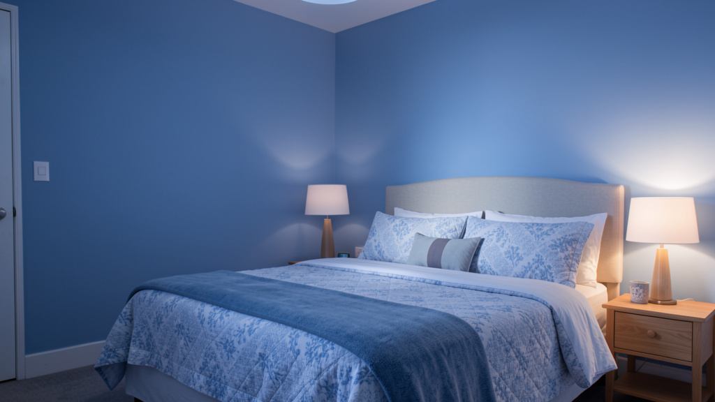
Move beyond basic color charts. Discover how to intentionally select and apply hues that nurture your emotions, enhance daily rituals, and transform every room into a sanctuary aligned with your deepest needs.
Your walls do more than hold up your roof—they shape your emotional landscape. Stepping into a space washed in soft, earthy clay may invite a subtle release of tension; sunlight catching a warm terracotta accent can evoke quiet comfort. These responses arise from the interplay of biology, perception, and personal history. Environmental psychology research indicates that color influences nervous system activity, mood regulation, and cognitive focus—not through magic, but through measurable sensory pathways. This guide synthesizes established principles from environmental psychology, cross-cultural studies, therapeutic design practices, and practical application strategies. It offers a personalized framework for selecting colors that honor both universal tendencies and your unique emotional ecosystem. Forget rigid “blue for calm” rules. We’ll explore how light, texture, memory, culture, and context shape your relationship with color—so you can create spaces that feel authentically supportive, not merely decorative.
Introduction: Color as an Environmental Conversation
Consider two spaces after a demanding day: one with stark white walls and unmodulated overhead light; another with softly textured walls in a warm neutral, layered ambient lighting, and tactile textiles. Without conscious analysis, your body may register difference—shoulders softening, breath deepening. This isn’t imagination. Light wavelengths interact with photoreceptors, sending signals that influence autonomic functions. Studies suggest muted cool tones may support reduced physiological arousal in some contexts, while warm earth tones can evoke feelings of grounded safety. Yet biology is only one thread. A hue celebrated as joyful in one culture may carry solemn meaning in another. A color tied to cherished memory may comfort one person and unsettle another. True emotional alignment requires honoring both shared human patterns and deeply personal associations.
This resource draws upon documented research in environmental psychology, principles from therapeutic and biophilic design frameworks, cross-cultural color symbolism literature, and adaptable application strategies. It prioritizes self-awareness over trend adherence. Your home is not a showroom—it’s a living environment for your humanity. Whether refining a single corner or reimagining multiple spaces, this guide supports choices rooted in intention, flexibility, and compassion for your evolving needs.
The Harmony Mapping Framework: A Three-Phase Approach to Intentional Color Selection
Most color guidance begins with the paint chip. Sustainable emotional alignment begins inward. The Harmony Mapping Framework reverses the sequence: understand your inner landscape first, then align external choices with purpose, and finally apply techniques that honor context. This fluid process adapts to your life—not the reverse. Developed through synthesis of environmental psychology literature and therapeutic design methodology, its three phases build upon one another. Skipping foundational reflection may lead to aesthetically pleasing spaces that feel emotionally disconnected. Proceed gently, without judgment.
Step 1: Clarify Your Emotional Landscape—The Essential Foundation
Before evaluating a single hue, pause to map your current relationship with space. This phase cultivates self-awareness through three reflective practices. There are no right answers—only honest ones.
Define Room-Specific Emotional Intentions
For each key space, journal responses to:
– What feeling would best support my well-being here? (Move beyond “calm.” Is it “safety to release the day,” “gentle focus,” or “warm connection”?)
– What sensation drains me in this space currently? (e.g., “feeling exposed,” “mental fragmentation,” “sensory overload”)
– What daily ritual occurs here that color could gently support? (e.g., “morning tea as mindful transition,” “evening wind-down as nervous system reset”)
Precision matters. “Psychological containment” directs different choices than generic “calm.” A space designed for “creative flow” requires different energetic support than one for “restorative stillness.” Your wording becomes your compass.
Observe Your Circadian and Activity Patterns
Track your experience across a typical day:
– Morning (6–10 AM): Where do you feel most alert or sluggish? How does light interact with current colors?
– Midday (11 AM–3 PM): Where do you seek focus or connection? Does the visual environment support or distract?
– Evening (6–10 PM): Where do you transition toward rest? Do colors feel supportive or stimulating?
Notice patterns without criticism. Someone sensitive to visual stimulation after hours of screen work may find even soft yellows fatiguing by evening. Another may crave gentle warmth to counteract dim winter light. This awareness informs when and where certain chromatic energies serve you.
Explore Your Personal Color Lexicon
Cultural symbolism offers context—but your lived experience holds greater weight. Reflect quietly:
1. Recall a memory of deep peace. What colors were present? (Faded denim on a porch chair? Moss on a forest path?)
2. Recall a moment of joyful connection. What hues surrounded it?
3. Recall a space where you felt uneasy. What visual elements contributed?
These associations form your unique color vocabulary. If “calming blue” evokes a sterile clinical environment from your past, honor that truth. If terracotta recalls warmth and belonging, let that guide you. This isn’t rejecting science—it’s integrating your whole story. Keep these reflections visible as you move forward. They are not constraints, but compassionate data.
The Fundamental Principle: Color in your home functions as a continuous, nonverbal dialogue with your nervous system. Aligning choices with your authentic emotional landscape—not external ideals—creates environments that feel genuinely supportive over time.
Step 2: Align Colors with Purpose, Context, and Personal Resonance
With inner clarity established, bridge intention to application. This phase integrates universal tendencies, room function, lighting reality, and your personal lexicon. Avoid rigid room-by-room mandates; instead, use this as a responsive decision matrix.
Understanding Hue Families with Nuance
Cool Tones (Blues, Greens, Purples)
– Typical Tendencies: Often associated with sky, water, foliage. Muted variations (sage, powder blue, dusty lavender) may support reduced visual stimulation for some.
– Critical Considerations: Undertone and saturation dramatically shift impact. A gray-based blue may feel serene; the same hue with green undertones might read cold in low light. Deep navy can feel grounding (like twilight); bright cyan may feel clinical. Always test in your space.
– Personal Check: Does this family connect to restorative memories for you? If not, explore bridging hues (e.g., teal blends cool calm with earthy warmth).
Warm Tones (Reds, Oranges, Yellows, Earth Tones)
– Typical Tendencies: Linked to sun, earth, hearth. Earth tones (terracotta, ochre, warm taupe) often provide comforting warmth without visual intensity. Soft warm yellows may uplift; saturated yellows can overwhelm sensitive individuals.
– Critical Considerations: Intensity is key. Muted brick red feels nurturing; vibrant crimson energizes. Research suggests warm-toned dining environments may encourage relaxed, connected meals.
– Personal Check: Does “orange” evoke autumn hikes or construction zones? Honor your association. If warmth is needed but a hue triggers discomfort, seek alternatives within the family (e.g., rust instead of bright orange).
Neutrals (Whites, Grays, Beiges, Blacks)
– Typical Tendencies: Far from “blank,” neutrals carry significant emotional weight. Crisp white may feel expansive or sterile. Warm beige (yellow/red undertones) often feels nurturing; cool beige may feel dated. Charcoal offers depth; light gray may feel serene or somber depending on context.
– Critical Considerations: Undertones are non-negotiable. Hold a “white” chip against pure paper. Is it leaning pink? Yellow? Blue? In north-facing rooms, cool whites may amplify chill; warm whites add balance. Always test large swatches.
– Personal Check: Does “beige” mean builder-grade blandness or the comforting warmth of a favorite café? Reframe neutrals as intentional emotional anchors.
Room-Purpose Alignment Guide (Adaptable, Not Prescriptive)
Use this table as a reflective tool. Cross-reference with your Step 1 insights.
| Room | Core Emotional Intent | Thoughtful Hue Considerations | Lighting & Context Notes | Personalization Prompt |
|---|---|---|---|---|
| Bedroom | Safety, Release | Muted earth tones (clay, oat), soft greens with warm undertones, deep warm neutrals | Avoid cool whites under artificial light; prioritize warm, dimmable sources. Test colors at night. | “What hue makes me feel held? Does depth feel cozy or confining?” |
| Kitchen | Nourishment, Connection | Warm earth tones (terracotta, olive), creamy whites with yellow undertones | North-facing? Add warmth. South-facing? Soften intensity. Avoid stark white if it heightens anxiety about cleanliness. | “Does this palette make cooking feel like a caring ritual?” |
| Home Office | Focused Clarity | Soft blues/greens with gray bases, warm light grays | Minimize screen glare. Avoid high-contrast walls behind monitors. Layer task and ambient light. | “Does this support entering ‘flow’ without feeling sterile?” |
| Living Room | Balanced Social Energy | Warm neutral base (greige), layered secondary colors for zoning (e.g., olive for calm zones) | Ensure colors transition gracefully from daylight to lamplight. Use multiple lighting sources. | “Does this support both connection and quiet solitude?” |
| Bathroom | Renewal, Sensory Reset | Soft seafoam (gray-based), warm misty blue, creamy ivory | Vanity lighting: warm bulbs beside mirror. Avoid cool whites that wash out skin tones. | “Does stepping in feel like a gentle ritual of care?” |
| Children’s Room | Security, Age-Appropriate Stimulation | Soft earth tones, muted primaries (dusty rose, sage); avoid high-saturation brights on large surfaces | Prioritize non-toxic paints. Use color to define zones (reading nook vs. play area). | “Does this support calm transitions? Will it grow with them?” |
| Entryway | Grounding Transition | Warm neutrals (clay, taupe), deep accent on interior door | First impression under artificial light. Should feel like a “visual handshake”—welcoming, not overwhelming. | “Does this space help me shed the outside world?” |
| Dining Area | Mindful Connection | Warm earth tones (terracotta, olive), deep warm hues (burgundy, chocolate as accents) | Warm, dimmable lighting essential. Color should feel intimate at low light levels. | “Does this encourage lingering presence over rushed meals?” |
The Lighting Reality Check: Non-Negotiable Testing
Paint chips cannot predict in-situ results. Light transforms color. Conduct this essential process:
1. Purchase sample pots of top contenders.
2. Paint swatches (minimum 2ft x 2ft) on multiple wall sections (near windows, in corners, opposite light sources).
3. Observe at dawn, midday, sunset, and under evening lighting. Photograph changes.
4. Live with swatches for 48+ hours. Notice subtle emotional shifts upon entering the space.
A neutral selected in a sunlit store may read cold in a north-facing room. This step prevents costly repaints and emotional disappointment. Document observations. Lighting isn’t an afterthought—it’s a co-author of your color story.
Step 3: Apply with Intention—Techniques for Integration and Adaptability
Selection is only the beginning. How color is applied determines its long-term resonance. These adaptable techniques, informed by therapeutic design principles, support integration into daily life.
The 60-30-10 Harmony Principle (Emotionally Adapted)
This ratio gains depth when assigned emotional purpose:
– 60% Dominant (Walls, Large Surfaces): Your foundational emotional anchor. Aligns with core room intention (e.g., warm clay in bedroom for safety).
– 30% Secondary (Upholstery, Rugs, Large Textiles): Nuances the anchor. In a living area with warm greige walls, deep olive sofas add grounded calm.
– 10% Accent (Pillows, Art, Small Objects): Provides gentle punctuation. A terracotta vase on an olive sofa introduces warmth without overwhelm.
Why it supports well-being: Dominance creates psychological safety through consistency. Secondary elements add depth. Accents offer micro-moments of joy. Rotate accents seasonally to maintain freshness without repainting. This structure prevents visual chaos while allowing personal expression.
Intentional Accent Walls: Purpose Over Cliché
An accent wall succeeds when it serves a clear function:
– Placement: Position opposite primary light source for depth. Behind a bedhead for enveloping comfort. At the end of a hallway to create visual arrival.
– Color Choice: Select a hue 2–3 shades deeper within the same family for sophistication (light sage walls with deep forest green accent). For emotional contrast, choose a complementary hue that serves a specific need (warm rust accent in a cool-toned living area to create a “hearth” zone).
– Critical Consideration: In small or relaxation-focused spaces (like bedrooms), avoid high-contrast, saturated accents—they may create visual tension. Deepen the existing palette instead of introducing conflict.
Texture and Sheen: The Silent Amplifiers
Color perception shifts with surface quality:
– Matte/Flat: Absorbs light. Feels soft, intimate. Ideal for low-traffic zones (bedrooms, ceilings). Reduces glare; supports calm.
– Eggshell/Satin: Subtle sheen. Wipeable. Balanced warmth. Ideal for living areas, hallways.
– Semi-Gloss: Reflects light. Crisp, modern. Best for trim, doors, or small accents. Overuse in large areas may feel clinical for sensitive individuals.
Pair thoughtfully: Matte clay walls beside a rough-textured jute rug and smooth ceramic vase create multi-sensory “earthy comfort.” In high-stress households, minimizing high-gloss surfaces in common areas can reduce visual noise. Run your hand over fabric swatches beside paint chips. Does the combination feel harmonious to your senses? Trust that tactile response.
Transition Zones for Open Layouts
Define emotional zones without physical barriers:
– Method: Use a consistent warm neutral base on all main walls. Shift the secondary color family per zone:
– Kitchen zone: Warm wood tones + terracotta accents
– Living zone: Deep olive green sofa + sage pillows
– Dining zone: Rust-colored chairs + burnt orange art
– Why it works: The neutral base provides visual calm. Shifting secondary colors create intuitive emotional zoning. Walking between zones, your nervous system gently transitions.
– Cohesion Tip: Carry one subtle accent color (e.g., rust) through all zones (a vase, placemats) to maintain flow. This technique helps signal mental boundaries—like shifting from “work mode” to “home mode.”
Room-by-Room Emotional Blueprint: Principles for Purposeful Spaces
Apply the Harmony Mapping Framework to key living areas. Each section offers adaptable principles—not prescriptions—grounded in function, sensory experience, and emotional intent.
The Sanctuary Bedroom: Cultivating Rest and Restoration
The bedroom’s primary role is physiological and emotional restoration. Every choice should support the transition into restful states.
Sleep-Supportive Color Principles
While soft blues and greens are commonly recommended, undertone and personal association matter most. Warm-leaning muted greens (sage), soft clay tones, deep warm neutrals (charcoal with brown base), and dusty lavenders (gray-based) often provide accessible calm. These hues bridge cool serenity with earthy comfort. Avoid stark white (may trigger alertness), highly saturated colors (potential overstimulation), and cool grays in low-light rooms (may amplify chill). Research suggests warm, muted earth tones in sleep environments may support smoother transitions into rest by reducing cool-light reflection under artificial lighting.
Lighting for Circadian Support
– Day: Sheer curtains in warm ivory filter light gently. Avoid heavy blackout unless medically needed—they can disrupt morning light cues.
– Evening: Dimmable warm-white LEDs (2700K or lower). Fabric-shaded lamps casting light upward/outward reduce harsh shadows.
– Ceiling Tip: Paint ceiling a shade lighter than walls in the same undertone family. Warm white over clay walls feels cohesive; cool white creates dissonance.
Texture for Sensory Safety
Layer tactile elements that signal rest:
– Walls: Matte finish
– Bedding: Linen or brushed cotton in complementary muted tones
– Floor: Plush wool rug in a slightly deeper wall shade
– Accents: Woven rattan, smooth ceramic
This multi-sensory approach engages the parasympathetic nervous system. The slight texture of linen, softness of wool underfoot—these cues reinforce visual calm.
Common Considerations & Adaptive Solutions
– “Deep color feels cave-like.” → Use depth only on the wall behind the bedhead. Keep other walls warm light neutral. Amplify with abundant warm lighting and textured creams/taupes in textiles.
– Partner preference differences. → Compromise on a deep, warm neutral (rich taupe) for walls. Express bold preferences through removable accents (art, throws). Prioritize the primary sleeper’s emotional needs.
– North-facing room feels cold. → Choose wall colors with strong warm undertones. Amplify warmth through textiles: terracotta rug, burnt orange pillow, visible wood grain. Add a small warm-toned art light.
The Nourishing Kitchen: Fostering Connection and Gentle Vitality
The kitchen serves as a hub for creation, connection, and daily ritual. Color should energize without overwhelming, welcome without demanding.
Sustainable Warmth Strategies
Pale, buttery yellows with brown undertones may feel inviting; saturated or green-based yellows can increase anxiety for sensitive individuals. Preferred alternatives: warm earth tones (terracotta, ochre, warm olive), creamy whites with yellow undertones, muted coral. These hues gently support appetite and social ease while evoking primal symbols of hearth and nourishment. Avoid stark white (highlights imperfections, may increase cleaning anxiety) and cool gray (can feel industrial).
Zoning Through Color
Define emotional zones visually:
– Task Zone (Countertops): Slightly cooler neutral (warm gray tile) to support focused prep.
– Connection Zone (Island/Dining Nook): Introduce warmth—muted terracotta island base, warm wood stools.
This subtle cue helps the nervous system distinguish “focus here” from “connect here,” reducing cognitive load.
Lighting and Texture for Tactile Warmth
– Lighting: Under-cabinet warm-white LEDs (3000K) for task safety; pendant lights with fabric shades for ambient warmth. Avoid cool-white bulbs—they alter food appearance and skin tones.
– Texture: Counteract hard surfaces with handmade tile backsplash, woven fruit bowl, linen towels, ceramic canisters. Running a hand over textured surfaces during routine tasks becomes a micro-moment of mindfulness.
Adaptive Solutions
– Small kitchen feels smaller. → Apply deep color only to lower cabinets or one accent wall. Keep uppers and ceiling light. Add matte brass hardware or ceramic tiles to bounce light softly.
– North-facing kitchen feels cold. → Select wall colors with pronounced warm undertones. Incorporate warm wood elements and amber-tinted glass cabinet doors to trap and reflect warmth.
The Dynamic Living Room: Supporting Fluid Emotional Needs
This space often serves multiple roles: social hub, quiet retreat, family zone. Color must support graceful transitions between states without emotional whiplash.
Layered Palette Strategy
– Base (60%): Warm, complex neutral (greige with brown undertones). Provides calm consistency.
– Secondary (30%): Two complementary families for zoning:
– Connection Zone (sofa area): Warm earth tone (terracotta, rust) to encourage warmth.
– Retreat Zone (reading nook): Muted cool tone (sage, dusty blue) for quiet focus.
– Accents (10%): Rotate seasonally—mustard in fall, soft coral in spring.
This structure allows the space to “read” its purpose intuitively. Moving between zones feels natural, not jarring.
Lighting as Emotional Choreography
Install separate dimmers for zones: brighten connection areas when hosting; dim retreat zones for solo evenings. Layer ambient (cove lighting), task (adjustable floor lamp), and accent lighting (picture lights). Warm bulbs (2700K) throughout maintain cohesion. This puts you in control of the room’s emotional temperature.
Texture for Multi-Sensory Comfort
Combine matte walls, textured-weave sofa fabric, chunky knit throw, high-pile wool rug, smooth ceramic vase. This variety engages multiple senses, inviting lingering and embodied comfort. Sinking into textured fabric while wrapped in wool creates comfort that color alone cannot achieve.
Adaptive Solutions
– Open concept feels undifferentiated. → Use consistent base neutral on all walls. Shift secondary colors per zone (kitchen: olive accents; living: terracotta accents). Carry one wood tone throughout.
– Dark furniture feels heavy. → Lighten walls significantly (warm white). Add reflective surfaces (mirror, glass table) and light textiles (cream rug, oat pillows).
– Room feels cold when empty. → Prioritize warm undertones in all elements. Layer multiple warm-light sources (lamps) and textured textiles that feel inviting even unoccupied.
The Focused Home Office: Supporting Clarity and Cognitive Flexibility
This space must balance sustained attention with creative openness. Color can reduce visual fatigue and support mental transitions.
Dual-Zone Color Strategy
– Focus Zone (Desk Area): Cool-leaning muted tones (soft sky blue with gray base, muted seafoam, warm light gray). May reduce visual distraction for detail work. Avoid pure white—it creates high screen contrast.
– Creative Zone (Opposite Wall, Lounge Chair): Warm accent (muted coral, terracotta, deep mustard). When stuck, looking up provides a gentle visual shift to cue brainstorming mode.
Lighting for Visual Comfort
– Task: Adjustable warm-white desk lamp (3000K) positioned to eliminate screen glare.
– Ambient: Indirect cove lighting or floor lamp behind desk to soften shadows.
– Critical: Avoid cool-white overheads—they may increase eye strain and mental fatigue. Position desk perpendicular to windows to maximize natural light benefits while minimizing glare.
Texture for Sensory Focus
Matte walls reduce glare. Warm wood or matte laminate desk surface. Low-pile wool rug under chair absorbs sound. Cork bulletin board offers satisfying tactile feedback. These elements create a “contained” feeling that supports concentration without sensory deprivation.
Adaptive Solutions
– Gray feels cold. → Ensure gray has warm undertones (brown base). Test swatches under evening lighting. Pair with abundant warm wood and textured textiles.
– Need energy without chaos. → Use muted warm accent on one wall or in artwork. Keep dominant walls neutral. Increase task lamp brightness rather than wall saturation.
– Small office feels cramped. → Paint all walls a light, warm neutral (ivory). Consider soft sky blue on ceiling to create height illusion. Use color inside bookshelves for hidden delight.
The Rejuvenating Bathroom: Designing for Ritual and Renewal
This intimate space supports physical and emotional reset. Color should enhance ritual, not just function.
Authentically Calming Palettes
Soft seafoam (gray-based), warm misty blue, creamy ivory (yellow undertone), muted clay. These hues support parasympathetic shifts without clinical sterility. Avoid stark white (highlights flaws, feels institutional) and cool gray (amplifies post-shower chill).
Lighting for Ritual and Realism
– Vanity: Sconces beside mirror with warm-white LEDs (2700–3000K) eliminate unflattering shadows.
– Ambient: Dimmable ceiling or cove lighting.
– Shower: Waterproof warm-toned LED strip for evening baths.
Avoid cool-white bulbs—they wash out skin tones and undermine warmth of earth-tone colors.
Texture for Tactile Tranquility
Matte walls reduce moisture reflection. Pebble tile floor or smooth river rock accent in shower. Honed stone countertop (matte, warm to touch). Plush cotton towels, woven seagrass basket, smooth ceramic dispenser. Stepping onto textured tile becomes a mindful moment. The weight of a thick towel signals care.
Adaptive Solutions
– Small bathroom feels smaller. → Use light, warm neutrals on walls. Add depth through textured tiles or a single deeper-toned accent wall behind the vanity.
– Humidity affects appearance. → Choose paints with mildew resistance. Matte/eggshell finishes hide moisture spots better than gloss. Ensure ventilation.
– Spa-like feels cold. → Prioritize warm undertones everywhere: warm ivory walls, honey-toned wood shelf, terracotta soap dish. Pair with ambient sound (small speaker) for multi-sensory renewal.
The Thoughtful Children’s Room: Supporting Development and Security
Color choices impact emotional regulation and imaginative play. Balance stimulation with security, growth with grounding.
Age-Responsive Principles
– Infants (0–2): Walls: soft warm neutrals (creamy white, warm beige). High-contrast patterns reserved for mobiles/play mats to avoid overstimulation during sleep.
– Toddlers (2–5): Introduce muted primaries: dusty rose, sage green, sky blue. Supports color recognition without sensory overload. Research suggests overly saturated environments may increase agitation in sensitive children.
– School-Age (6–12): Involve child in choosing one accent color. Keep walls calm neutral. Builds autonomy while maintaining restful base.
– Teens (13+): Respect emerging identity. Deep, sophisticated tones (navy, forest green) feel mature. Offer bounded choices: “Select between these three deep blues for your accent wall.”
Zoning Within the Room
Even small rooms benefit from visual cues:
– Sleep Zone: Calming muted tone walls (soft clay, warm gray).
– Play/Study Zone: Accent wall in child’s chosen muted color.
This helps children transition between activities, potentially reducing bedtime resistance.
Safety and Sensory Considerations
– Paint: Non-toxic, zero-VOC formulas are essential.
– Lighting: Warm, dimmable sources. Nightlights with red/orange light minimize melatonin disruption.
– Texture: Soft rugs for play; smooth surfaces for cleaning. Avoid overwhelming patterns on large surfaces.
Adaptive Solutions
– Theme lost relevance. → Keep walls neutral. Express themes through removable decals, bedding, art that evolve with the child.
– Room feels chaotic. → Strictly apply 60-30-10: neutral walls (60%), one secondary color for furniture (30%), one accent for decor (10%). Store toys in bins matching secondary color.
– Child insists on neon. → Compromise: “Neon green works for art supplies and one special pillow. Walls need a color that helps your brain rest at night. Let’s choose a calm green together.” Offer controlled choices.
The Welcoming Entryway: Creating a Threshold of Transition
This small space sets the emotional tone for your entire home. In seconds, it can signal safety, welcome, or stress.
Transition Palette Principle
The entryway should gently prepare you for the home’s dominant mood:
– Warm/Earthy Home: Entry walls in a slightly deeper shade of the main living neutral (warm taupe leading to warm greige).
– Cool/Calm Home: Entry walls in soft, warm-leaning neutral (ivory) to transition from outdoor coolness.
This visual gradient guides the nervous system inward. Stepping from street to warm-toned entry can trigger an almost immediate physiological shift toward safety.
Intentional Arrival Cue
One small color moment anchors transition:
– Interior of front door: Deep forest green or warm terracotta
– Console table: Small vase with dried grasses
– Art: Single piece in your home’s accent color
This isn’t decoration—it’s ritual design. Closing the door on the outside world and seeing this cue signals: “You are home. You are safe.”
Lighting for Psychological Threshold
Warm, dimmable overhead or sconce (2700K). Motion-sensor amber nightlight for returning after dark—feels welcoming, not stark. Avoid cool-white overheads; they feel institutional upon arrival.
Adaptive Solutions
– Tiny entry feels cramped. → Paint walls and ceiling the same light, warm neutral (ivory). Creates seamless expansion. Add depth through one textured element (woven wall hanging).
– Dark entry feels unwelcoming. → Use lightest warm neutral possible. Add mirror opposite door, glass console, metallic accents. Ensure abundant warm lighting.
– Open entry flows into living room. → Use same wall color throughout. Introduce home’s accent color only in entry (front door interior, small rug, art) for subtle “welcome mat” effect.
The Mindful Dining Area: Encouraging Presence and Connection
Beyond eating, this space hosts connection, celebration, and mindful presence. Color should slow time and encourage engagement.
Connection-Supporting Hues
Deep terracotta, warm olive green, muted burgundy. These evoke hearths, clay pottery, earth—symbols of shared sustenance across cultures. Research suggests warm-toned dining environments may support longer, more engaged meals. Avoid cool grays (may suppress appetite), stark white (feels clinical), and bright red (may encourage rushed eating).
Lighting for Intimate Ambiance
Dimmable pendant/chandelier over table with warm bulbs (2700K) and fabric/paper shades for soft downward diffusion. Wall sconces or buffet lamp add layered warmth. Install a dimmer preset for “dinner mode” (~50% brightness) to remove decision fatigue. Candlelight (real or LED) adds flickering warmth screens cannot replicate.
Texture for Sensory Grounding
Matte walls avoid glare. Visible wood grain table. Upholstered chairs in linen or velvet. Linen runner, ceramic dishes, cloth napkins. The texture of linen under fingertips, warmth of wood grain—these tactile elements ground diners in the present, reducing distraction and increasing connection.
Adaptive Solutions
– Dark room feels cave-like. → Apply deep color to one accent wall (behind buffet). Keep other walls warm light neutral. Add mirror opposite window, glass tableware, metallic accents. Ensure abundant warm lighting.
– Open to kitchen—colors clash. → Same base neutral on all walls. Dining zone uses warmer secondary colors (terracotta chairs); kitchen uses cooler secondaries (olive accents). Carry wood tones consistently.
– Formal room feels unused. → Repaint in warm, inviting tone. Add comfortable upholstered chairs. Use space for morning coffee or board games—color should support actual use.
Navigating Personal and Cultural Dimensions: Honoring Your Unique Context
Color meaning is not universal. True emotional intelligence requires humility, curiosity, and personalization. This section addresses nuances often overlooked.
When Personal History Diverges from General Advice
You’ve clarified your Personal Color Lexicon. If “calming blue” recalls a cold childhood room, honor that truth. Your history is valid data—not a flaw.
– Strategy: Seek the emotional equivalent in another family. Need “calm” but blue feels cold? Explore muted greens (sage) or warm neutrals (clay, oat). Need “energy” but yellow feels anxious? Try muted coral or warm terracotta.
– Professional Insight: Therapeutic design practices often use “color substitution”—finding hues that carry similar restorative properties without negative triggers. The goal isn’t to override your association, but to work with your unique landscape.
– Action: Revisit your lexicon. For any recommended color causing discomfort, brainstorm three alternatives evoking the same core emotion (safety, joy, focus). Test rigorously.
Cultural Context: Moving Beyond Western-Centric Views
Color symbolism shifts across cultures. This isn’t about stereotyping—it’s about mindful integration of your heritage:
– East Asian Contexts: Red often symbolizes luck, joy, celebration (used in weddings). White may symbolize mourning. Incorporating red accents (art, textiles) can infuse cultural resonance. Avoid using white as dominant “calm” color if it carries mourning associations for you.
– South Asian Contexts: Saffron represents purity/spirituality; green symbolizes new beginnings; jewel tones denote prosperity. Integrate thoughtfully as meaningful anchors.
– Latin American Contexts: Vibrant colors (cobalt, sunflower, terracotta) reflect cultural warmth and earth connection. Muted versions can honor heritage while supporting modern emotional needs.
– Critical Approach: If your background assigns specific meanings, prioritize those over generic advice. Consult elders or cultural resources. Your home should reflect your story. A family might choose deep terracotta for a dining room to honor ancestral adobe homes—a choice carrying deeper emotional weight than trend-driven palettes.
Neurodiversity and Sensory Processing Considerations
For individuals with autism, ADHD, PTSD, or sensory differences, color impact is magnified.
– For Sensory Sensitivity: Prioritize low-visual-vibration palettes: muted earth tones (clay, sand, warm taupe), soft greens. Avoid high-contrast schemes, bright saturations, complex patterns on large surfaces. Matte finishes reduce glare.
– For Seeking Stimulation: Introduce controlled color moments: single accent wall in preferred muted hue; color-coded zones (blue shelf for books) to support organization.
– Professional Guidance: Occupational therapists often recommend “color zoning”—using distinct but muted colors to define functional areas, supporting spatial understanding and emotional regulation. Always prioritize the individual’s stated preferences.
– Example: A bedroom with consistent warm oat walls (reducing visual noise), soft sage bedding (self-identified calm color), and a small removable blue star decal (personal comfort symbol) balances consistency with personal security.
Navigating Household Differences: A Collaborative Framework
Clashing preferences are common. Approach as a communication opportunity:
1. Separate Preference from Need: “I hate beige” (preference) vs. “I need visual calm to decompress” (need). Uncover the emotional need behind each preference.
2. Find Overlap: Both may need “a retreat space.” One associates retreat with deep blue; the other with warm clay. Is there a bridging hue? (e.g., deep teal with warm undertones).
3. Zone Strategically: In shared spaces, use a neutral base both tolerate. Allocate personal zones (home office corner, bedside area) for individual expression.
4. Test Rigorously: Paint large swatches. Live with them 48+ hours. Revisit at different times. Data reduces emotion-driven conflict.
5. Prioritize Primary User: In a bedroom used primarily by one person for sleep recovery, their emotional needs may outweigh a partner’s aesthetic preference. Compromise elsewhere.
A couple resolved a debate (navy vs. terracotta) by choosing deep warm charcoal with brown undertones—a hue feeling “grounded” to one and “earthy” to the other. Terracotta pillows and a navy throw blanket honored both. “It meets both our needs better than our original demands,” they noted.
Advanced Integration: Light, Seasons, and Micro-Moments
Elevate your practice with nuanced techniques that honor dynamic living.
The Light-Color Relationship
Light doesn’t just reveal color—it creates it. Adapt choices to your room’s light:
– North Light (Cool, Consistent): Amplifies cool undertones. Counteract with warm-leaning colors (creamy whites, terracotta). Avoid cool grays—they read colder.
– South Light (Warm, Intense): Amplifies warm undertones. Balance with cooler neutrals (greiges with gray base) or muted cool tones (sage). Avoid overly warm colors—they may feel overwhelming by afternoon.
– East Light (Soft Morning): Enhances warm tones beautifully. Ideal for bedrooms, breakfast nooks. Soft yellows, warm whites shine here.
– West Light (Warm Evening): Intensifies reds/oranges. Use muted earth tones (olive, clay) that deepen gracefully. Avoid bright reds—they may feel aggressive at sunset.
Pro Technique: At golden hour, observe where light pools. Paint that wall a color that deepens beautifully in warm light (terracotta, olive). Where light is scarce? Use lighter, warmer neutral to lift the space.
Seasonal Palette Shifts: Honoring Natural Rhythms
Emotional needs shift with seasons. Build flexibility:
– Base (Walls, Large Furniture): Choose a neutral working year-round (warm greige, soft clay).
– Secondary (Curtains, Rugs): One set for warm months (lighter weave, cooler tone like oat); one for cool months (heavier weave, warmer tone like caramel).
– Accents (Pillows, Throws, Art): Rotate quarterly:
– Spring: Soft coral, sage green, sky blue
– Summer: Cream, seafoam, warm white
– Fall: Terracotta, ochre, deep olive
– Winter: Charcoal, deep teal, warm ivory
This subtle shift aligns your home with natural cycles, supporting emotional adaptation. Changing pillow covers becomes a mindful ritual marking transition.
Color in Micro-Moments: High-Impact, Low-Commitment
You don’t need renovation to harness color psychology:
– Threshold Moment: Paint the inside of your front door a color signaling “home” (deep green, warm terracotta). Every closing offers an emotional cue.
– Ritual Anchor: Choose one color for morning ritual items (ivory mug, oat journal, wood spoon). Visual consistency signals “beginning of day.”
– Portable Anchor: Keep a small object in your “calm” color (smooth stone, silk scarf) in your bag. During stress, touch it—a tactile color anchor.
These micro-applications weave intention into daily life. A healthcare worker keeps a terracotta-colored stone in her pocket: “Holding it for 60 seconds brings me back to my safe space. It’s my portable sanctuary.”
When to Trust Your Intuition
Frameworks guide—but your inner wisdom matters most.
– The Joy Test: If a color brings unexplainable joy—even if “it shouldn’t work”—honor it. Joy is valid data. Display it.
– Memory Anchor: A color tied to a cherished memory (grandmother’s kitchen blue, childhood treehouse green) deserves respectful inclusion. Frame a swatch; use it meaningfully.
– Professional Perspective: Experienced designers often include one “rule-breaking” element—a vibrant ceiling, mosaic tile—that reminds them color is personal. As noted by color researchers, the most resonant color is the one that makes the occupant feel authentically seen. If deep emerald in your sunlit nook brings peace, test it thoroughly. If it sustains that feeling, proceed. Your emotional truth outweighs generic advice.
Your Questions, Answered
Q: Is blue always the most calming color for bedrooms?
A: Not universally. Impact depends on undertone, lighting, and personal association. A blue with strong green undertones in a north-facing room may feel cold. For those with negative associations (e.g., clinical settings), blue may increase unease. Warm-muted greens (sage) or earth tones (clay) often provide more accessible calm by blending cool serenity with earthy warmth. Always test large swatches in your specific room across multiple times of day.
Q: Can color genuinely influence sleep quality?
A: Indirectly, yes. Color shapes the pre-sleep environment. Cool, muted tones may support lowered physiological arousal for some. Critically, wall colors affect reflected light. Warm-toned walls under artificial lighting reduce cool-light reflection, which may better support natural melatonin production than cool-toned walls. Pair color choices with warm, dimmable lighting and blackout solutions for holistic support. Research in sleep environments emphasizes reducing visual stimulation and cool-light exposure before bed.
Q: How do we compromise on color when household members disagree?
A: Shift from “I like X” to “I need Y emotionally.” One may need “deep color for grounding”; another “light walls for calm.” Often, underlying needs can coexist. Solutions: 1) Use a complex neutral base (warm greige) satisfying both. 2) Zone the space—deep accent wall for grounding, light neutrals elsewhere. 3) Allocate personal zones for individual expression. 4) Test swatches rigorously together. Data reduces conflict. Remember: the shared goal is a space where everyone feels emotionally supported.
Q: Are there colors to avoid in a child’s bedroom?
A: For most children, avoid highly saturated brights (neon green, hot pink) on large surfaces. Environmental psychology research links overly stimulating visual environments to increased difficulty winding down and heightened anxiety in sensitive children. Stark white may feel sterile and highlight marks, increasing stress. Instead, choose muted versions of favored colors (dusty rose vs. hot pink) and keep walls a calm neutral. Let bright colors live in removable items (bedding, art). Always prioritize non-toxic, zero-VOC paints. Most importantly, observe your child’s unique responses—some thrive with more stimulation. Trust your knowledge of your child.
Q: How do I create cohesion in an open-concept home?
A: Establish cohesion through a consistent base neutral on all main walls (e.g., warm greige with brown undertones). Define emotional zones through secondary colors and textures: kitchen zone uses warm olive accents; living zone uses terracotta; dining zone uses deep wood tones. Carry one subtle accent color through all zones (e.g., terracotta in a kitchen vase, living room pillow, dining chair). Use area rugs and layered lighting to reinforce zones. This provides visual flow while allowing each space to support its unique purpose. Test your base neutral extensively across all room orientations.
Q: I rent and can’t paint walls. How can I use color psychology?
A: Focus on large, removable surfaces and strategic accents:
– Textiles: Area rugs, curtains, large throws define zones and set emotional tone (e.g., warm terracotta rug creates instant coziness).
– Furniture: Slipcovers in intentional colors (sage green sofa cover).
– Art and Decor: Group framed art with consistent mat colors to create “color walls.” Removable wallpaper on a single accent wall (verify lease) or inside a bookshelf back.
– Lighting: Warm bulb swaps are highest-impact. Add lamps with fabric shades in chosen hues.
– Private Joy: Paint the inside of closet doors or use removable wallpaper inside cabinets.
Your emotional environment isn’t defined by walls alone—layered textiles and intentional lighting create profound impact.
Q: Does paint finish (matte, satin) affect emotional perception?
A: Significantly. Matte/flat finishes absorb light, feeling soft, intimate, and sophisticated—ideal for bedrooms and calm-focused spaces. Eggshell/satin offers subtle warmth and practicality, creating balanced comfort for living areas. Semi-gloss/gloss reflects light, feeling crisp and energizing but potentially clinical if overused. In sensitive households, minimizing high-gloss finishes in common areas reduces visual “noise.” Conversely, a semi-gloss deep navy front door can feel intentionally welcoming. Always consider finish alongside hue—matte sage feels earthy; glossy sage may feel dated. Test finishes on large swatches under your room’s lighting.
Q: I’m sensitive to color and get overwhelmed easily. Where do I start?
A: Begin with neutrality as sanctuary. Choose one warm, complex neutral for your entire space (e.g., greige with clear brown undertones). This creates a calm, cohesive backdrop. Introduce color only through small, removable accents: one pillow in muted terracotta, a single vase in soft sage. Live with each addition for a week. Notice your emotional response without judgment. If it brings calm or joy, keep it. If overwhelming, remove it. There is no rush. Many sensitive individuals find profound peace in minimalist palettes emphasizing texture (wood grain, linen weave) over color variation. Honor your sensitivity—it’s wisdom, not limitation.
Q: How do cultural differences affect my choices if I’m multicultural or living abroad?
A: Prioritize meanings that resonate with your lived experience and emotional needs. If red symbolizes both celebration (from heritage) and caution (from another context), explore which association feels more authentic to you. Consult family elders if appropriate and meaningful. Your home should reflect your personal and cultural identity in a way that feels supportive. There is no single correct answer—mindful integration of colors holding positive meaning for you is the goal. When in doubt, return to your Personal Color Lexicon: what hues evoke safety, joy, or connection within your story?
Conclusion: Weaving Color into the Fabric of Your Daily Life
Color psychology is not about rigid rules or chasing trends—it’s about cultivating awareness of how your environment shapes your inner world. Through the Harmony Mapping Framework, you’ve learned to begin with self-reflection, align choices with purpose and context, and apply techniques with flexibility. Remember these enduring principles:
- Your experience is the compass. Scientific insights and design principles are guides, not mandates. If a recommended color doesn’t resonate with your history or cultural context, trust your intuition and seek alternatives that honor your truth.
- Context is dynamic. Lighting shifts, seasons change, and your needs evolve. A hue that supports you today may feel different tomorrow. Approach color with curiosity, not permanence. Test thoroughly, observe gently, and adjust without judgment.
- Small intentions create meaningful shifts. You don’t need a full renovation. One mindful change—a warmer lightbulb, a textured throw, a single accent object—can begin transforming your relationship with space.
The 24-Hour Rule: Your First Step Starts Now
Within the next 24 hours, complete this simple action: Identify one room where you spend significant time. Observe its current colors at three different times of day (morning, afternoon, evening). Note one subtle emotional shift you experience in that space. No purchase required—just mindful awareness. This observation is the seed of intentional change.
The Big Picture: Your Home as a Living Ecosystem
Your home is not a static backdrop but a responsive partner in your well-being. As your life unfolds, your space can evolve with compassion. View color as one thread in a larger tapestry—woven with light, texture, ritual, and personal meaning. By approaching your environment with curiosity and kindness, you cultivate more than beautiful rooms. You nurture sanctuaries that meet you exactly where you are, supporting your journey with quiet consistency.
Explore Our Complete System:
The Mindful Homeowner’s Guide to Lighting Design | Creating Calm: Biophilic Design Principles for Everyday Spaces | The Ritual Room: Designing Spaces for Daily Practices | Sensory Sanctuary: Adapting Your Home for Neurodiversity | The Sustainable Palette: Eco-Conscious Material Choices | Beyond the Walls: Integrating Art and Personal Artifacts | The Adaptive Home: Designing for Life’s Transitions